Pages Modeling
The page modeler allows to create custom interfaces that make up the application being modeled. Pages can show business information and define data sources if necessary.
Pages are fully responsive, automatically adjusting to the screen or device they are being viewed on to deliver the best user experience, every time. The elements can be modeled as fixed (size in px), which means that their size does not change, regardless of the breakpoint, or fluid (size in %) which means that the element automatically changes its size according to the breakpoint and the modeler preferences. These units of measure help create a layout that fits perfectly in any breakpoint.
To have a page that is as adaptable as possible, it is convenient to use relative measurements, allowing inferior elements to change size in relation to the superior elements, ensuring that elements do not overlap and look good on all types of screens, this is achieved by setting the size of elements from highest to lowest hierarchy.
Elements can be dragged anywhere on the page, within sections or containers. They can also be dragged into layout elements.
Although the page modeler is aimed at modeling without writing a single line of code, there is the possibility of extending the operation of the page and its elements through events and Deyel SDK for JS.

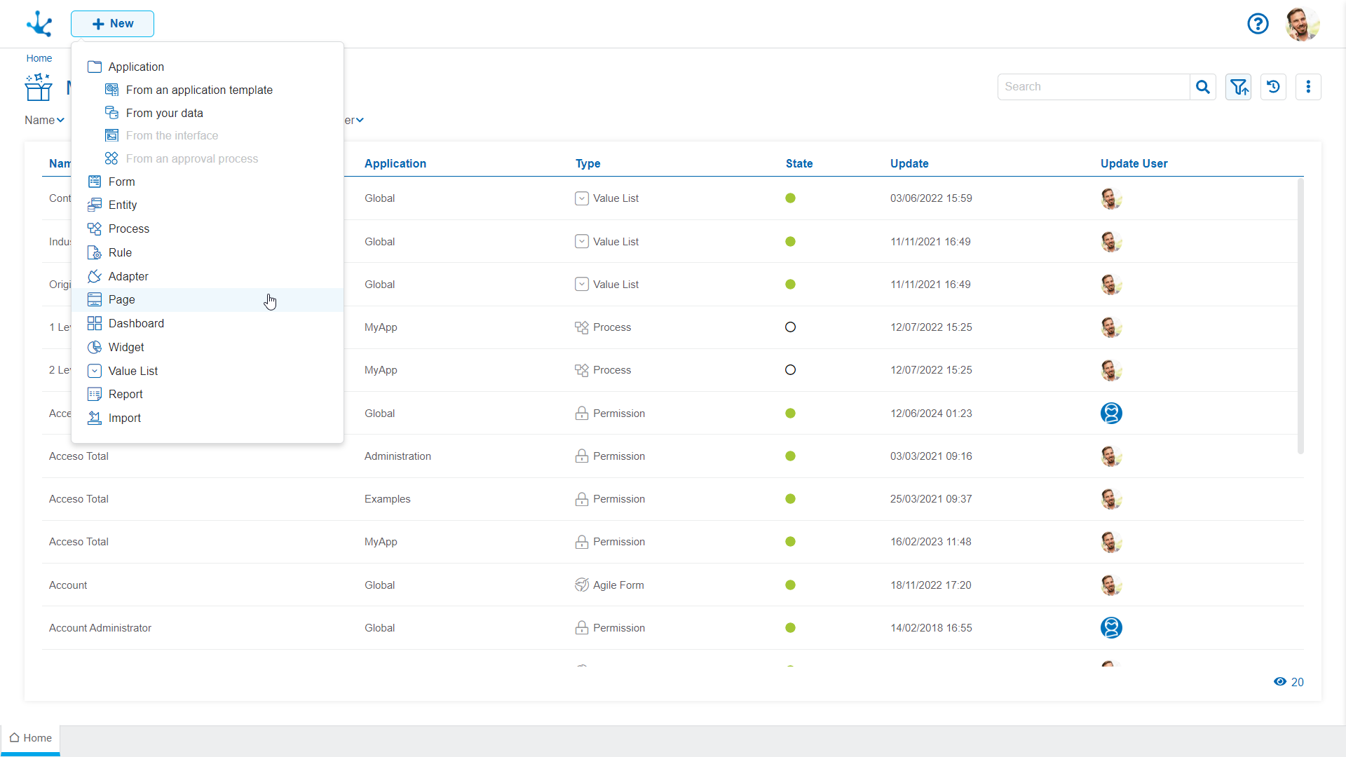
 This button is used to create a page from the option
  Page.
Page.
The general characteristics of the page modeler and the main elements that compose it are described in the following topics:


