View Submenu
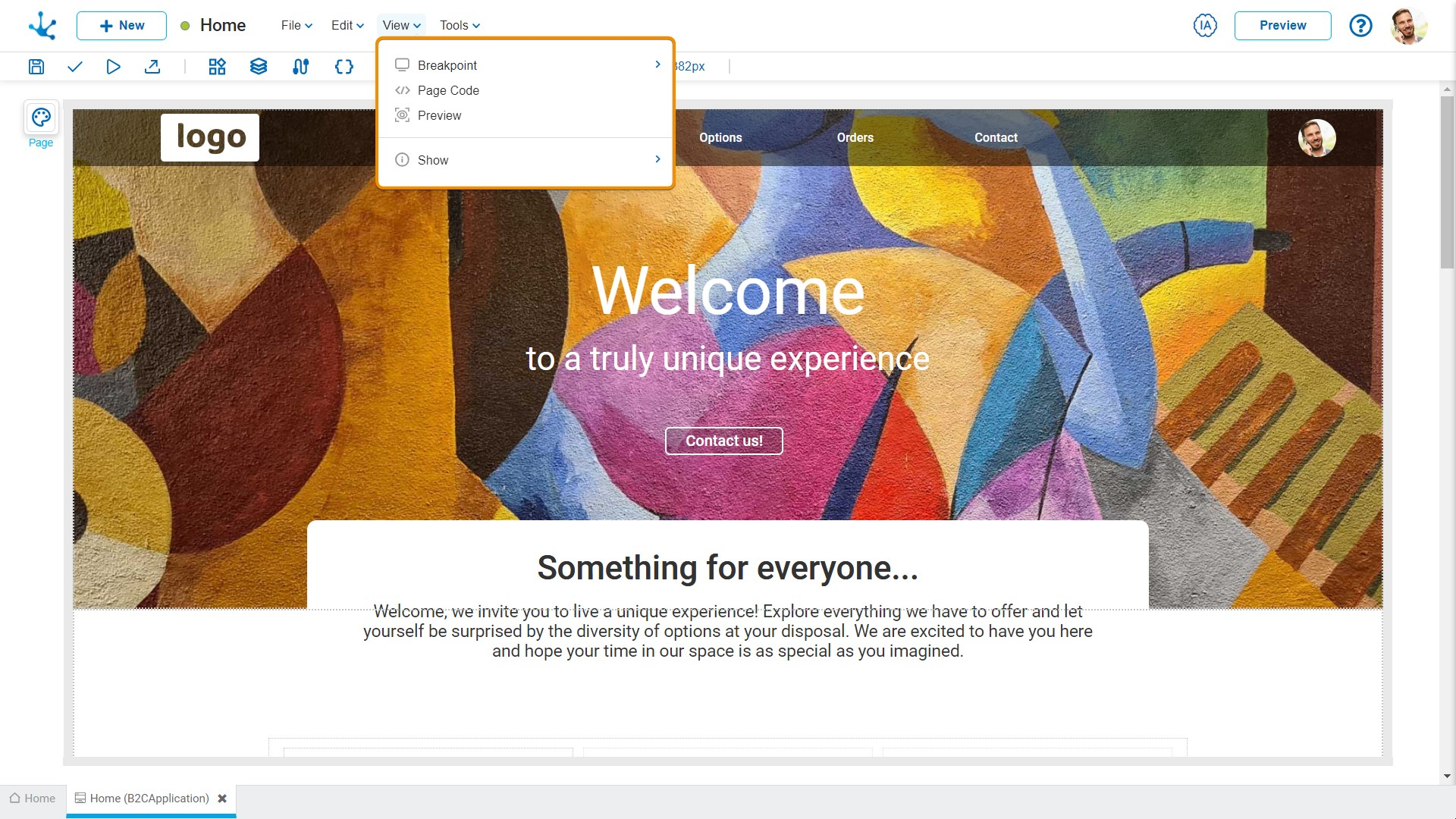
This submenu opens by clicking on the "View" option and allows to select different ways of displaying the page.

They ensure that users always view the best version of their page, regardless of the device they are using.
The modeler includes the most common breakpoints (desktop, tablet, and mobile), allowing the page to adapt to individual screen sizes by defining what takes priority in the layout. Styles can be rearranged, elements can be shown or hidden, and the layout can be customized for each breakpoint.
By clicking on “Breakpoint”, a secondary submenu is displayed, where the following options can be selected:
•Desktop Computer
•Tablet
•Mobile
![]() Zoom
Zoom
Selecting "Zoom" allows adjusting the viewing size of the modeling area, using built-in options such as 25%, 50%, 75%, 90%, 100%, 125%, 150% and 200%. The shortcut Ctrl+ to zoom in and Ctrl- to zoom out can also be used. Another option to adjust the size is to hold down the Ctrl key and use the mouse wheel.
![]() Page Code
Page Code
Selecting this option opens or closes an area for code editing at the bottom margin of the modeling area.
![]() Show
Show
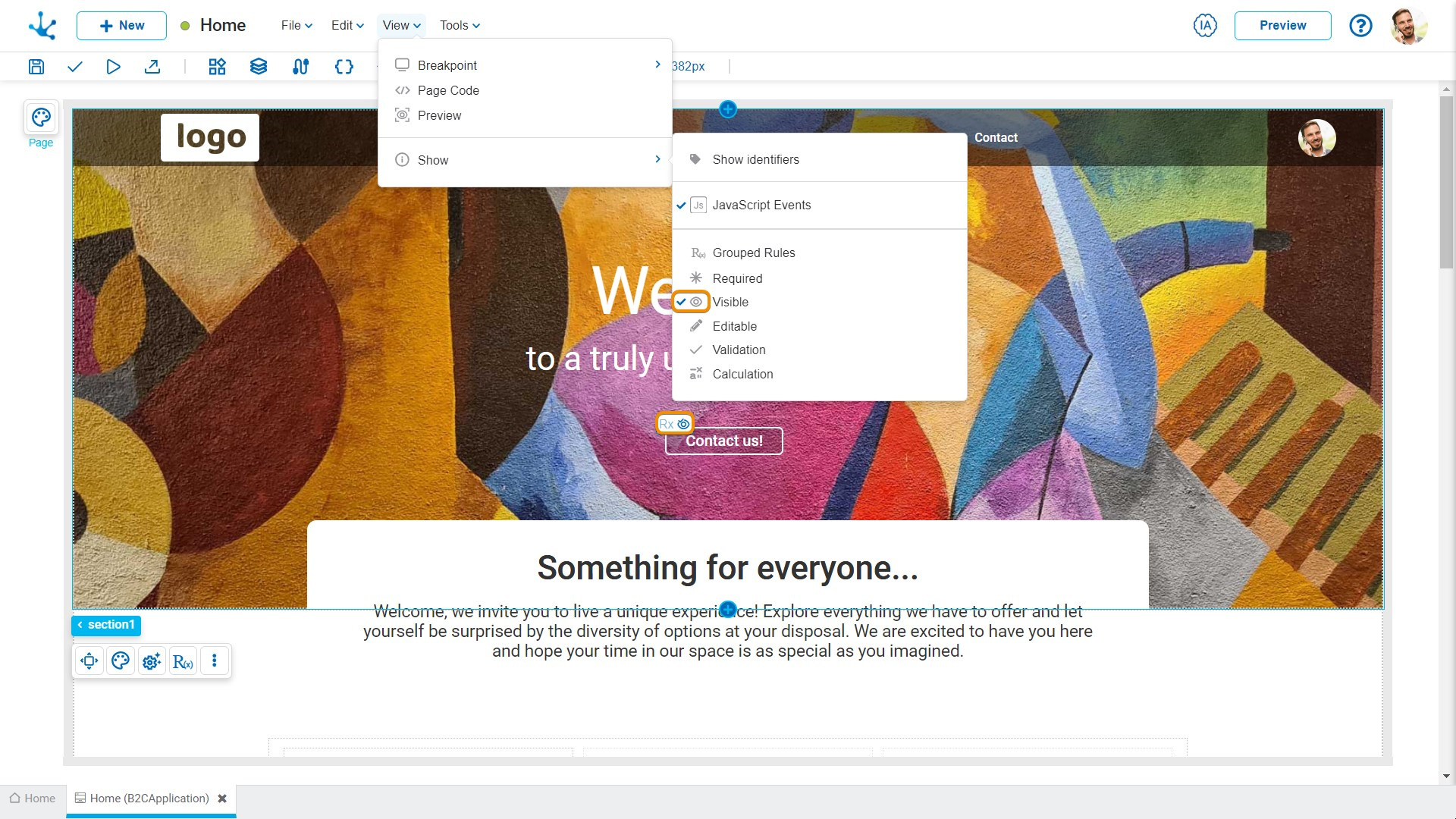
This functionality allows showing or hiding the set of visual icons that indicate the behavior that affects the elements.
Clicking on the "Show" option displays a secondary submenu, where the icons corresponding to the modeled rules that should be displayed for each element can be selected.
•JavaScript Events
•Grouped Rules
•Required
•Visible
•Editable
•Validation
•Calculation


