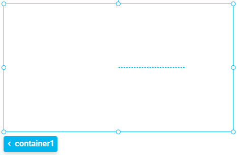
Container


To create an adaptive and structured design for the page, container boxes are used. Drag the elements inside the container and its style is then arranged for different displays. Elements are automatically attached to the container so they change size in direct relation to the container.
The page modeler also includes other structural elements that facilitate the fields modeling by speeding up the modeling of a page, without worrying about the aesthetic aspects of the fields. All aesthetic aspects of these elements are defined by default to adapt to different breakpoints.
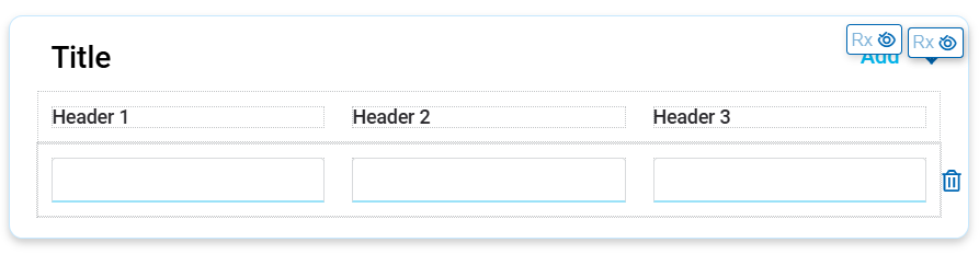
The element properties are represented by icons in its context menu, where its operations are also available.
Subtypes
By selecting the “Container” option from the icon  on the top toolbar, a list with the different subtypes of this element is displayed, which can be dragged to the modeling area. Each subtype has modeled element properties, predefined in a specific way.
•Simple
•Background Color
•Border
•Shadow
•Collapsible
•Repetitive Group Fields
•Collapsible Repetitive
Simple
It allows modeling a simple-style container. The content can be any element.
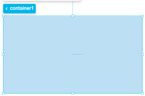
Background Color
It allows modeling a container with a preset background color, which can be modified. The content can be any element.
Border
It allows modeling a container with a preset background color and a border, which can be modified. The content can be any element.
Shadow
It allows modeling a container with a preset background color, a border, and a shadow, which can be modified. The content can be any element.
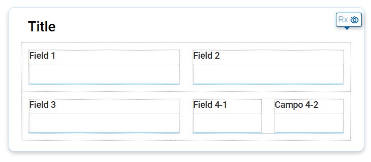
It allows grouping fields and offer drop-down behavior. This means that its content can be easily expanded or closed, by clicking on the corresponding icon,  or
or  , depending on the state of the container.
This container not only groups fields, but can also contain any other element, providing great flexibility in design.
The collapsible container is primarily used within design elements, to visually organize entities with a large number of fields. By expanding or collapsing the container, information can be viewed in a more organized manner, making it easier to navigate through data groups.
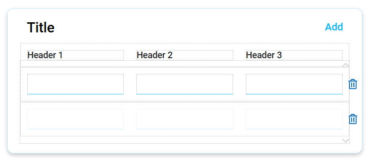
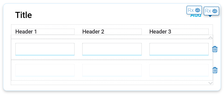
It allows organizing repetitive field structures in a grid format, with descriptions for each field and headers for columns. Additionally, being a repetitive structure, it includes the facility to add and delete rows within the grid.
Collapsible Repetitive Card Group
It allows organizing repetitive field structures in a grid format, with descriptions for each field and headers for the columns. Additionally, being a repetitive structure, it includes the facility to add and delete rows within the grid.
This container has a fixed size, and items are scrolled page by page within the repeater, using the icons  and
and  . In the repeater configuration properties panel, it is modeled as subtype "card" and the number of rows to paginate.
The collapsible repetitive tape group is ideal for saving multiple instances of the same type of information while making it easier to display entities with many fields.
Collapsible Repetitive Tape Group
It allows organizing repetitive field structures in a grid format, with descriptions for each field and headers for the columns. Additionally, being a repetitive structure, it includes the facility to add and delete rows within the grid.
This container expands indefinitely as new items are added, offering greater flexibility. In the repeater configuration properties panel, it is modeled as “tape” subtype.
The collapsible repetitive tape group is ideal for saving multiple instances of the same type of information while making it easier to display entities with many fields.
Classification of Properties
Properties are divided into two groups: esthetic properties and behavior properties.
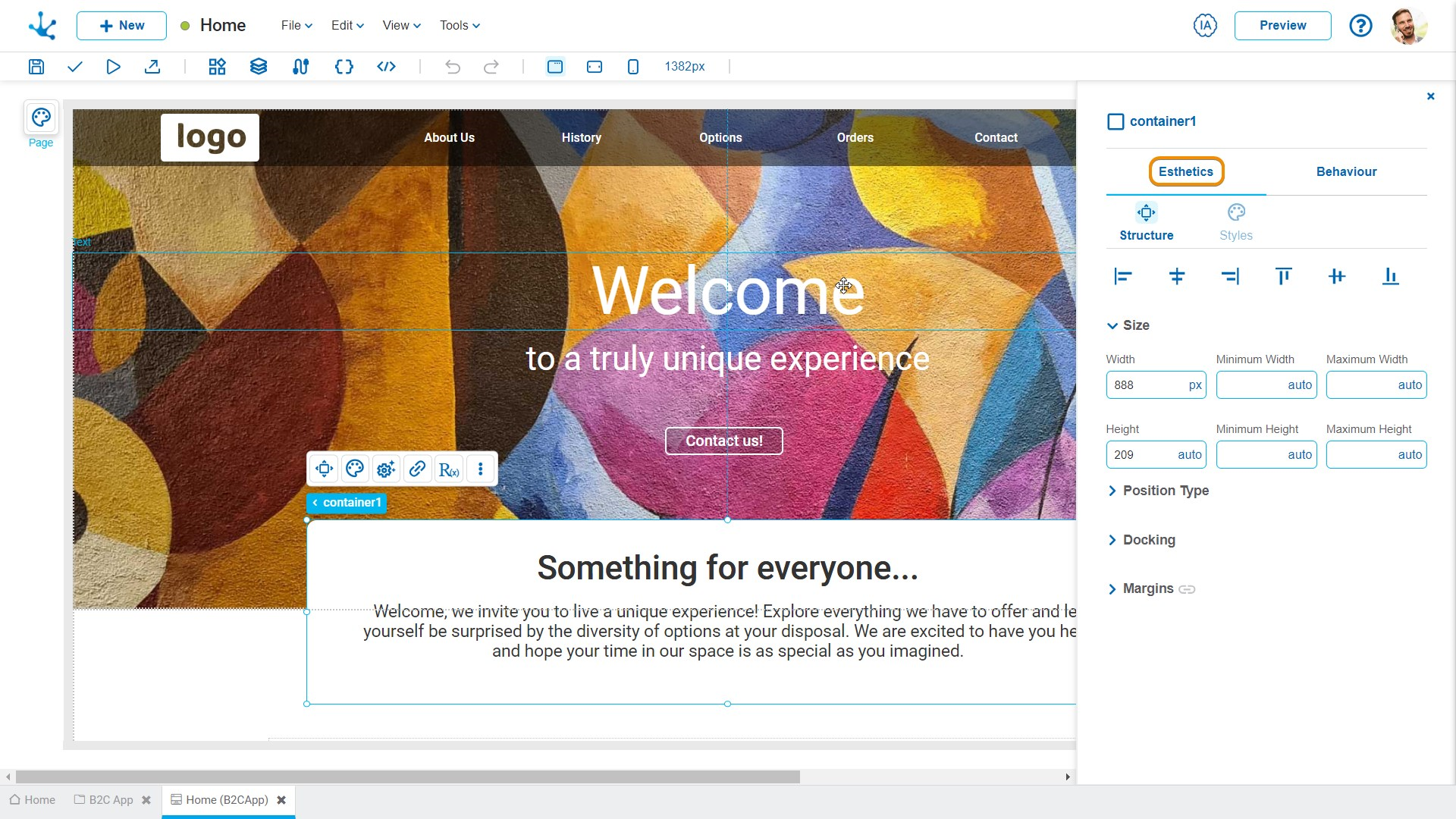
Esthetic Properties
In the esthetic properties panel, the following are grouped:
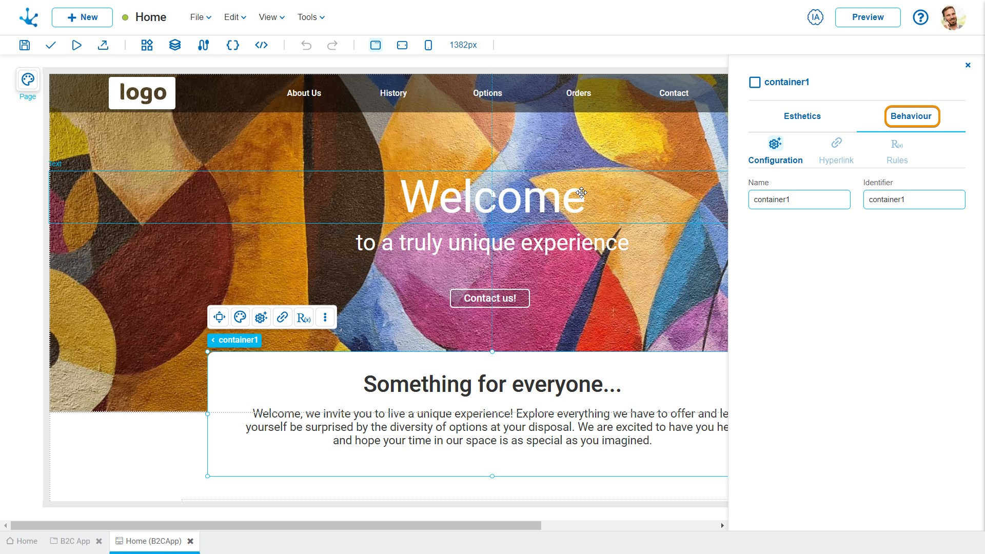
Behavior Properties
In the behavior properties panel, the following are grouped:


