Action


It allows to create an action in the graphic modeling area, by dragging the icon to the desired position. If the icon is clicked, the action is created in a certain position and should be dragged to the chosen location.
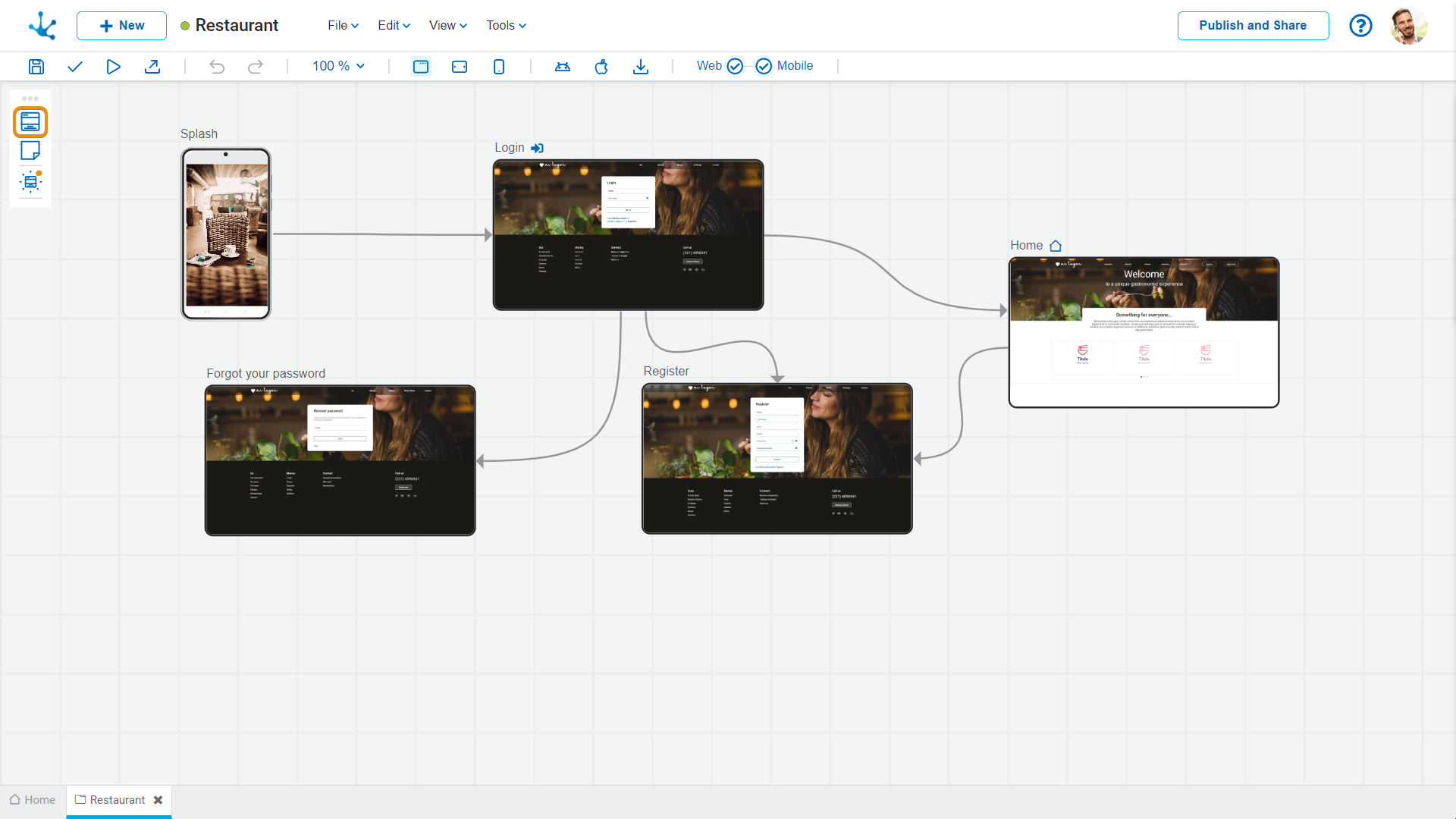
An action represents an operation within the functional flow of the application. It is generally associated with a user story and defines what should happen when the business user interacts with the interface, for example by clicking a button, selecting an option, or moving forward in a process.
Each action describes a specific task performed in the application, such as displaying a page, updating an entity's data, or navigating to another point in the flow. The actions are visually connected within the modeler's canvas, allowing the complete flow of the application to be built graphically.
Operations
Add Actions
Actions can be added to the graphic modeling area in any location via the “drag and drop” facility. Once the element is configured, double-clicking on it opens a new tab corresponding to the pages modeler.
Modify Position of an Action
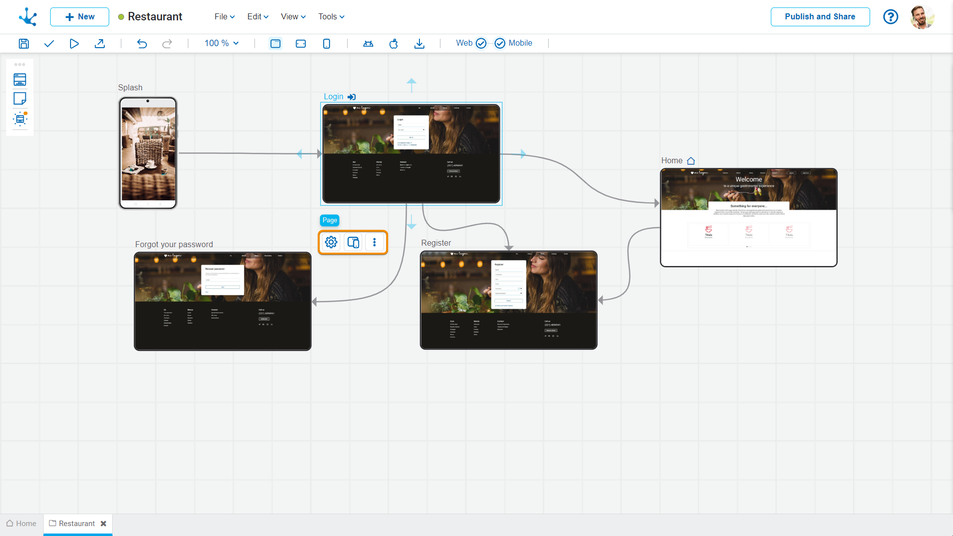
Once the action is added, its position can be changed by dragging it within the graphic modeling area. If the position of an element is changed, the change is applied to all breakpoints.
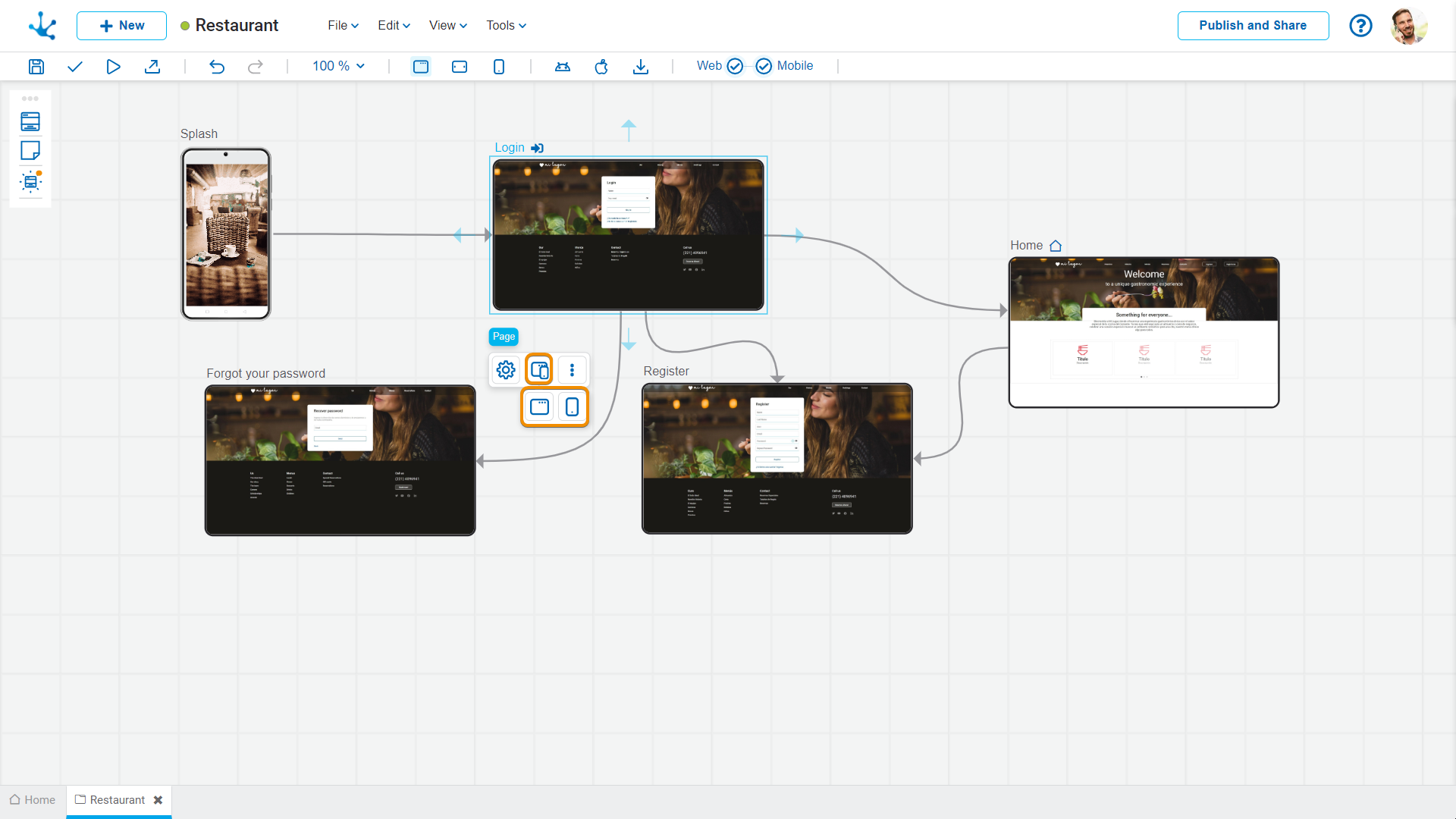
Selecting an element opens a palette of icons which represent the configuration of its properties, the type of web or mobile page, the option to modify the size of an element and a menu, whose options correspond to operations that can be performed on the selected action.
Configuration Properties
The configuration properties panel opens when selecting the icon  .
.
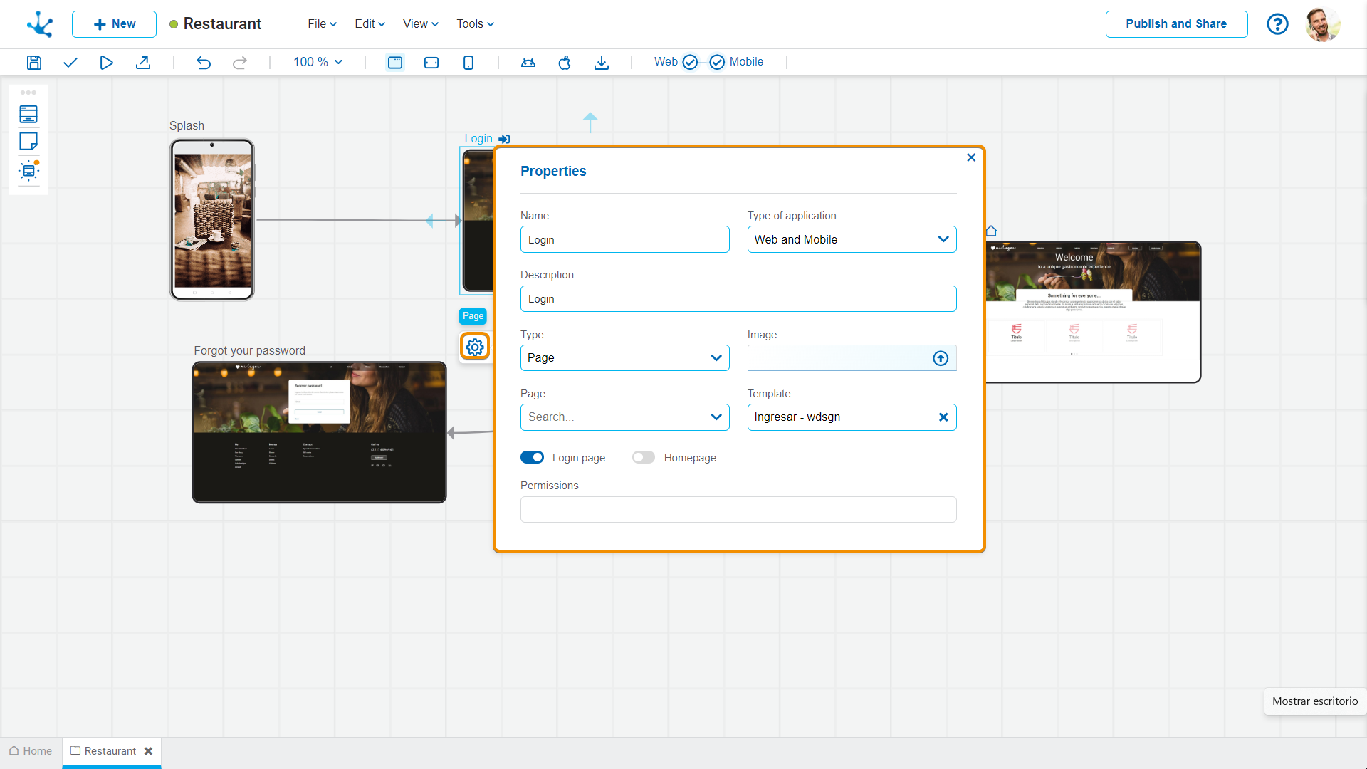
Name
It is used at the modeling level to reference the action.
Type of Application
It allows to define if the application is web-type, mobile-type or both.
Description
Text that defines the action describing its functionality.
Type
It allows to select the content displayed on the action and depending on the option selected, different properties are enabled.
Image
It allows to define an image that represents the action in the applications modeler, it is valid if the properties for the selected item type are not completed .
Properties according to the Selected Type
Different properties are enabled depending on the selected type of object.
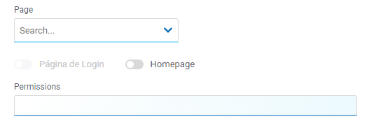
Page
Page
The pages modeled in the environment are displayed.
Template
It allows selecting a template to model the page if the previous property is not completed.
Login Page
Indicates that the unlinked page corresponds to a login page.
Home Page
Indicates that the unlinked page corresponds to a home page.
Permissions
Indicates all the permissions of the selected page. They are not modifiable.
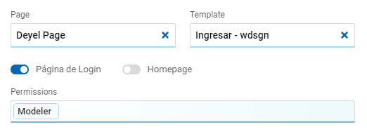
Deyel Page
Page
The pages modeled in the environment are displayed.
Home Page
Indicates that the unlinked page corresponds to a home page.
Permissions
Indicates all the permissions of the selected page. They are not modifiable.
Form
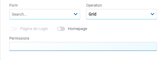
Form
The forms modeled in the environment are displayed.
Operation
The operation that is performed when selecting the form is defined.
Possible Values
•New: Indicates that the panel of the object selected in the previous property is opened for the creation of an instance.
•Grid: Indicates that the grid of the object selected in the previous property is opened.
Home Page
Indicates that the unlinked page corresponds to a home page.
Permissions
Indicates all the permissions of the selected page. They are not modifiable.
Process
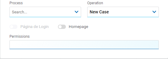
Process
The processes modeled in the environment are displayed.
Operation
The operation that is performed when selecting the process is defined.
Possible Value
•New Case
Home Page
Indicates that the unlinked page corresponds to a home page.
Permissions
Indicates all the permissions of the selected page. They are not modifiable.
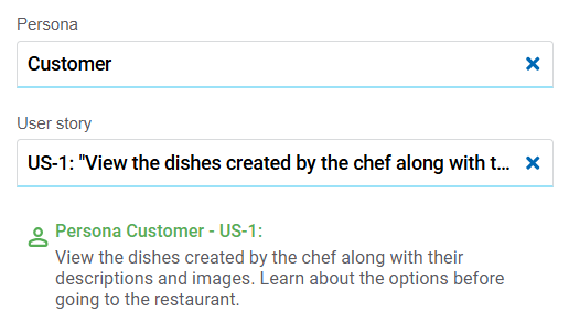
Persona
Indicates the persona that interacts with the action.
User Story
The user stories of the selected persona are displayed.
Type of Page
The type of page is selected by means of the icon  .
.
Possible Values
• Web: This type of application can be accessed from the web.
• Mobile: This type of application can be accessed from mobile devices.
Expand or Collapse the Page
 Expands the size of the page, displaying all its content without height restrictions. Can be used for long pages or pages with multiple sections.
Reduces the size of the page, displaying the content in a compact version. It helps keep the modeling area organized and makes navigation between pages easier.
More options
The menu to select additional options is expanded with the icon  .
.
The options menu can also be opened by right-clicking mouse on the selected item.
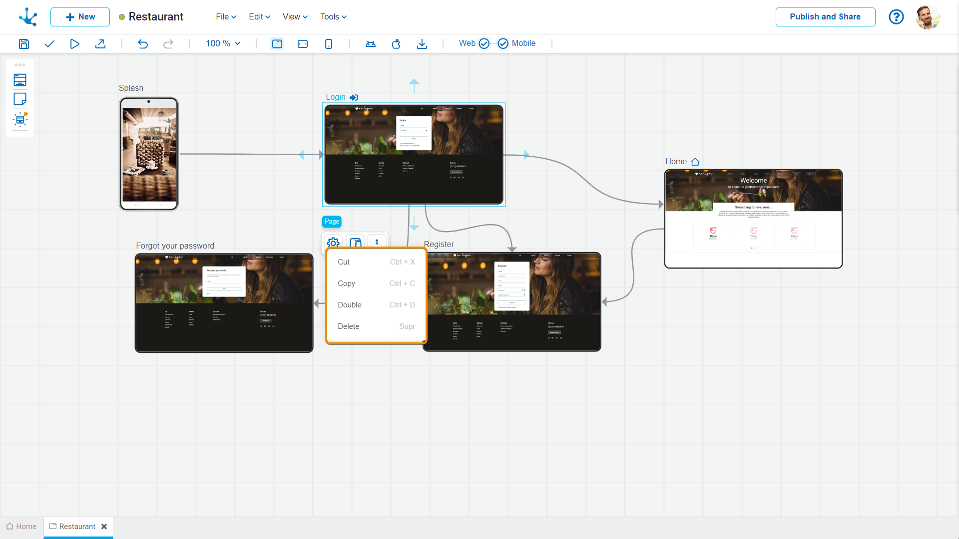
The options correspond to operations that can be performed on the selected element.
•Cut (Ctrl+X)
•Copy (Ctrl+C)
•Duplicate (Ctrl+D)
•Delete (Del)


