Design
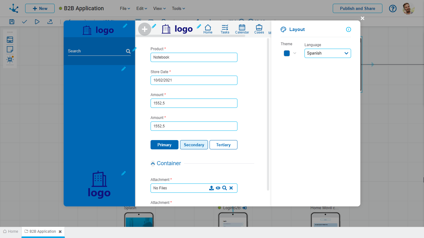
The "Design" page allows configuring various visual and functional aspects of the application through a set of properties.

Theme
It is used to select the overall visual appearance of the application, from a set of pre-built themes. Themes define the visual aspects that impact the aesthetics of the application, such as primary and secondary colors, text fonts, and button styles.
In the central section, a preview of the user interface can be seen, displaying the selected theme applied to the interface elements. This helps in making decisions regarding the customization of the application.
Language
It allows selecting the default language to use in the user interface. Although a user can choose in which language the application is presented, if they do not, the interface language is determined by the one configured in this property.
Logos
A set of properties related to the logos used in the web portal can be configured. Including:
• Top left logo
• Bottom left logo
• Top center logo
They allow adding corporate or brand logos within the user interface, by selecting the icon ![]() .
.
![]() Context Menu
Context Menu
It allows modeling the business operations that the user has enabled for execution, by selecting the icon ![]() . For example, starting a process or entering data into a business entity. It is optional for applications to have this icon enabled.
. For example, starting a process or entering data into a business entity. It is optional for applications to have this icon enabled.
Top Toolbar
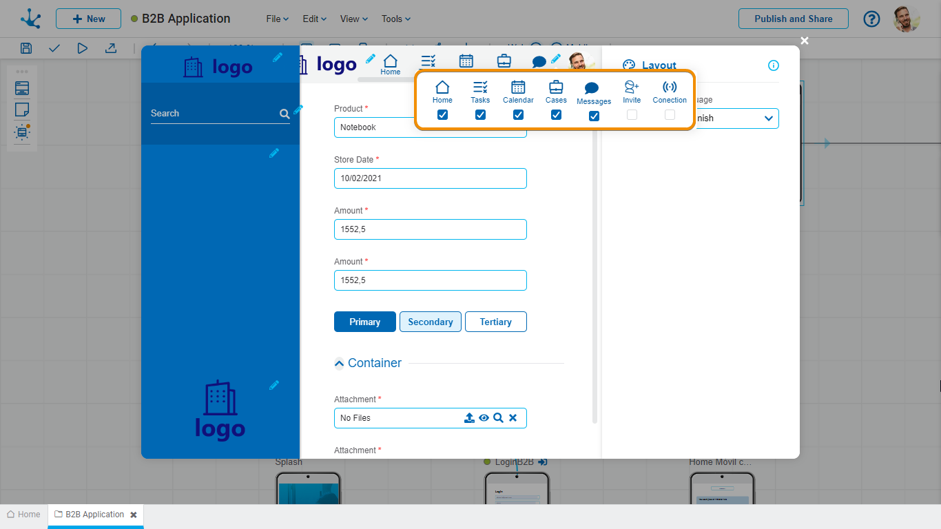
In the top toolbar, the icons used as shortcuts to default platform functionalities can be activated or deactivated.

Bar Elements
![]() It allows direct access to the "Home" page of the application.
It allows direct access to the "Home" page of the application.
![]() Redirects to the management page of tasks of Deyel.
Redirects to the management page of tasks of Deyel.
![]() It allows access to the page where the tasks and relevant information are displayed on a calendar interface.
It allows access to the page where the tasks and relevant information are displayed on a calendar interface.
![]() Redirects to the management page of cases of Deyel.
Redirects to the management page of cases of Deyel.
![]() It allows activating or deactivating the chat functionality, facilitating instant messaging within the platform.
It allows activating or deactivating the chat functionality, facilitating instant messaging within the platform.
![]() It allows expanding the user network of an application, simplifying the process of adding new members who use the application.
It allows expanding the user network of an application, simplifying the process of adding new members who use the application.
 It allows monitoring the state of the user's local network, which is useful to evaluate the performance of the application.
Side Menu
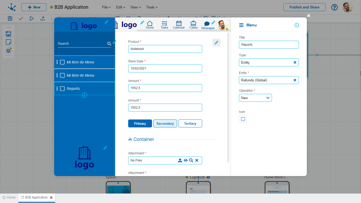
It provides a set of tools to design a simple and well-structured navigation of the application. Selecting the icon ![]() enables access to the editing, creation, and sorting of menu items that allow for configuring a set of properties.
enables access to the editing, creation, and sorting of menu items that allow for configuring a set of properties.

Title
Defines the text that is displayed on each menu item.
Type
Specifies the type of object related to the menu item.
Possible Values
•Page
•Deyel Page
•Entity
•Process
•Link
Object
Each of the above options allows linking the menu item with different objects within the application. For example, if the chosen type is 'Page', a specific page of the application can be selected. If, however, the type is 'Entity', a business entity can be chosen.
Operation
Defines the operation that is performed when the object is selected.
Possible Values
•Create
•Grid
Icon
It graphically describes the functionality to which it is redirected, improving usability.


