Section
Entities are divided into sections where elements can be included. By default, the entity has a defined section.
Operations
Add
It allows to add a new section by clicking on the icon  of one existing section.
Modify Size
The section height can be adjusted from the top or bottom borders, by clicking on them and dragging. Another way to modify its size is from the section structure panel.
Move
A section can be moved using the layer functionality.
Structure Properties
The structure properties panel of a section is opened when selecting the icon  of the context menu.
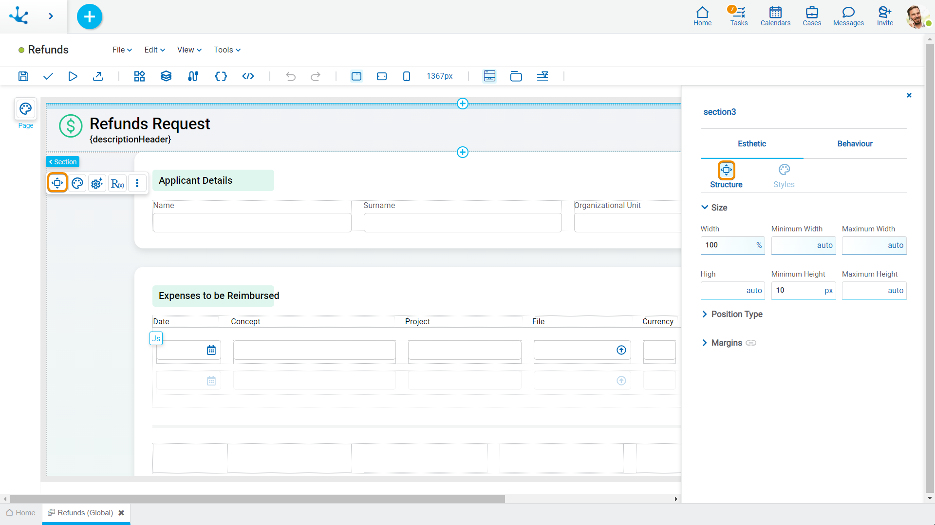
Size
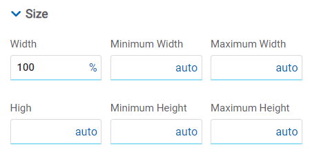
All size properties can be expressed in pixels (px), percentage (%), viewport width (vw), and viewport height (vh). Additionally, for Width and Height properties, the “auto” option is added.
Sections do not allow modifying the Width property.
Position Type
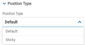
Possible Values
•Default: The element has a relative position with respect to the superior element where it was placed (container or section).
•Sticky: Available only in sections, it allows the section to remain visible while users continue to scroll through it. At first, the section is seen where it has been positioned in the entity, but it "sticks" to the screen as it is scrolled down.
Margins

It allows to define the distance of elements from the borders of their top element. The behavior of margins depends on the docking of the element. It can be expressed in pixels (px), percentage (%), viewport width (vw), and viewport height (vh).
Top
Distance to the top border of the highest ranking element.
Bottom
Distance to the bottom border of the highest ranking element.
Left
Distance to the left border of the highest ranking element.
Right
Distance to the right border of the highest ranking element.
Advanced
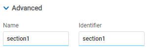
Name
Name used to reference the section during modeling.
Identifier
Uniquely identifies the section. It is used in the Javascript SDK.
Style Properties
The style properties panel of a section is opened when selecting the icon  of the context menu.
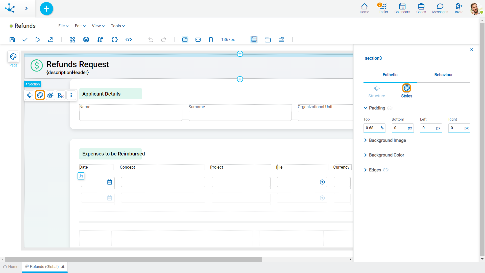
Padding

All padding space properties allow to create a space around the element borders (top, bottom, sides) and its content. The padding space configured is inward, while the margin is configured relative to a top element. It can be expressed in pixels (px), percentage (%), viewport width (vw), and viewport height (vh).
Background Image
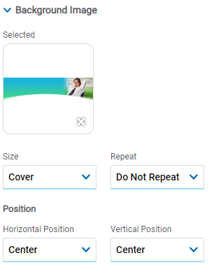
It allows to add a background image to the section.
Selected
An image can be uploaded from the computer where it is being modeled.
Size
Possible Values
•Cover
•Content
•Auto
Repeat
Possible Values
•Repeat
•Repeat Hor.
•Repeat Vert.
•Spacing
•Rounded
•Do Not Repeat
Horizontal and Vertical Position
Possible Values
•Center
•Left
•Right
Background Color
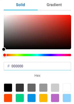
It allows to model a background color for the element, it can be solid or gradient and different properties are defined for each one.
Solid

This option enables not only to select the color from a palette but also to define the degree of transparency.
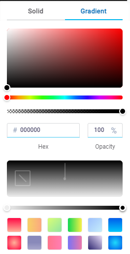
Gradient

This option enables to select not only the color from a palette but also to define its opacity and intensity according to the selected angle.
Edges
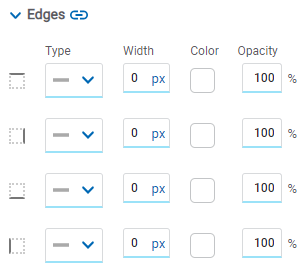
It allows to define the style of borders. Each one has its type, width, color and opacity defined, the latter as a percentage.
Embedded Rules
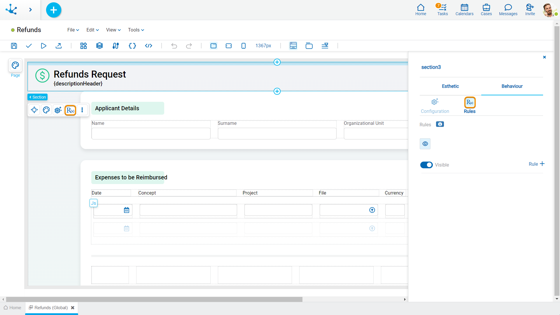
The embedded rules properties panel of a section is opened when selecting the icon ![]() of the context menu.
of the context menu.
Properties
Rules
It is possible to define embedded rules for behavior, validation and calculation associated with a section using the wizard (ctrl + space).
 Shows syntax examples to write rules.
|
|
Indicates whether the section is visible. If this property is not checked, the section is not displayed on the page.
|
Operations when defining the rule:
|
Saves the new or modified rule |
|
Cancels the operation |
Operations once the rule is defined:
|
Edits the existing rule |
|
Deletes the rule |
Events
Sections allow the use of different events.
Event |
Description |
|---|---|
onMouseIn() |
It is executed when the cursor is positioned on the element. |
onMouseOut() |
It is executed when the cursor moves out of the element. |
onClick() |
It is executed when clicking on the element. |
onDoubleClick() |
It is executed when clicking twice on the element. |
onInit() |
It is executed before the element is loaded. |
afterViewInit() |
It is executed after viewing the element. |
onViewportEnter() |
It is executed when the element is visible. |
onViewportLeave() |
It is executed when the element is no longer visible. |


 Visible (default)

