Configuration Properties


The configuration properties panel of an element opens when clicking the icon  of its context menu.
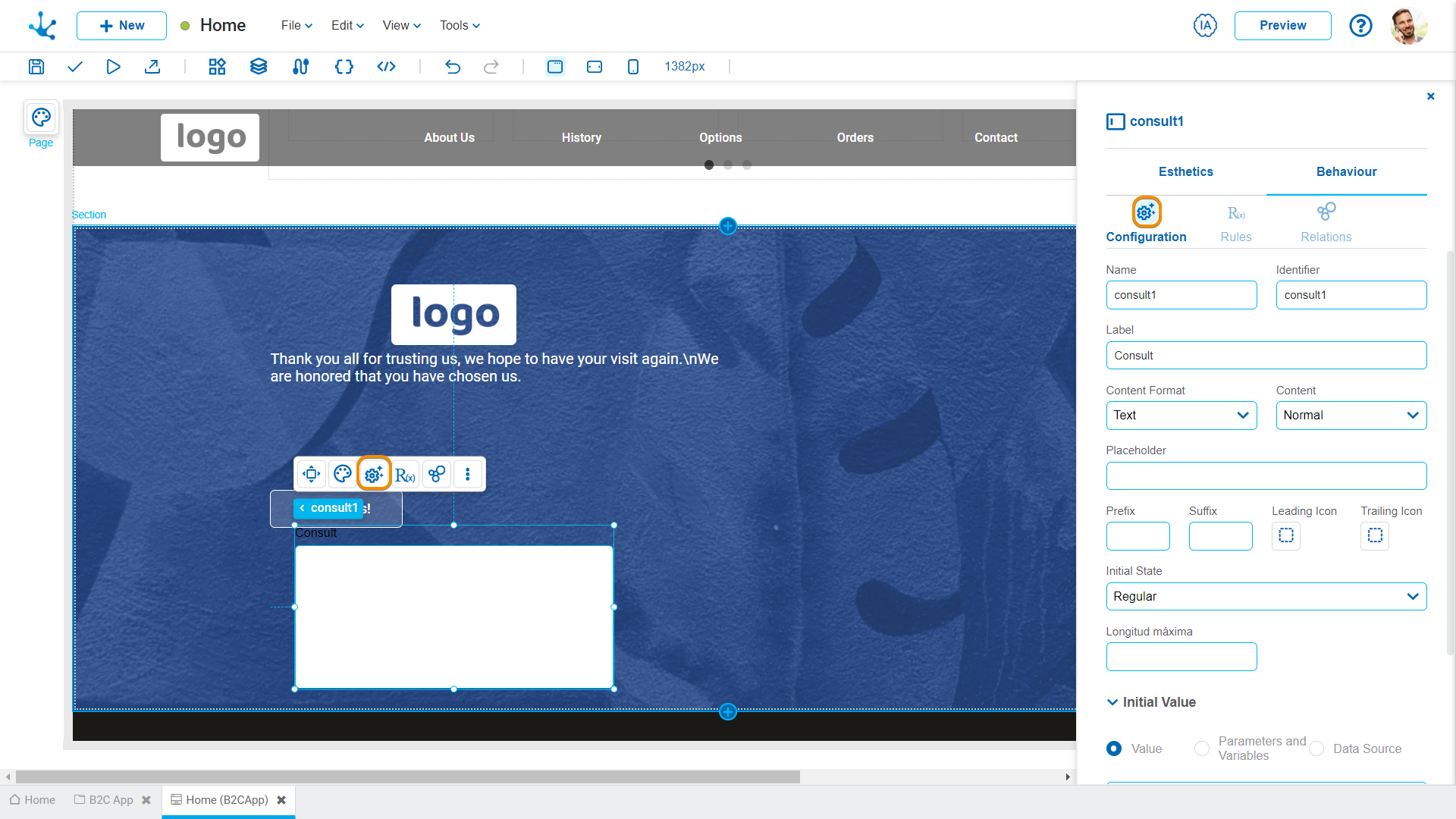
Name
Name assigned to reference a field when modeling, allowing the field to be uniquely identified within the page. Used in rule wizards to refer to the field within the conditions. It is generated automatically from the Label property, can be modified by the user and does not allow spaces or special characters.
Identifier
It is the name assigned to reference a field in the programming code, used to refer to the field within Java code in the "Execution Code" tab of advanced rules and the JavaScript code in the "Page Code" tab of the page modeler. It allows to uniquely identify the field within the modeled page. It can be modified by the user, as long as no data has been loaded into the page, and it does not allow spaces or special characters.
Tooltip
Pop-up message that appears when hovering over an element, providing additional information.
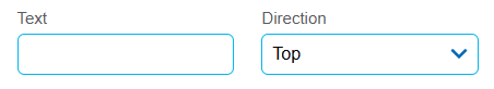
Text
Content of the message being displayed.
Direction
Position of the message in relation to the element (top, bottom, left, or right).
Label
It allows entering the text that is displayed on the field. Supports white space.
Field Type
It allows modifying the selected field type.
Possible Values
•Text
•Number
•Multiline
•Date and Time
•File
Options available for this property depend on the value of the property Content Format. For each possible value, the options are different:
•Text: the options are "Normal, "Password", "Phone Number" and "Mail".
•Number: the options are "Decimal" and "Integer".
•Date and Time: the options are "Date and Time", "Local Date and Time", "Time", "Local Time", "Date" and "Local Date".
•File: the options for images are "*", "jpeg", "png", "gif", "svg+xml", "bmp", "webp", "tiff" and "x-icon". The options for audio are "*", "mpeg", "wav", "ogg", "midi", "aac" and "x-ms-wma". Video options are "*", "mp4", "quicktime", "webm", "x-msvideo", "x-flv", "3gpp". Application options are "*", "pdf", "msword", "vnd.ms-excel", "vnd.ms-powerpoint", "zip", "x-rar-compressed", "x-tar", "x-gzip", "x-bzip2", "jason"and "xml". The options for text are "*", "plain", "csv" and "xml".
If this option is selected, an additional property is enabled.
Display Mode
It allows modifying the way the file uploaded by the user is presented.
Possible Values
•File Name: Shows only the file name when the user uploads it, without an additional preview.
•Previewer: Presents a preview of the uploaded file, providing the user with a more user-friendly and interactive view.
Placeholder
It allows guiding the user about the content when entering the element. The placeholder text is displayed within the element.
Picker
It allows defining an interval picker that helps the user to increase or decrease the numeric field value according to a defined interval. Only available if the Field Type property is of type "Number".
Possible Values
•Align to the left: The picker is displayed on the left side of the numeric field.
•Align to the right: The picker is displayed on the right side of the numeric field.
•Hide: The picker is not displayed in the field; the arrow keys must be used to increase or decrease the value.
Interval
It allows defining the value that is increased or decreased each time the user interacts with the picker. For example, if the interval value is set to 5, clicking the increment icon increases the numeric field value by 5 units. Similarly, clicking the decrement icon decreases the field value by 5 units.
Prefix
It allows incorporating a text or symbol that is displayed on the left side of the field, before the entered value. It is used to provide additional context immediately, making it easier to understand the purpose or format of the field. For example, the $ sign can be set for monetary fields, indicating that a value in a specific currency is expected.
Suffix
It allows incorporating a text or symbol that is displayed on the right side of the field, immediately after the entered value. It is used to complement the information provided, offering details that indicate the context or units of the value entered. The meaning of the value can be specified by including units of measurement, percentages, or frequencies—for example, "kg" in a field intended to record weight.
Leading Icon
It allows incorporating an icon on the left side of the field, before the value that is entered or displayed. This leading icon can graphically represent the expected data type, making it easier to quickly identify the purpose of the field. For example, a phone icon can be used to indicate that a contact number should be entered.
Trailing Icon
It allows incorporating an icon on the right side of the field, immediately after the value that is entered or displayed. This trailing icon is intended to complement the meaning of the field through a visual element, making it easier to understand the context in which it is located. For example, a "%" icon can be used to indicate that a percentage value should be entered.
Initial State
Defines the visual and functional state of the field when the page is loaded for the first time. This setting allows determining whether a field is enabled and ready to receive interaction or, on the contrary, is disabled, waiting for an action or precondition to be activated.
Possible Values
•Regular: The field is enabled by default. Allows the user to interact with the field immediately upon loading the entity.
•Inactive: the field is shown as disabled and does not allow interaction.
Maximum Length
It allows defining the maximum number of characters that can be entered in a text field.
Initial Value
Allows to select the source of the element's content.
Value
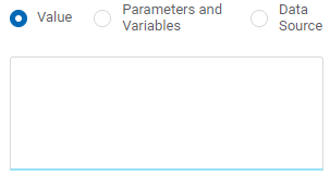
Value
Allows to enter a text that is displayed in the element.
Parameters and Variables
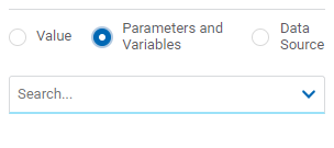
Parameters and Variables
Allows to select a parameter or a variable from, whose value is displayed in the element.
Data Source
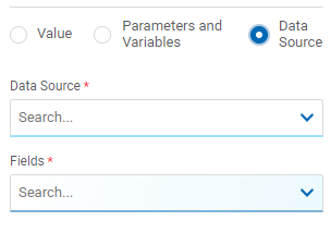
Data Source
It allows selecting a previously defined data source within the object.
Fields
It allows selecting a field from the data retrieved in the chosen data source, whose value is displayed in the element.
Description and Help
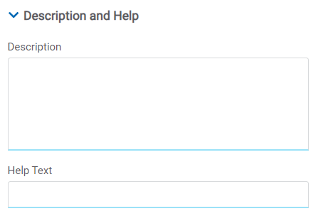
Description
Text that defines the field and optionally its content.
Help Text
This function is to guide the user about the content to be entered in the field. The text entered as help is displayed when the user hovers the cursor over the field.


