Grid
The results and search grid allows viewing all form instances or those that are the result of having applied search filters. It is made up of columns and rows.
Columns
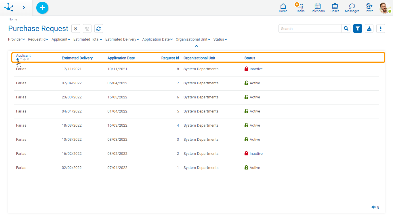
The results and search grid allows viewing different columns and by hovering over the name of each one it is possible to indicate its behavior, in the same way as in the tasks grid.
The columns displayed in the grid correspond to the form fields that were modeled by checking the Included in Grid property or else by modeling the design option Grid and Filters. If the field is related to a value list, in this design option, the content of the column is also modeled to be displayed with or without icons.

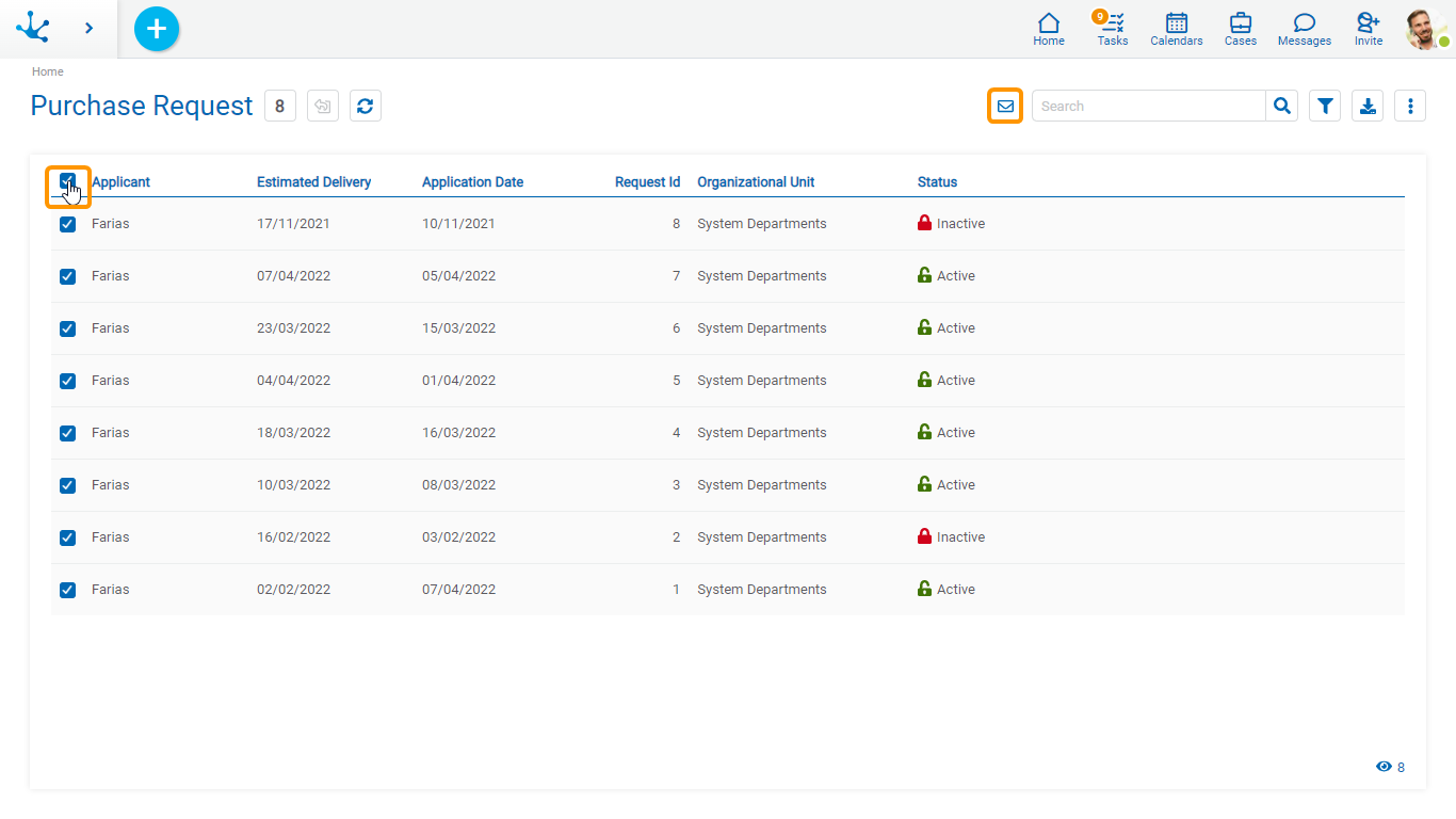
If the Send Emails form property was modeled, a checkbox column to select instances is displayed on the left side of the grid. By checking the mark field in the grid header, all visible instances are selected. If there are more instances, a message is displayed giving the possibility of selecting all of them.

Whenever an instance is selected, the icon is displayed  in the top bar.
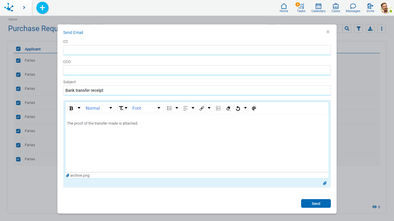
Clicking this icon opens a panel where the following sections of an email can be configured:
•Cc
•Bcc
•Subject
•Message
•Attachments

By pressing the icon  in the lower right corner of the panel, it is possible attach:
•A file-type or image-type form field, in this way the file contained in the field of each instance is sent in the corresponding email.
•A file from the user's device, it is sent in the corresponding emails to all instances.
The email addresses of the recipients are completed with the values entered in the text fields of the form where its Content Type property is email.
The sender email address used is the one entered in the user profile that is showing the form's results grid.
By pressing the “Send” button, emails are sent to all the selected instances of the grid. Each email sent becomes associated with its corresponding instance.
Rows
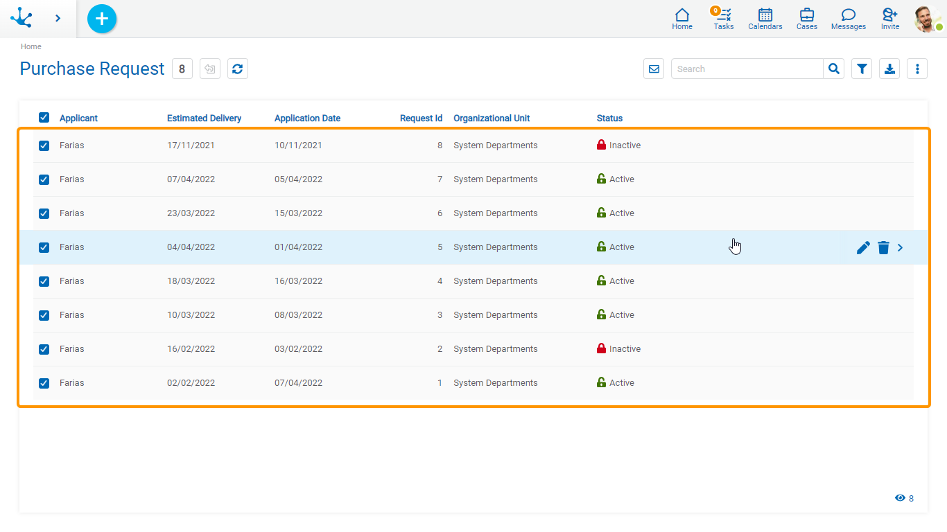
Each instance of the grid can be shown by clicking on the corresponding row, while hovering the cursor over it enables the icons  and
and  allows updating or deleting operations respectively.
In the lower right margin there are number of instances loaded in the grid. This number increases as the scroll bar is scrolled vertically.

Display of Icons on Rows
The user can decide if they want to see the icons with the operations of the instances on the row.
 Display the available icons for each instance.
 Hide the available icons for each instance.
Scroll Bar
By scrolling vertically, rows are incorporated in the grid, allowing scrolling up or down using a scroll bar.
