Grid and Filters
Grid
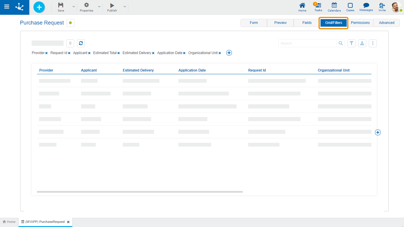
Allows to model the columns displayed in the results and search grids. The default columns of the grid correspond to those fields that have been configured with the Included in Grid property checked.

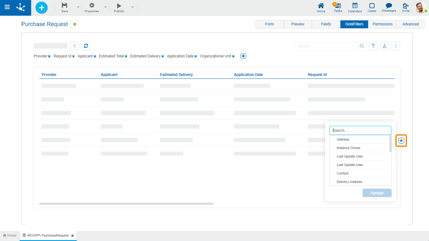
New fields can be added by pressing the icon  to the right of the last column of the grid and its order can be modeled by dragging the shaded rectangles of the columns to swap their positions.
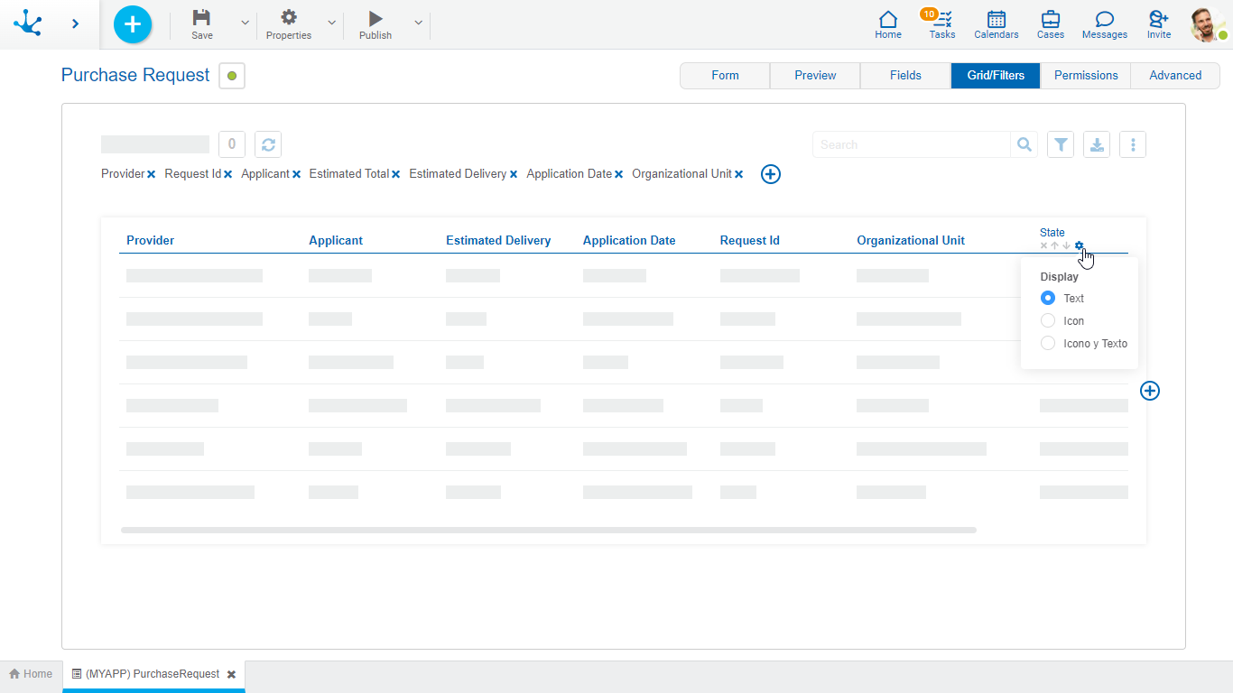
When hovering over the title of each column, the following icons are displayed:
 Allows to model the width of each column by moving the limit bar to the right to enlarge the column, or to the left to shrink it.
 Remove the column from the grid.
 To establish the column by which the default sorting will be performed, it is ascending or descending depending on the selected icon.
 It is displayed when a field has a relation modeled to a value list . Pressing the icon allows to select the content type to display in the column. The default value is "Text", which can be changed to "Icon" or "Icon and Text".

In forms with associated processes, columns related to the case execution can be added when modeling the result grid .
Case Activity
It is the activity of the process in which the case is.
Case Responsible Agent
Refers to the user, role or office that the case has pending on its task list.
Case State
It is represented by a circle of different colors.
•Active: Green
•Finalized: Blue
•Cancelled: Red
•Discontinued: Gray

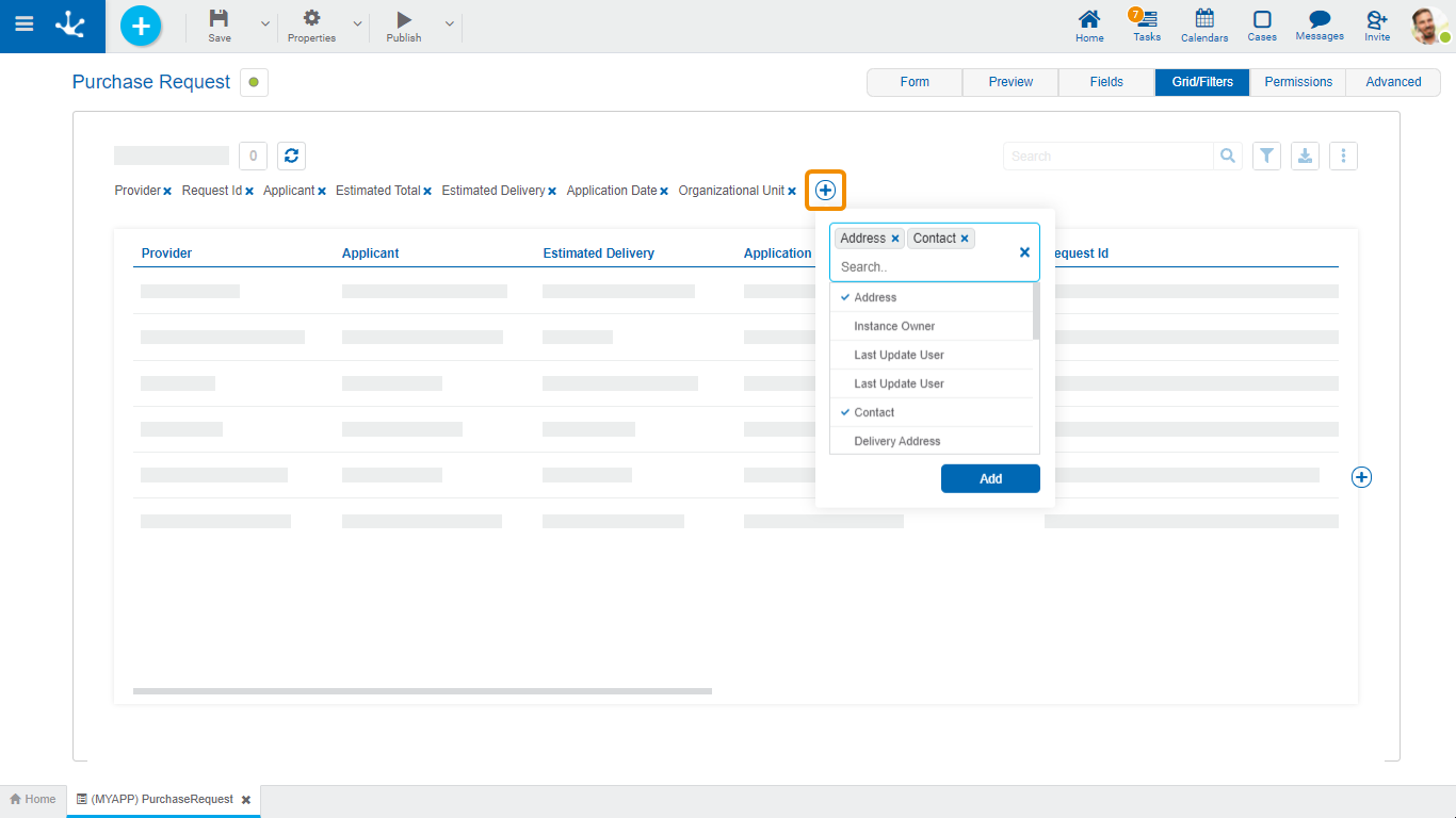
The definition of filters allows modeling search criteria on form instances. Each filter corresponds to a form field or to a field related to its execution.
Pressing the icon  located in the filter line, a panel to select the fields opens.

