Characteristics
 Phase 2: Forms Modeling > Deyel Modeler
The context menu adopts the general characteristics of the portal, but adapted to the modeler's own functionalities.
Icons Menu
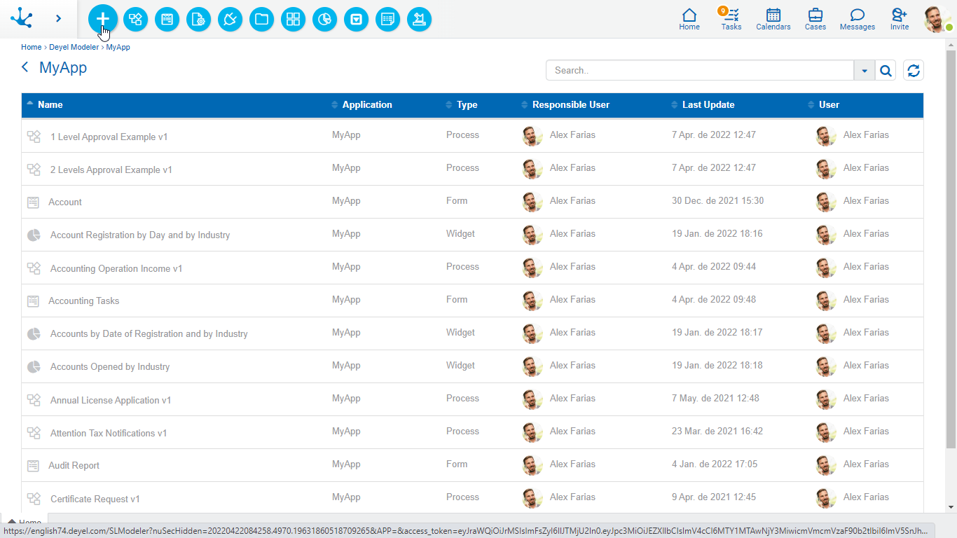
This menu is enabled by hovering over the icon  and allows to create different types of objects and import them.


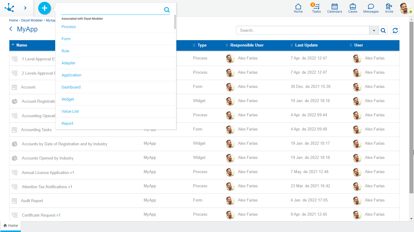
This menu is displayed by pressing the icon  , unfolding a vertical panel with the following sections:
•Options associated with the modeler, in light blue.
- Process
- Form
- Rule
- Adapter
- Application
- Dashboard
- Widget
- Value List
- Report
- Import
•Most used, in gray.
- Forms and processes most used by the user.
The objects grid allows to display all objects defined in Deyel and perform operations with each one of them.

Columns
Name
Name used in the interface to reference the object, corresponds to the Name property of each object.
Application
Application the object belongs to, corresponds to the Application property of each object.
Type
Identifies the type of object defined in Deyel.
Responsible User
The user that created the object.
Last Update
Date of last update made to the object.
User
Last user that modified the object.
Operations
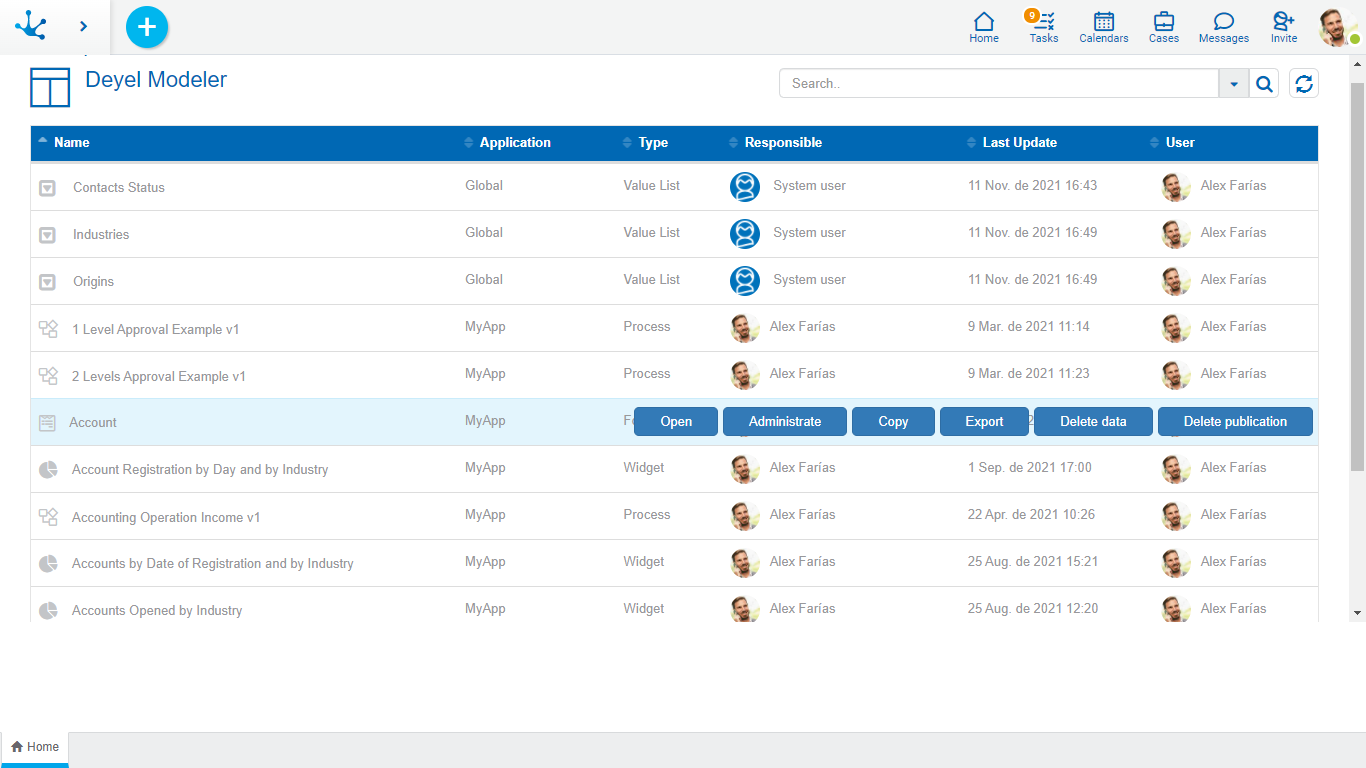
The operation buttons are enabled when hovering over the row selected in the grid and they depend on the type of object selected.
Adapter
•Open
Opens the selected adapter properties panel in a new tab, for modification.
•Delete
Deletes the selected adapter, after confirmation.
Application
•Open
Opens a reduced view of the objects grid, only with those that belong to the selected application.
•Modify
Opens the selected application properties panel, for modification.
•Delete
Deletes the selected application, if it is not associated with other objects of Deyel.
•Export
Opens a panel for the user to select and confirm the application export.
Form
•Open
Opens the form modeler in a new tab.
•Administrate
Opens a panel with the results grid corresponding to the selected form.
•Copy
Copies the selected form into a new modeler tab. Its properties must be modified to save it as a new form.
•Delete Data
Deletes the existing instances of the selected form, after confirmation.
•Delete Publication
Removes the existing instances of the selected form and its publication after confirmation, that is, it cannot be used from the portal.
•Export
Opens a panel for the user to select and confirm the form export.
Agile Form
•Open
Opens the agile forms modeler in a new tab.
Permissions
•Open
Opens a panel to show the permission properties.
•Modify
Opens a panel with the permission properties for modification.
•Delete
Allows to delete the permission selected if not in use, otherwise the user receives a message.
•Export
Opens a panel for the user to select and confirm the permission export.
Processes
•Open
Opens the process modeler in a new tab.
•Tests Plan
Opens a panel with the grid corresponding to the tests plan defined for the process.
•Delete
Deletes the selected process, after confirmation.
•Export
Opens a panel for the user to select and confirm the process export.
Rule
•Open
Opens the rules modeler in a new tab.
•Delete
Deletes the selected rule, after confirmation.
•Export
Opens a panel for the user to select and confirm the rule export.
Roles
•Open
Opens a panel to show the role properties.
•Modify
Opens a panel with role properties for modification.
•Delete
Allows to delete the role selected if not in use, otherwise the user receives a message.
•Export
Opens a panel for the user to select and confirm the role export.
Dashboard
•Open
Opens the dashboard modeler in a new tab.
•Delete
Deletes the selected dashboard.
•Export
Opens a panel for the user to select and confirm the dashboard export.
Widget
•Open
Opens the widget modeler in a new tab.
•Delete
Deletes the selected widget, after confirmation.
•Export
Opens a panel for the user to select and confirm the widget export.
Value List
•Open
Opens the value list modeler in a new tab.
•Delete
Deletes the selected value list, after confirmation.
•Export
Opens a panel for the user to select and confirm the value list export .
The search bar allows to see a reduced grid of objects, based on the definition of filters.
When entering a text in the bar and pressing the icon ![]() or the "Enter" key, all the objects that contain the text entered in the Name column are displayed in the grid.
or the "Enter" key, all the objects that contain the text entered in the Name column are displayed in the grid.
Filters
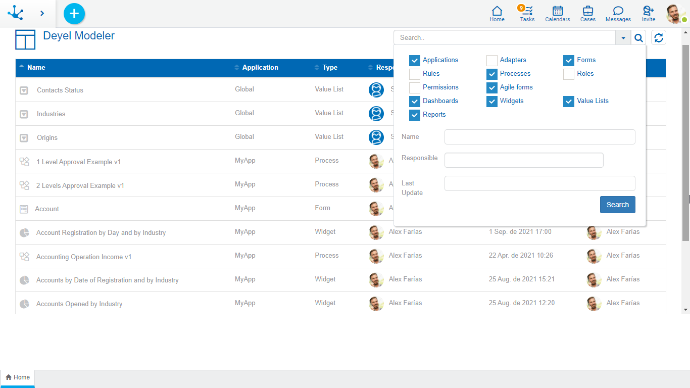
The icon  allows to display a panel with filters, they can be combined to define the selection criteria of the grid rows.
Filters can be combined by checking object types and values in the grid columns. Once the filter selection was made, press the "Search" button to apply them.

Filters for Object Types
•Applications
•Adapters
•Forms
•Agile Forms
•Rules
•Processes
•Roles
•Permissions
•Dashboards
•Widgets
•Value Lists
•Reports
Filters for Column values
•Name
•Responsible User
•Last Update
The icon ![]() allows to update the grid of objects to reflect recent changes.
allows to update the grid of objects to reflect recent changes.
The icon ![]() is displayed in each column of the grid and allows to sort rows, ascending or descending, based on that column. Sorting can be done on a single column.
is displayed in each column of the grid and allows to sort rows, ascending or descending, based on that column. Sorting can be done on a single column.
If the number of rows exceeds the maximum number to display on a page, the buttons at the bottom right of the grid can be used to move to the previous and next page, or to select a specific page.
The tab with the icon  corresponds to the modeler's grid. When opening other objects in different tabs, the home tab always allows to return to the modeler's grid.


