Item
Items are defined within the repeater and only the first one can be modified since the changes are applied to the rest.
Structure Properties
The structure properties panel of an item opens when selecting the icon  of the context menu.
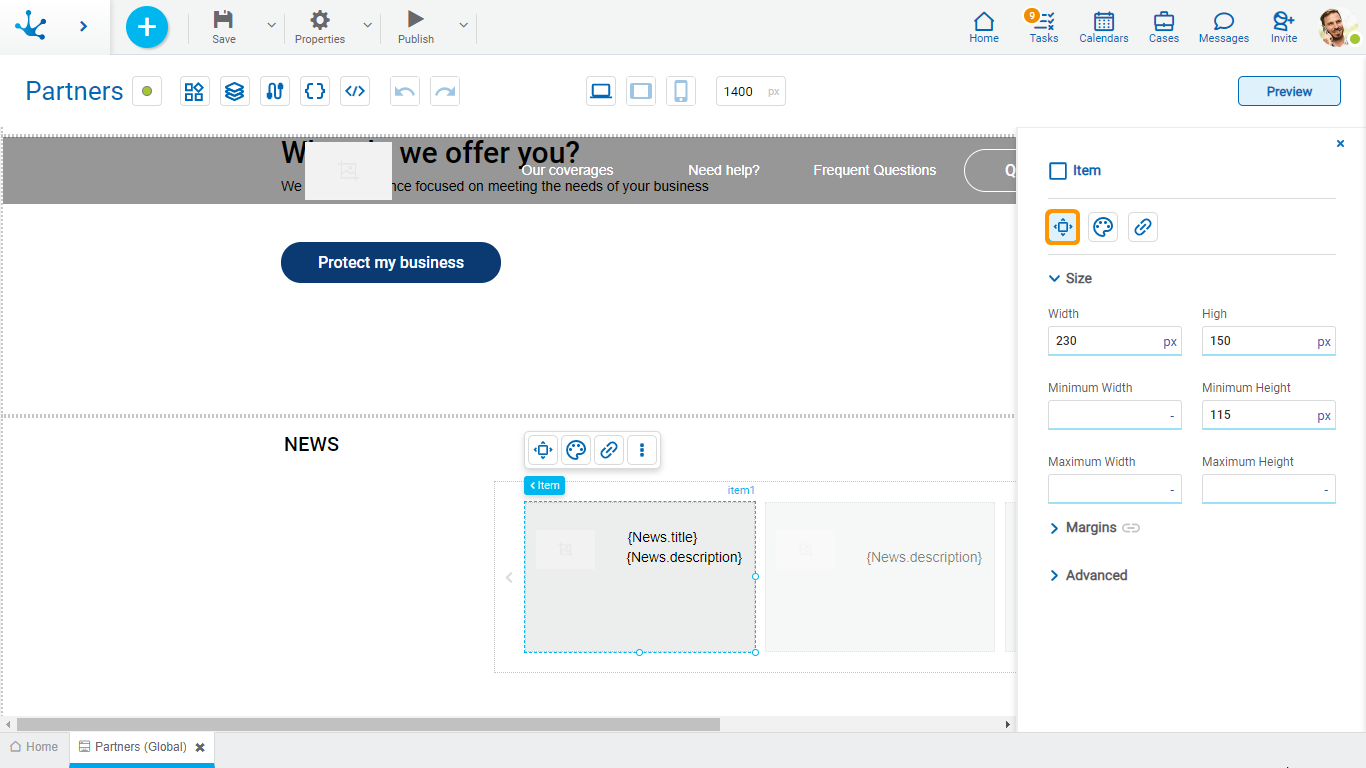
Size
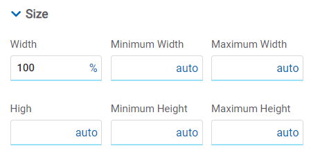
All size properties can be expressed in pixels (px), percentage (%), viewport width (vw), and viewport height (vh). Additionally, for Width and Height properties, the “auto” option is added.
If selecting percentage (%) for the width and height properties, the size is calculated relative to the top element.
Margins

Allows to define the distance among items and also from items to the borders of the containing element. It can be expressed in pixels (px), percentage (%), viewport width (vw), and viewport height (vh).
Top
Distance to the top border of the containing element.
Bottom
Distance to the bottom border of the containing element.
Left
Distance to the left border of the containing element or to the previous item.
Right
Distance to the right border of the containing element or to the following item.
![]() Allows the value entered in one of the margins to be copied to the other ones automatically.
Allows the value entered in one of the margins to be copied to the other ones automatically.
![]() Allows to indicate different values for each margin.
Allows to indicate different values for each margin.
Advanced

Name
Name used to reference the item during modeling.
Identifier
Uniquely identifies the item. It is used in the Javascript SDK.
Style Properties
The style properties panel of an item opens when selecting the icon  of the context menu.
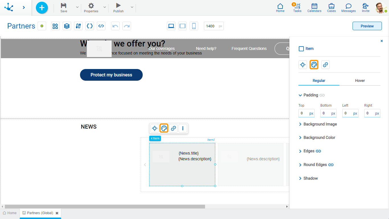
This type of element may take different states and for each of them different values for its properties may be modeled.

•Regular: The mouse pointer is not over the element.
•Over: The mouse pointer is over the element.
Padding

All padding space properties allow to create a space around the item borders (top, bottom, sides) and its content. The padding space configured is inward, while the margin is configured relative to a top item. It can be expressed in pixels (px), percentage (%), viewport width (vw), and viewport height (vh).
![]() Allows values entered in one of the paddings to be copied to the other ones automatically.
Allows values entered in one of the paddings to be copied to the other ones automatically.
![]() Allows to indicate different values for each padding.
Allows to indicate different values for each padding.
Background Image
Allows to add a background image to the item.
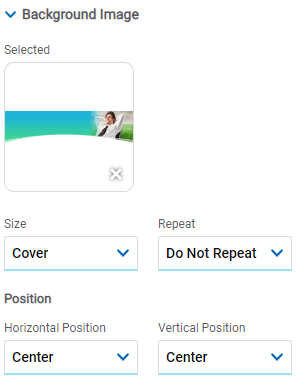
Selected
An image can be uploaded from the computer where it is being modeled.
Background Color
It allows to model a background color for the element, it can be solid or gradient and different properties are defined for each one.
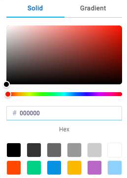
Solid

This option enables not only to select the color from a palette but also to define the degree of transparency.
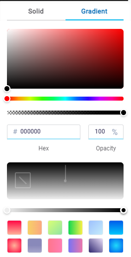
Gradient

This option enables to select not only the color from a palette but also to define its opacity and intensity according to the selected angle.
Edges
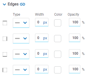
It allows to define the style of borders. Each one has its type, width, color and opacity defined, the latter as a percentage.
![]() Allows the value entered in one of the borders to be copied to the other ones automatically.
Allows the value entered in one of the borders to be copied to the other ones automatically.
![]() Allows to indicate different values for each border.
Allows to indicate different values for each border.
Round Edges
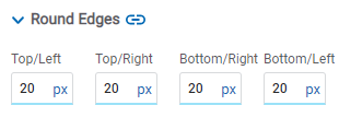
It allows to define the round edges at the corners of items.
It can be expressed in pixels (px), percentage (%), viewport width (vw), and viewport height (vh).
![]() Allows the value entered in one of the borders to be copied to the other ones automatically.
Allows the value entered in one of the borders to be copied to the other ones automatically.
![]() Allows to indicate different values for each border.
Allows to indicate different values for each border.
Shadow
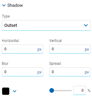
Allows to define a shadow effect around the item.
Type
Possible Values
•Outset
•Inset
Horizontal
Horizontal size of the shadow to the right of the item. It can be expressed in pixels (px), percentage (%), viewport width (vw), and viewport height (vh).
Vertical
Vertical size of the shadow below the item. It can be expressed in pixels (px), percentage (%), viewport width (vw), and viewport height (vh).
Blur
The greater this value is, the greater and lighter the shadow becomes. If not specified, its value is 0 and the shadow border is darker. It can be expressed in pixels (px), percentage (%), viewport width (vw), and viewport height (vh).
Spread
Positive values will cause the shadow to expand and grow bigger, while negative values will cause the shadow to shrink. If not specified, its value is 0 and the shadow will have the same size as the item.
Color
Defines the color of the shadow.
Transparency
Defines the transparency of the shadow.
Hyperlink Properties
The hyperlink properties panel of an item opens by pressing the icon ![]() of the context menu.
of the context menu.
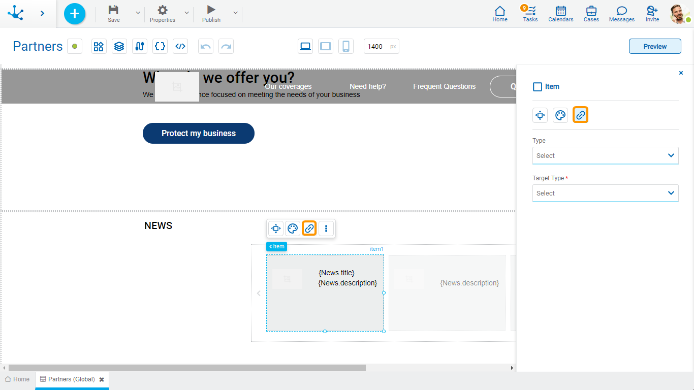
Define the behavior of the item when selecting it. Different properties are enabled depending on the type of object selected.
Page
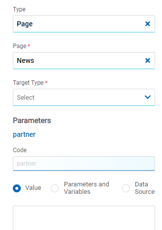
Page
The pages modeled in the environment are displayed.
Target Type
The available options for opening the object are displayed.
Possible Values
•Same Tab
•New Window
•Modal: if this option is selected the additional properties are enabled.
Modal Horizontal Size
Define its width.
Modal Vertical Size
Define its height.
•Iframe: this option is selected and an additional property is enabled.
Target Iframe
Displays the iframes previously defines in the page.
Parameters
If there are parameters, their value can be specified with text, parameters and variables or data source.
Deyel Page
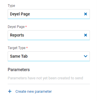
Deyel Page
The pages belonging to Deyel are displayed.
Target Type
The available options for opening the object are displayed.
Possible Values
•Same Tab
•New Window
•Modal: if this option is selected the additional properties are enabled.
Modal Horizontal Size
Define its width.
Modal Vertical Size
Define its height.
•Iframe: this option is selected and an additional property is enabled.
Target Iframe
Displays the iframes previously defines in the page.
Parameters
Allows sending parameters to the selected object type.
Form
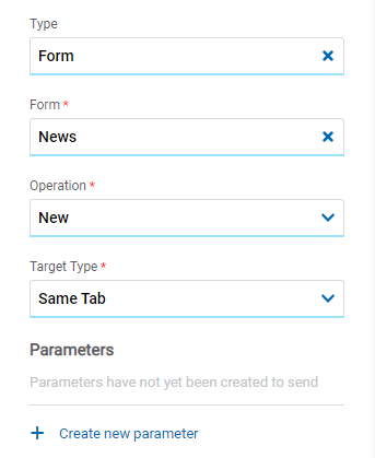
Form
The forms modeled in the environment are displayed.
Operation
Defines the operation made when selecting the object.
Possible Values
•New: Indicates that the panel of the form selected in the previous property is opened for the creation of an instance.
•Grid: Indicates that the grid of the form selected in the previous property is opened.
Target Type
The available options for opening the object are displayed.
Possible Values
•Same Tab
•New Window
•Modal: if this option is selected the additional properties are enabled.
Modal Horizontal Size
Define its width.
Modal Vertical Size
Define its height.
•Iframe: this option is selected and an additional property is enabled.
Target Iframe
Displays the iframes previously defines in the page.
Parameters
Allows sending parameters to the selected object type.
Process
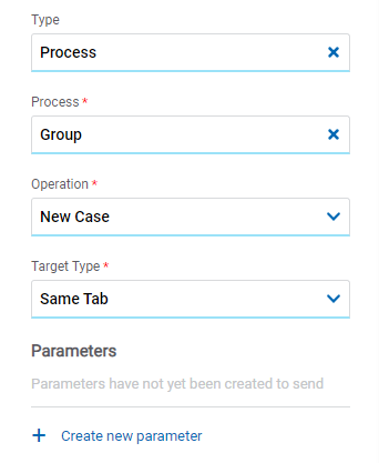
Process
The processes modeled in the environment are displayed.
Operation
Defines the operation made when selecting the object.
Target Type
The available options for opening the object are displayed.
Possible Values
•Same Tab
•New Window
•Modal: if this option is selected the additional properties are enabled.
Modal Horizontal Size
Define its width.
Modal Vertical Size
Define its height.
•Iframe: this option is selected and an additional property is enabled.
Target Iframe
Displays the iframes previously defines in the page.
Parameters
Allows sending parameters to the selected object type.
Link
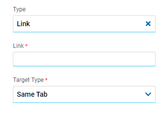
Link
Allows to enter any link.
Target Type
The available options for opening the object are displayed.
Possible Values
•Same Tab
•New Window
•Modal: if this option is selected the additional properties are enabled.
Modal Horizontal Size
Define its width.
Modal Vertical Size
Define its height.
•Iframe: this option is selected and an additional property is enabled.
Target Iframe
Displays the iframes previously defines in the page.
Element
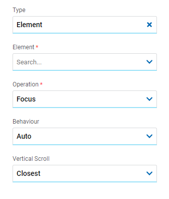
Element
The modeled elements in the page are displayed.
Operation
Defines the operation made when selecting the element.
Possible Values
•Focus
•Show
•Hide
•Show/Hide
Behaviour
Establishes the transition of the animation. It is only modelable if the "Focus" operation was selected.
Possible Values
•Auto
•Smooth
Vertical Scroll
Possible Values
•Start: Moves to the start of the selected element.
•Closest: Moves to the closest position to the selected element from the element the event fires.
•Center: Moves to the center of the selected element.
•End: Moves to the end of the selected element.
Back

It allows associating the event to go back in the browser to the element.
Embedded Rules
The embedded rules properties panel of an element opens when selecting the icon ![]() of the context menu.
of the context menu.
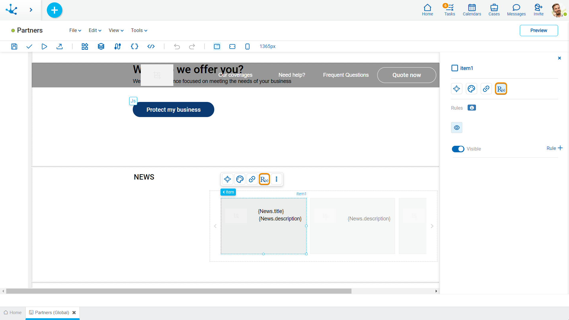
Properties
Rules
Embedded rules on behavior, validation and calculation can be defined, associated with an element, by using the wizard (ctrl + space).
 Shows syntax examples for writing the rules.
|
|
Indicates whether the element is visible. If this property is not checked, the element is not displayed in the page.
|
Operations when defining the rule:
|
Saves the new or modified rule |
|
Cancels the operation |
Operations once the rule is defined:
|
Edits the existing rule |
|
Deletes the rule |
Events
The items allow to use different events.
Event |
Description |
|---|---|
onMouseIn() |
It is executed when the cursor is positioned on the element. |
onMouseOut() |
It is executed when the cursor moves out of the element. |
onClick() |
It is executed when clicking on the element. |
onDoubleClick() |
It is executed when clicking twice on the element. |
onInit() |
It is executed before the element is loaded. |
afterViewInit() |
It is executed after viewing the element. |
onViewportEnter() |
It is executed when the element is visible. |
onViewportLeave() |
It is executed when the element is no longer visible. |


 Visible (default)

