Iframe
This element is used to show objects Deyel or external web pages. For example, it can contain forms, pages, cases, etc. Its position and size must be selected so that it responds to different display windows.
Subtypes
•Iframe with Scroll
•Adaptable Iframe
Structure Properties
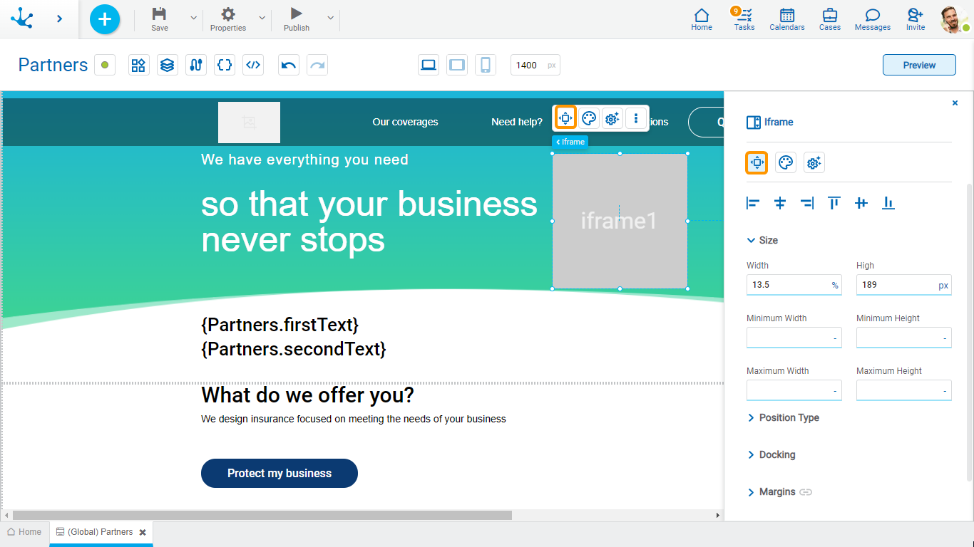
The structure properties panel of an element opens when selecting the icon  of the context menu.
Alignment
Allows to align the element by selecting one of the available icons.
• Align to the left.
• Align to horizontal center.
• Align to the right.
• Align up.
• Align vertical center.
• Align bottom.
Size
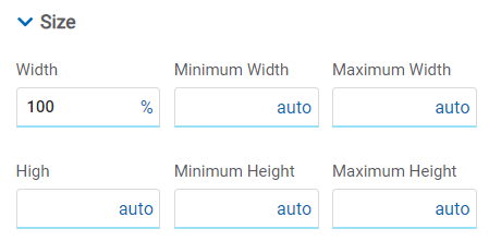
All size properties can be expressed in pixels (px), percentage (%), viewport width (vw), and viewport height (vh). Additionally, for Width and Height properties, the “auto” option is added.
If selecting percentage (%) for the width and height properties, the size is calculated relative to the top element.
Position Type
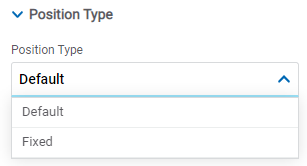
It determines if at the time of execution the element remains fixed on the page or if it moves as the scroll bar moves forward or backward.
Possible Values
•Default: The element has a relative position with respect to the superior element where it was placed (container or section).
•Fixed: Fixes the element to the page so that it is always visible in the same position. It allows to increase the visibility of important content.
Docking
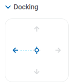
Determines the vertical and horizontal position of elements within the page section or container, when the screen is resized.
When an element is added or moved within the section or container, the modeler automatically docks it to the nearest corners or edges. It can also be configured by clicking on the arrows of the side to be docked to or on the center.
Once the element is docked, its exact position is indicated in the Margins property. The direction of the docking arrows determine the values that are automatically displayed for margins.
The docking position is indicated in the modeling area by dotted lines on the element.
Margins

It allows to define the distance of elements from the borders of their top element. The behavior of margins depends on the docking of the element. It can be expressed in pixels (px), percentage (%), viewport width (vw), and viewport height (vh).
Top
Distance to the top border of the highest ranking element.
Bottom
Distance to the bottom border of the highest ranking element.
Left
Distance to the left border of the highest ranking element.
Right
Distance to the right border of the highest ranking element.
![]() Allows the value entered in one of the margins to be copied to the other ones automatically.
Allows the value entered in one of the margins to be copied to the other ones automatically.
![]() Allows to indicate different values for each margin.
Allows to indicate different values for each margin.
Advanced
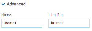
Name
Name used to reference the element during modeling.
Identifier
Uniquely identifies the element. It is used in the Javascript SDK.
Style Properties
The style properties panel of an element opens when selecting the icon  of the context menu.
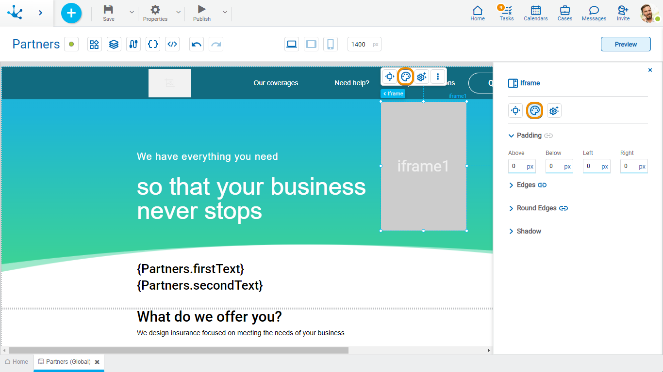
Padding

All padding space properties allow to create a space around the element borders (top, bottom, sides) and its content. The padding space configured is inward, while the margin is configured relative to a top element. It can be expressed in pixels (px), percentage (%), viewport width (vw), and viewport height (vh).
![]() Allows values entered in one of the paddings to be copied to the other ones automatically.
Allows values entered in one of the paddings to be copied to the other ones automatically.
![]() Allows to indicate different values for each padding.
Allows to indicate different values for each padding.
Edges
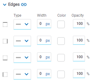
It allows to define the style of borders. Each one has its type, width, color and opacity defined, the latter as a percentage.
![]() Allows the value entered in one of the borders to be copied to the other ones automatically.
Allows the value entered in one of the borders to be copied to the other ones automatically.
![]() Allows to indicate different values for each border.
Allows to indicate different values for each border.
Round Edges
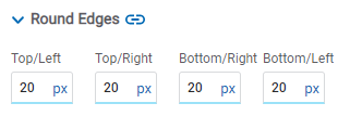
It allows to define the round edges at the corners of elements.
It can be expressed in pixels (px), percentage (%), viewport width (vw), and viewport height (vh).
![]() Allows the value entered in one of the borders to be copied to the other ones automatically.
Allows the value entered in one of the borders to be copied to the other ones automatically.
![]() Allows to indicate different values for each border.
Allows to indicate different values for each border.
Shadow
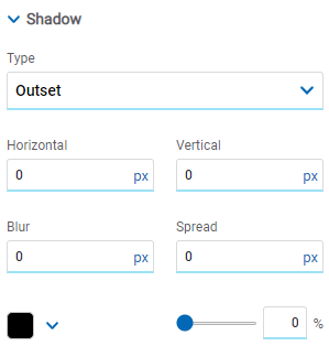
Allows to define a shadow effect around the element.
Type
Possible Values
•Outset
•Inset
Horizontal
Horizontal size of the shadow to the right of the element. It can be expressed in pixels (px), percentage (%), viewport width (vw), and viewport height (vh).
Vertical
Vertical size of the shadow below the element. It can be expressed in pixels (px), percentage (%), viewport width (vw), and viewport height (vh).
Blur
The greater this value is, the greater and lighter the shadow becomes. If not specified, its value is 0 and the shadow border is darker. It can be expressed in pixels (px), percentage (%), viewport width (vw), and viewport height (vh).
Spread
Positive values will cause the shadow to expand and grow bigger, while negative values will cause the shadow to shrink. If not specified, its value is 0 and the shadow will have the same size as the element.
Color
Defines the color of the shadow.
Transparency
Defines the transparency of the shadow.
Configuration Properties
The configuration properties panel of an element opens when clicking the icon ![]() of the context menu.
of the context menu.
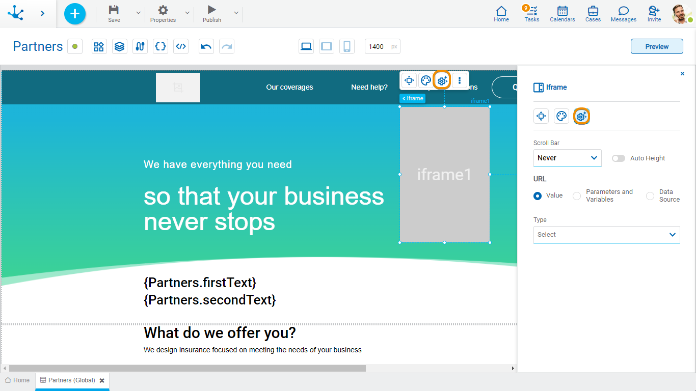
Scroll

Auto Height
Allows the iframe height to adapt to the size of its content incase that the former exceeds the iframe size. If such property is not checked the different values from the Scroll Bar property can be selected.
Scroll Bar
Indicates if the scroll in the element is displayed: always, never or according to the size of the iframe content.
URL
Allows to select the source of the element's content.
Value
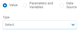
Type
Allows to select the object type to show in the iframe, it can be an object from Deyel or a link to an external web page. Depending on the type selected, different properties are enabled to be completed.
•Page
Page
Allows to select the external page displayed on the iframe. Once it is selected it displays its parameters in case it has them.
•Deyel Page
Deyel Page
Allows to select the external Deyel page displayed on the iframe. Once it is selected it displays its parameters in case it has them or allows to add one.
•Form
Form
Allows to select the form name displayed on the iframe. Once it is selected it displays its parameters in case it has them or allows to add one.
Operation
Allows to select whether to display the creation of an instance or the form grid.
•Process
Process
Allows to select the name of the process executed on the iframe. Once it is selected it displays its parameters in case it has them or allows to add one.
Operation
Indicates that the creation of a case is displayed.
•Link
Link
Allows the entry of the link of the page that is executed in the iframe.
Parameters and Variables
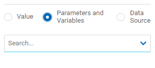
Parameters and Variables
Allows to select a parameter or a variable from the page. Its value is displayed in the element.
Data Source
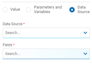
Data Source
Allows to select a data source that was previously defined on the page.
Fields
Allows to select a field from those retrieved in the chosen data source. Its value is displayed in the element.
Embedded Rules
The embedded rules properties panel of an element opens when selecting the icon ![]() of the context menu.
of the context menu.
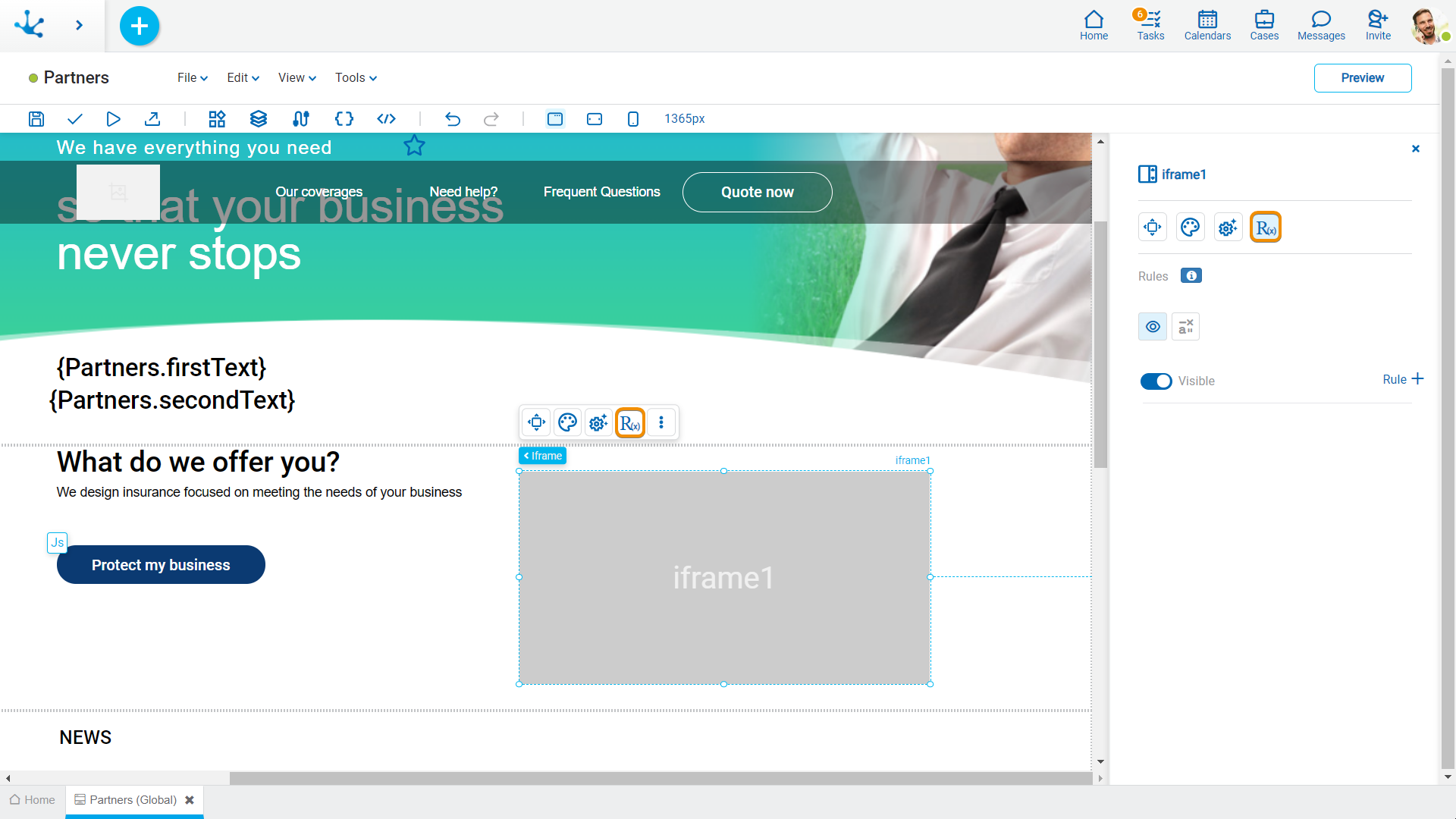
Properties
Rules
Embedded rules on behavior, validation and calculation can be defined, associated with an element, by using the wizard (ctrl + space).
 Shows syntax examples for writing the rules.
|
|
Indicates whether the element is visible. If this property is not checked, the element is not displayed in the page.
|
|
Calculation |
|
Operations when defining the rule:
|
Saves the new or modified rule |
|
Cancels the operation |
Operations once the rule is defined:
|
Edits the existing rule |
|
Deletes the rule |
Events
The iframes allow to use an event.
Event |
Description |
|---|---|
onLoad() |
It is executed once all the iframe elements have been loaded. |


 Visible (default)


