Bars and Columns
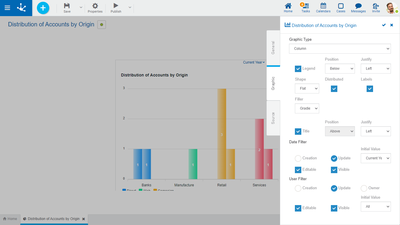
The bar and column widgets comprehend the charts of type: bar, grouped bar and stacked bar, column, grouped column and stacked column and N Top. To the shared properties by all the widgets, those specific to bars and columns are added.

Properties
Legend
Indicates the incorporation of the data series description.
If this property is selected, it must also indicate:
Position
Select above or below.
Justify
If above or below position is selected, it allows to indicate right, center or left alignment.
Shape
It allows to select whether the figure has a flat or curved edge.
Distributed
Indicates whether the series are grouped or interleaved.
Labels
Allows to indicate whether the labels corresponding to the data series are displayed.
Filler
Allows to highlight the area of data series in a gradient or solid way.
Title
If this property is selected, when using the widget on a dashboard, the descriptive name is displayed.
In this case it must also indicate:
Position
Allows to locate the title in the upper or lower sector of the widget area.
Justify
Allows to position the title to the right, center, or left, within the widget area.
Example of Use
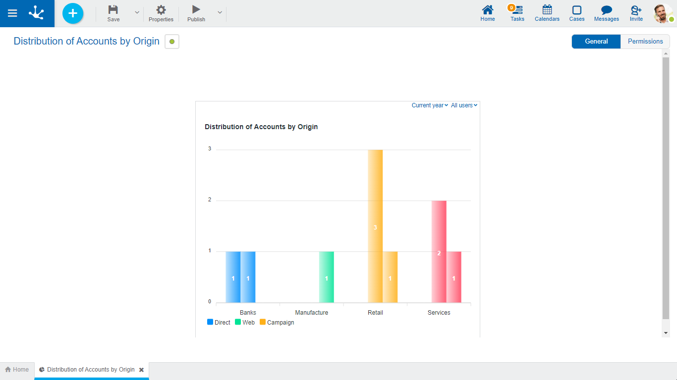
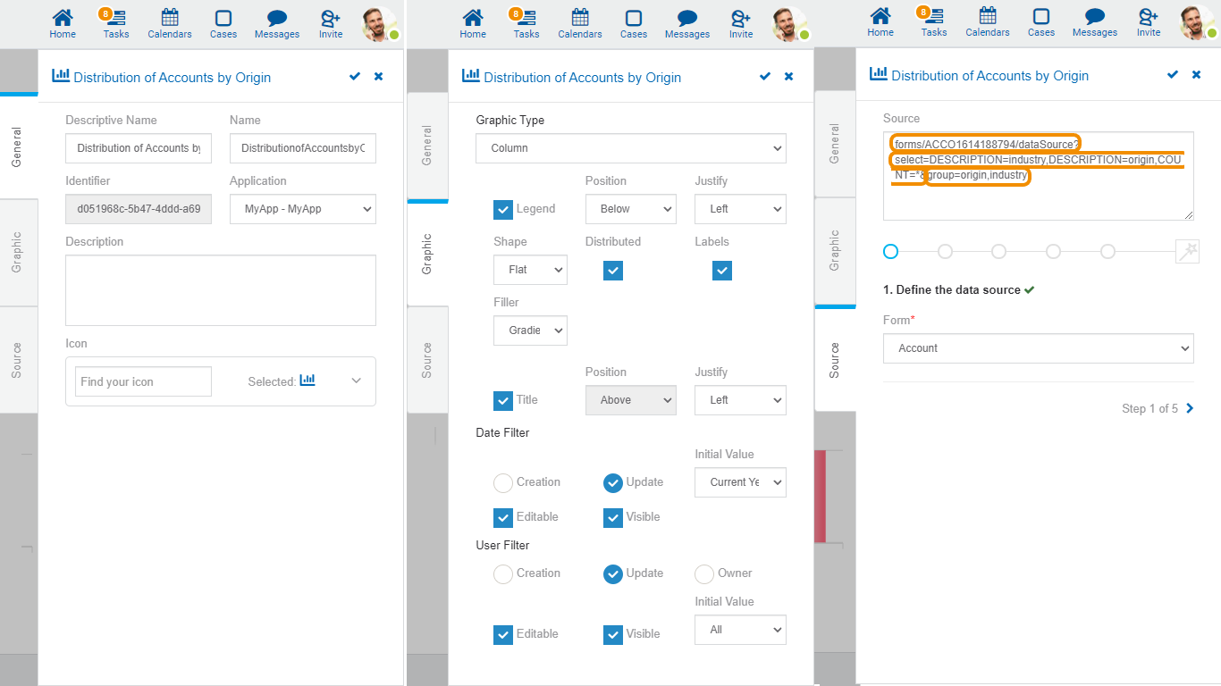
In this column or bar chart the series type of industry and origin are displayed at the same time, so as to make a comparative analysis of the total sum of CRM accounts.

The source code to model this chart is detailed.

In the "Source" tab, each orange box represents the code for a particular step.
