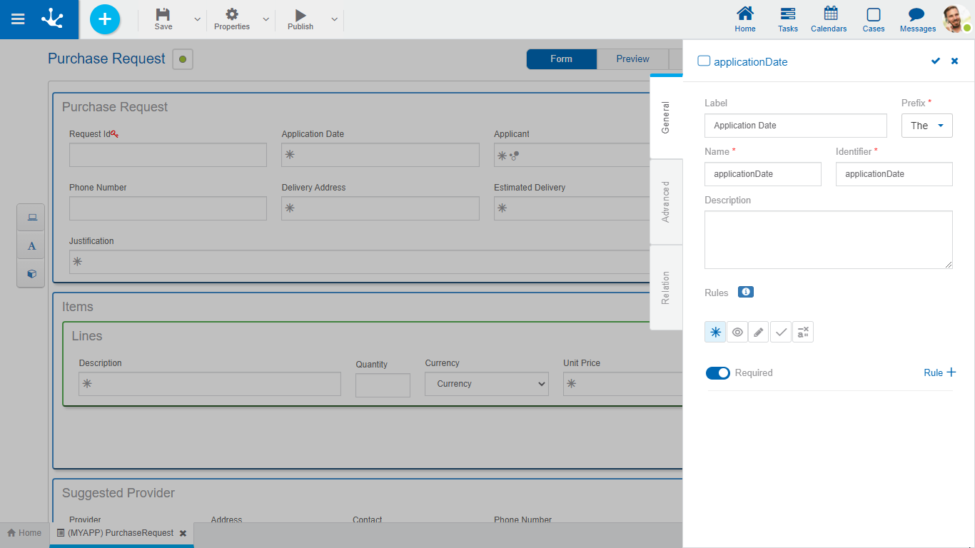
General
 Phase 2: Forms Modeling > Behavior modeling
The properties panel is displayed on the right side of the form modeler, where the first tab corresponds to general information.

An asterisk "*" on the label indicates that the property is required.
Properties
Allows to enter the text that is displayed on the field. It works together with the prefix to reference the field in validation messages and supports blank spaces.
Prefix
This prefix is used to conform error messages during data entry. It is required. Allows to select the value: "The".
Name assigned to reference a field in the modeling, allowing the field to be uniquely identified within the form. Used in rule wizards to refer to field within conditions. It generates automatically from the Label property, it can be modified by the user and does not allow spaces or special characters.
It is the name that is assigned to refer to a field in the programming code, it is used to refer to the field within the Java code in the "Execution Code" tab of the advanced rules and in the JavaScript code in the "Advanced Editing" tab of the form modeler. Allows to uniquely identify the field within the modeled form. It can be modified by the user, as long as no data has been loaded into the form and it does not allow spaces or special characters.
Description
Text that defines the field and optionally its content.
Embedded rules on behavior, validation and calculation can be defined, associated with a field, by using the wizard (ctrl + space).
 Shows syntax examples for writing the rules.
|
|
Indicates whether the field is required when creating a new form instance or when modifying an existing one.
|
|
|
|
Indicates whether the field is visible. If this property is not checked, the field is not displayed in the form instances.
|
|
|
|
Indicates if the field is editable. If this property is not checked, the user cannot enter or modify values in the field.
|
|
|
|
|
|
|
|
|
Operations when defining the rule:
|
Saves the new or modified rule |
|
Cancels the operation |
Operations once the rule is defined:
|
Edits the existing rule |
|
Deletes the rule |


 Required
  Not required (default)


