Execution
 Process modeling > Modeling the execution of a process
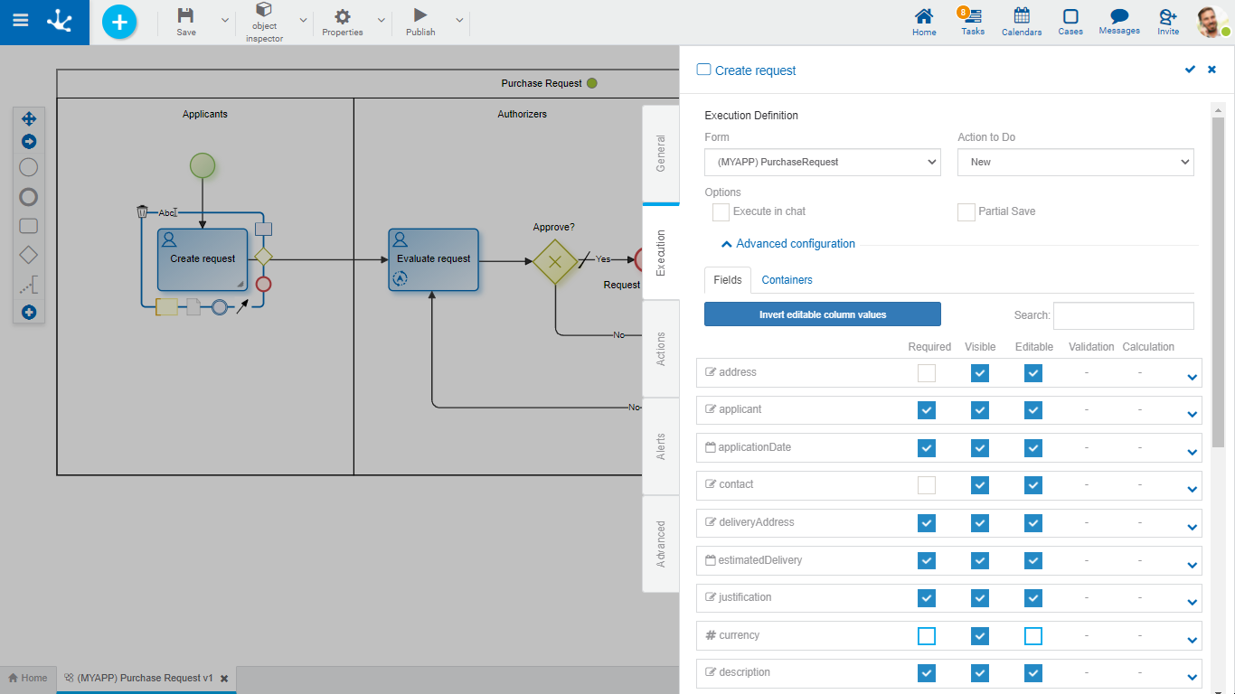
The second side panel tab of an activity corresponds to execution information and it is displayed only for manual, user or undefined activities.
Allows modeling users to define behaviors of the activity and form fields, according to the action performed. There must be at least one form previously associated with the process.

Execution Definition
In this section, the general properties of the activity execution are defined.
Form
Displays the name of the form related to the process used in the activity.
Action performed on the form in this activity.
•Open
| Displays the form instance in show mode. Fields cannot be edited. |
•New
Creates a new form instance that is related to the case. When there is an instance already created, it works like a "Modify" action.
•Modify
Displays the existing form instance and allows to modify the fields defined as editable.
Options
This option displays a confirmation message to execute a task.
A "Confirmation Message" container displays by checking this mark . When displayed, an editing area opens to enter the text of the message or an embedded rule that returns the confirmation message if applicable. If the rule does not return a text, the activity is executed without requiring confirmation.
This option allows the task to be executed not only from the task icon on the top toolbar, but also from the Deyel chat.
Selecting this check expands the properties panel to set the actionable message.
●Who will send the message?
Indicates a Deyel user that sends the message. Allows to use the autocomplete function to select it.
●Message content
The text that makes up the body of the message is reported, this text can contain variables and functions. To select them you can use their wizards, of variables  and of functions
  .
.
●What fields can the user complete?
Using the "Drag and Drop" function, fields are moved from the form fields area to the fields to complete area.
The fields to be completed must be entered by the user in the chat.
Save Partially
This option indicates that when executing the activity, the "Save" button is added, which allows to keep the values entered by the user, with no need to execute the activity.
Advanced Settings
To show this section, an action to do must have been previously defined.
Fields
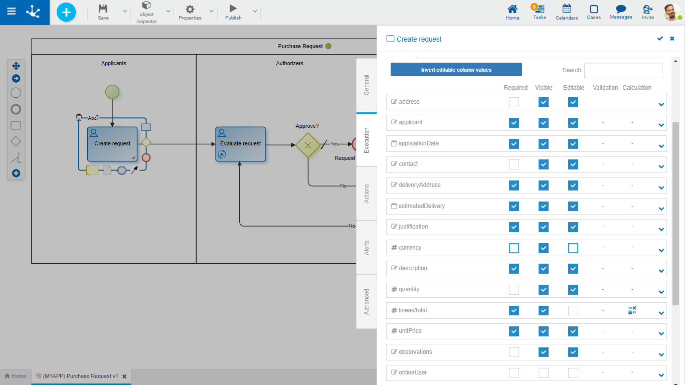
In this tab, a grid with the form fields is displayed. The properties of these fields can be redefined for the execution of each activity.


Inverts the values of the Editable property, for all the fields displayed in the grid. If it is narrowed by search filter, the modification affects only the filtered fields.

As characters are entered to the search field, it dynamically filters the fields whose Label or Name properties, indistinctly, match the text being entered.
Fields Grid
It is made up of form fields according to the filter applied. Each field is identified by its property Name.
The grid columns correspond to the modeled behavior properties, whether they have been defined from the form modeler, or from the activity itself.
Properties are modeled simply by checking or unchecking them and if they have embedded rules defined, they are displayed by icons. Checks and icons are displayed in blue if properties or rules were modeled in the form, while they are in light blue if they were modeled in the activity.
If there are properties or rules modeled from the form and any of them are modified from the activity, these modifications overwrite the definitions of the form only for the task execution.
If any property or rule of the form is overwritten from an activity, subsequent modifications made from the form have no impact on the behavior already defined in the activity.
If a field is added to the form, it is added to the activities that use the form, as non-required and non-editable, regardless of how it has been modeled on the form.
Required
Indicates if the field is required during the activity execution and if any required rule is defined, it displays the icon  .
.
Visible
Indicates if the field remains visible in the activity and if any visibility rule is defined, it displays the icon  .
.
Editable
Indicates if the field is editable for the activity and if any editability rule is defined, it displays the icon  .
.
Validation
Indicates if there is a validation rule for the field with the icon  .
.
Calculation
Indicates if there is a calculation rule for the field with the icon  .
.
Pressing the icon  expands the area of values and rules modeling of each field.
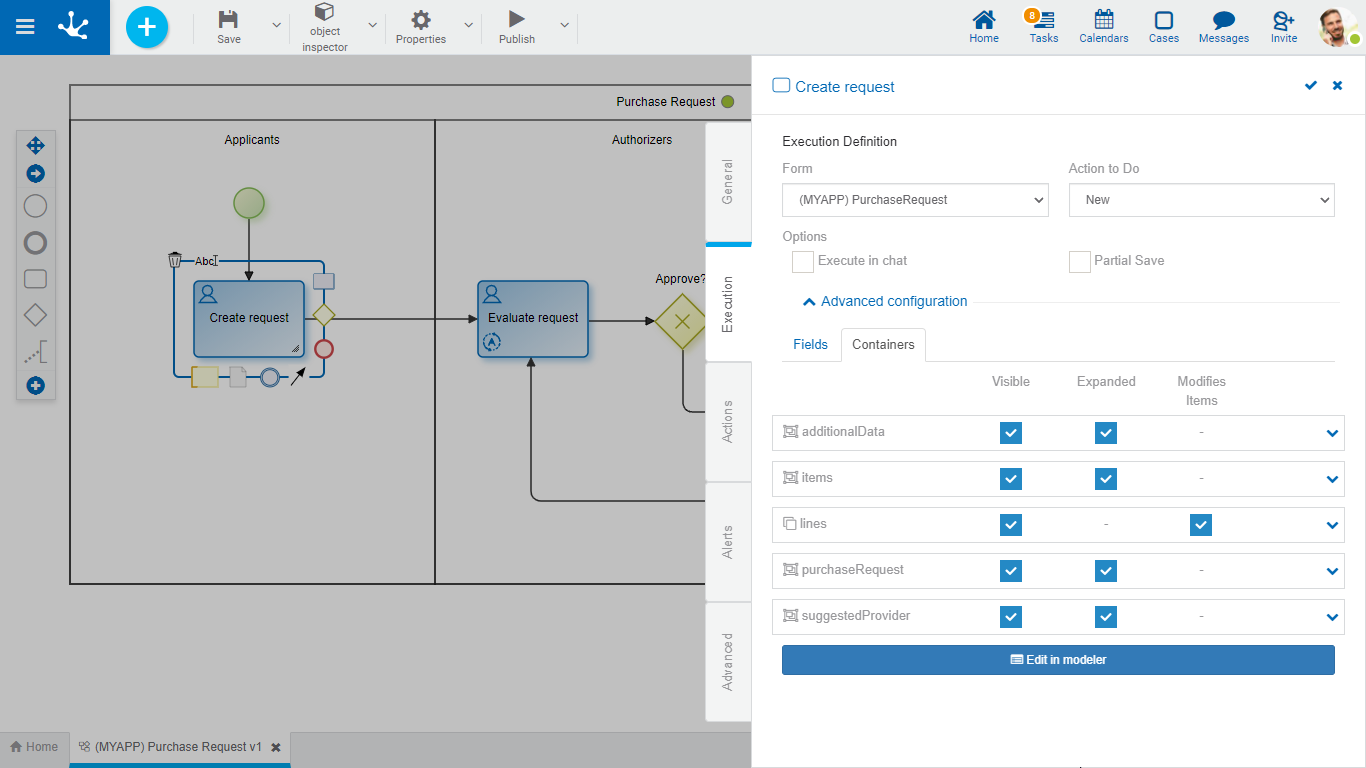
Containers
In this tab, a grid with the form containers is displayed. The properties of these containers can be redefined for the execution of each activity.

The grid columns correspond to the properties of containers.
Visible
This check indicates that the container remains visible when executing the activity. If it has associated visibility rules, it is represented by the icon  .
.
Expanded
This check indicates that the container is displayed when executing the activity.
Modifies Item
Only for iterative containers. This check indicates if iterative occurrences can be added or deleted. This property is displayed by default as checked, however if an iterative container is added to the form in this tab, this property is unchecked.
Pressing the icon  the embedded rules modeling area is expanded for each container.
Edit in Modeler
Pressing this button  the form associated with the activity is opened in another tab of the modeler, where the properties panel of each form element can be opened.
Pressing the icon  of the top toolbar, returns to the activity execution tab.


