Input
This element is used for entering data.
The element properties are represented by icons in its context menu, where its operations are also available.
Subtypes
•Text
•Number
•Password
•Multiline
Structure Properties
The structure properties panel of an element opens when selecting the icon  of the context menu.
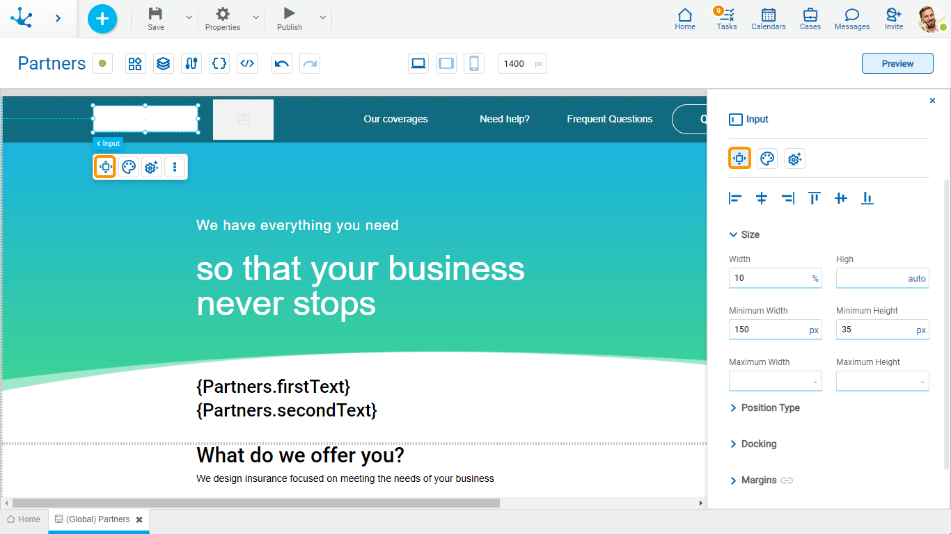
Alignment
Allows to align the element by selecting one of the available icons.
• Align to the left.
• Align to horizontal center.
• Align to the right.
• Align up.
• Align vertical center.
• Align bottom.
Size
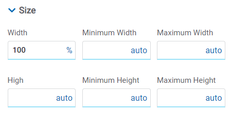
All size properties can be expressed in pixels (px), percentage (%), viewport width (vw), and viewport height (vh). Additionally, for Width and Height properties, the “auto” option is added.
If selecting percentage (%) for the width and height properties, the size is calculated relative to the top element.
Position Type
It determines if at the time of execution the element remains fixed on the page or if it moves as the scroll bar moves forward or backward.
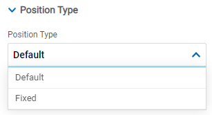
Possible Values
•Default: The element has a relative position with respect to the superior element where it was placed (container or section).
•Fixed: Fixes the element to the page so that it is always visible in the same position. It allows to increase the visibility of important content.
Docking
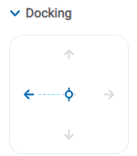
Determines the vertical and horizontal position of elements within the page section or container, when the screen is resized.
When an element is added or moved within the section or container, the modeler automatically docks it to the nearest corners or edges. It can also be configured by clicking on the arrows of the side to be docked to or on the center.
Once the element is docked, its exact position is indicated in the Margins property. The direction of the docking arrows determine the values that are automatically displayed for margins.
The docking position is indicated in the modeling area by dotted lines on the element.
Margins

It allows to define the distance of elements from the borders of their top element. The behavior of margins depends on the docking of the element. It can be expressed in pixels (px), percentage (%), viewport width (vw), and viewport height (vh).
Top
Distance to the top border of the highest ranking element.
Bottom
Distance to the bottom border of the highest ranking element.
Left
Distance to the left border of the highest ranking element.
Right
Distance to the right border of the highest ranking element.
![]() Allows the value entered in one of the margins to be copied to the other ones automatically.
Allows the value entered in one of the margins to be copied to the other ones automatically.
![]() Allows to indicate different values for each margin.
Allows to indicate different values for each margin.
Advanced
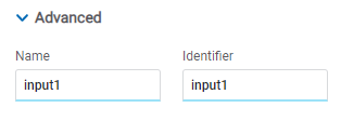
Name
Name used to reference the element during modeling.
Identifier
Uniquely identifies the element. It is used in the Javascript SDK.
Style Properties
The style properties panel of an element opens when selecting the icon  of the context menu.
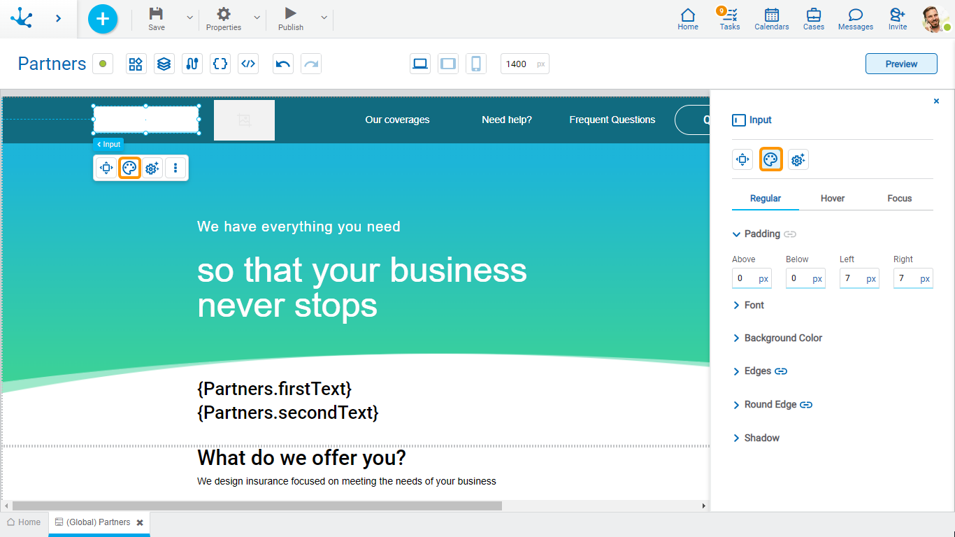
This type of element may take different states and for each of them different values for its properties may be modeled.

•Regular: the mouse is no longer over the element.
•Hover: the mouse is over element.
•Focus: the element is clicked.
Padding

All padding space properties allow to create a space around the element borders (top, bottom, sides) and its content. The padding space configured is inward, while the margin is configured relative to a top element. It can be expressed in pixels (px), percentage (%), viewport width (vw), and viewport height (vh).
![]() Allows values entered in one of the paddings to be copied to the other ones automatically.
Allows values entered in one of the paddings to be copied to the other ones automatically.
![]() Allows to indicate different values for each padding.
Allows to indicate different values for each padding.
Font
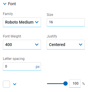
It allows to define the text style.
Background Color
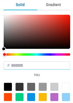
It allows to model a background color for the element, it can be solid or gradient and different properties are defined for each one.
Solid

This option enables not only to select the color from a palette but also to define the degree of transparency.
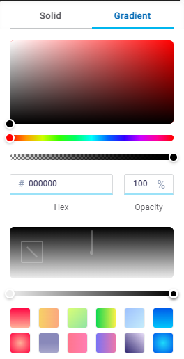
Gradient

This option enables to select not only the color from a palette but also to define its opacity and intensity according to the selected angle.
Edges
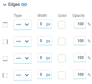
It allows to define the style of borders. Each one has its type, width, color and opacity defined, the latter as a percentage.
![]() Allows the value entered in one of the borders to be copied to the other ones automatically.
Allows the value entered in one of the borders to be copied to the other ones automatically.
![]() Allows to indicate different values for each border.
Allows to indicate different values for each border.
Round Edges
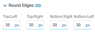
It allows to define the round edges at the corners of elements.
It can be expressed in pixels (px), percentage (%), viewport width (vw), and viewport height (vh).
![]() Allows the value entered in one of the borders to be copied to the other ones automatically.
Allows the value entered in one of the borders to be copied to the other ones automatically.
![]() Allows to indicate different values for each border.
Allows to indicate different values for each border.
Shadow
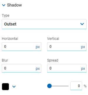
Allows to define a shadow effect around the element.
Type
Possible Values
•Outset
•Inset
Horizontal
Horizontal size of the shadow to the right of the element. It can be expressed in pixels (px), percentage (%), viewport width (vw), and viewport height (vh).
Vertical
Vertical size of the shadow below the element. It can be expressed in pixels (px), percentage (%), viewport width (vw), and viewport height (vh).
Blur
The greater this value is, the greater and lighter the shadow becomes. If not specified, its value is 0 and the shadow border is darker. It can be expressed in pixels (px), percentage (%), viewport width (vw), and viewport height (vh).
Spread
Positive values will cause the shadow to expand and grow bigger, while negative values will cause the shadow to shrink. If not specified, its value is 0 and the shadow will have the same size as the element.
Color
Defines the color of the shadow.
Transparency
Defines the transparency of the shadow.
Configuration Properties
The configuration properties panel of an element opens when clicking the icon ![]() of the context menu.
of the context menu.
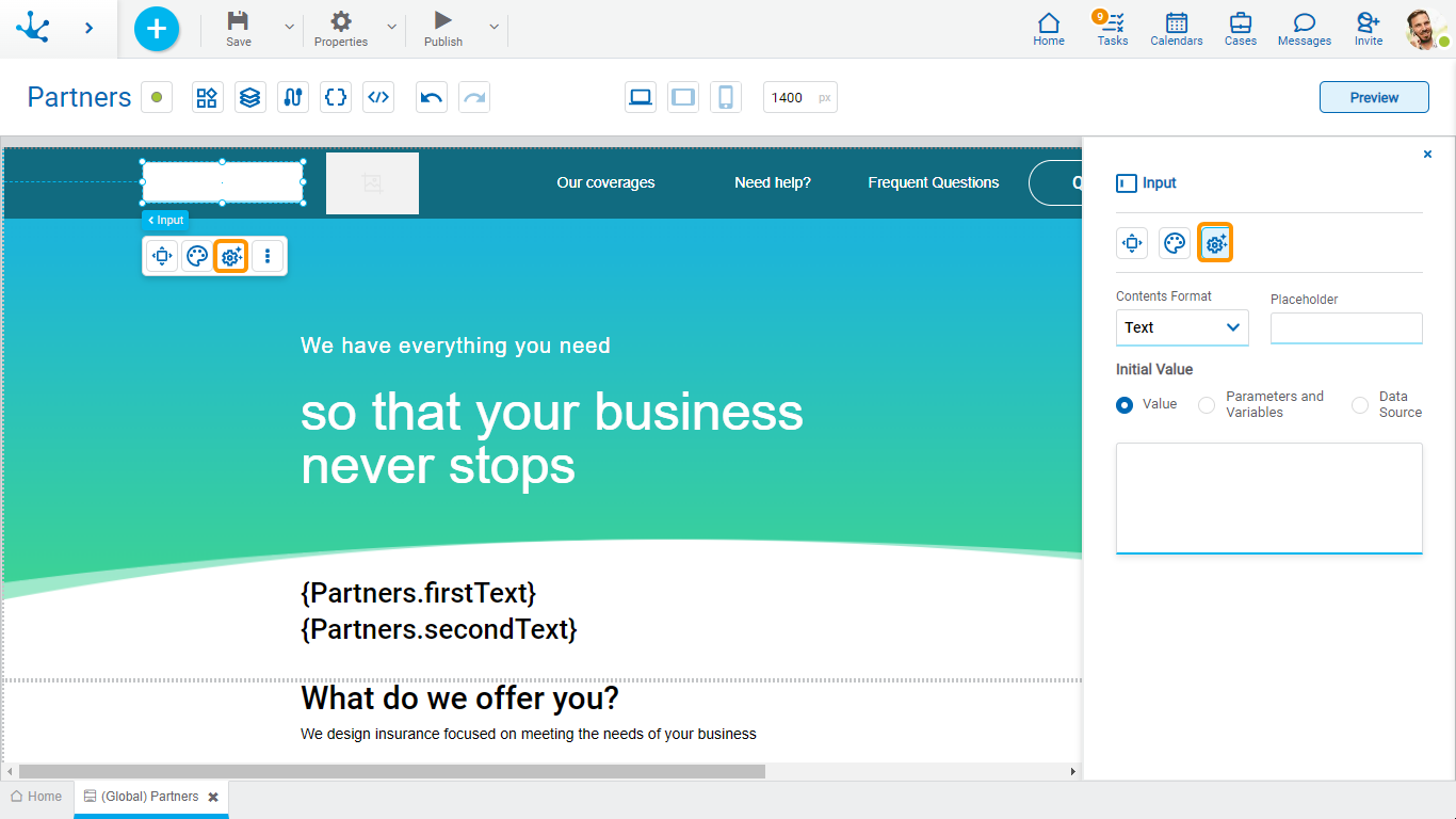
Format and Placeholder

Contents Format
Allows to select text, password, number and multiline.
Placeholder
Allows to guide the user on the content to load in the element. The text entered as a placeholder is displayed within the element.
Initial Value
Allows to select the source of the element's content.
Value
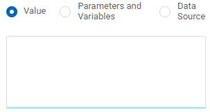
Value
Allows to enter a text that is displayed in the element.
Parameters and Variables
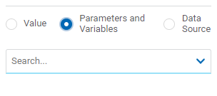
Parameters and Variables
Allows to select a parameter or a variable from the page. Its value is displayed in the element.
Data Source
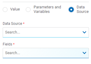
Data Source
Allows to select a data source that was previously defined on the page.
Fields
Allows to select a field from those retrieved in the chosen data source. Its value is displayed in the element.
Embedded Rules
The embedded rules properties panel of an element opens when selecting the icon ![]() of the context menu.
of the context menu.
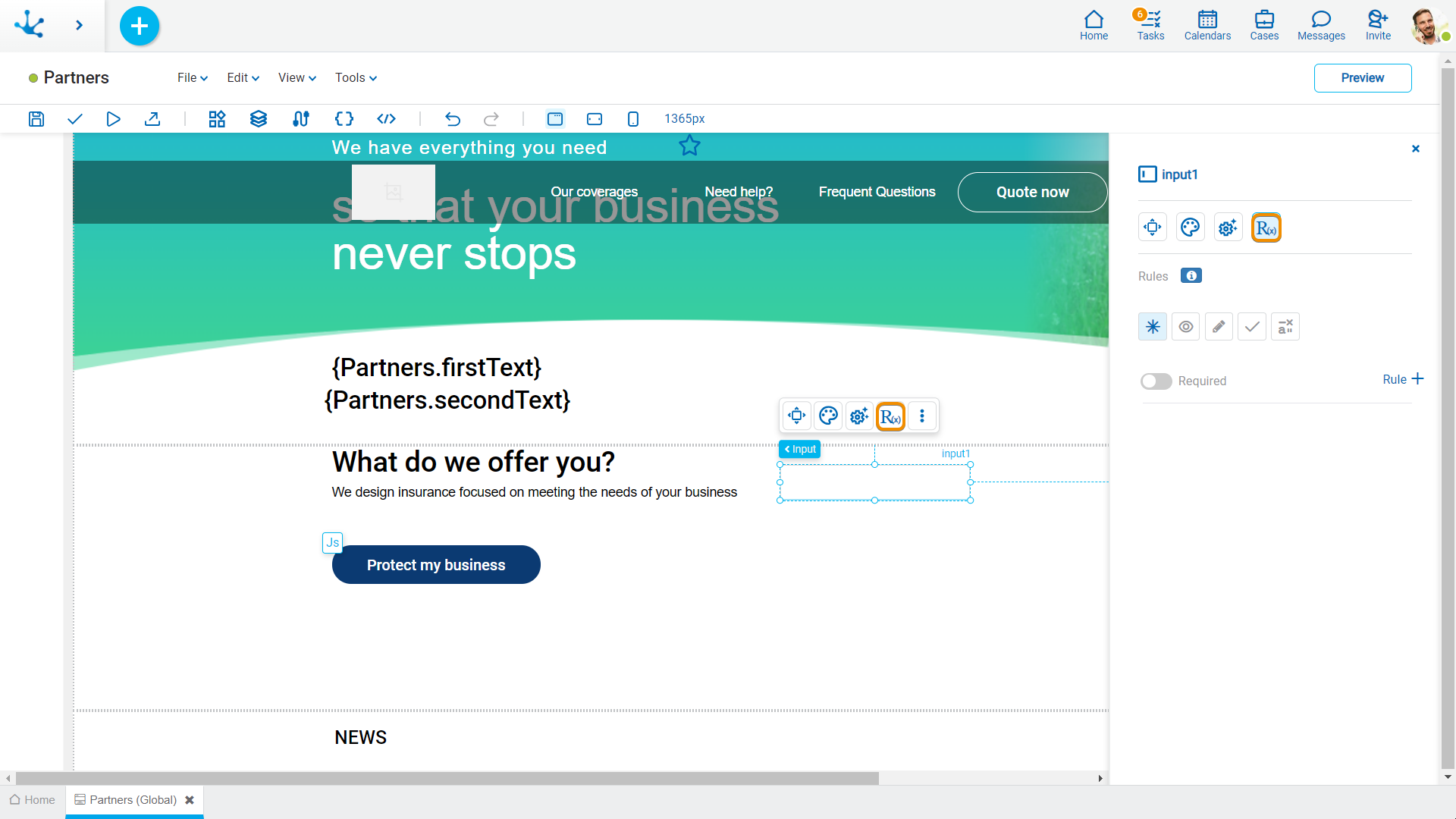
Properties
Rules
Embedded rules on behavior, validation and calculation can be defined, associated with an element, by using the wizard (ctrl + space).
 Shows syntax examples for writing the rules.
|
Required |
Indicates whether the element is required on the page.
|
|
|
Indicates whether the element is visible. If this property is not checked, the element is not displayed in the page.
|
|
Editable |
Indicates if the element is editable. If this property is not checked, the user cannot enter or modify values in the element.
|
|
Validation |
|
|
Calculation |
|
Operations when defining the rule:
|
Saves the new or modified rule |
|
Cancels the operation |
Operations once the rule is defined:
|
Edits the existing rule |
|
Deletes the rule |
Events
The inputs allow to use different events.
Event |
Description |
|---|---|
onMouseIn() |
It is executed when the mouse is over the element. |
onMouseOut() |
It is executed when the mouse is no longer over the element. |
onClick() |
It is executed by clicking on the element. |
onDoubleClick() |
It is executed by double clicking on the element. |
onInit() |
It is executed before loading the element. |
afterViewInit() |
It is executed after presenting the element. |
onViewportEnter() |
It is executed when the element is visible. |
onVIewportLeave() |
It is executed when the element stops being visible. |
pnChange() |
It is executed when the enter value is changed. |
onFocus() |
It is executed when focusing on the element. |
onBlur() |
It is executed when losing focus on the element. |


 Required
  Not required (default)


