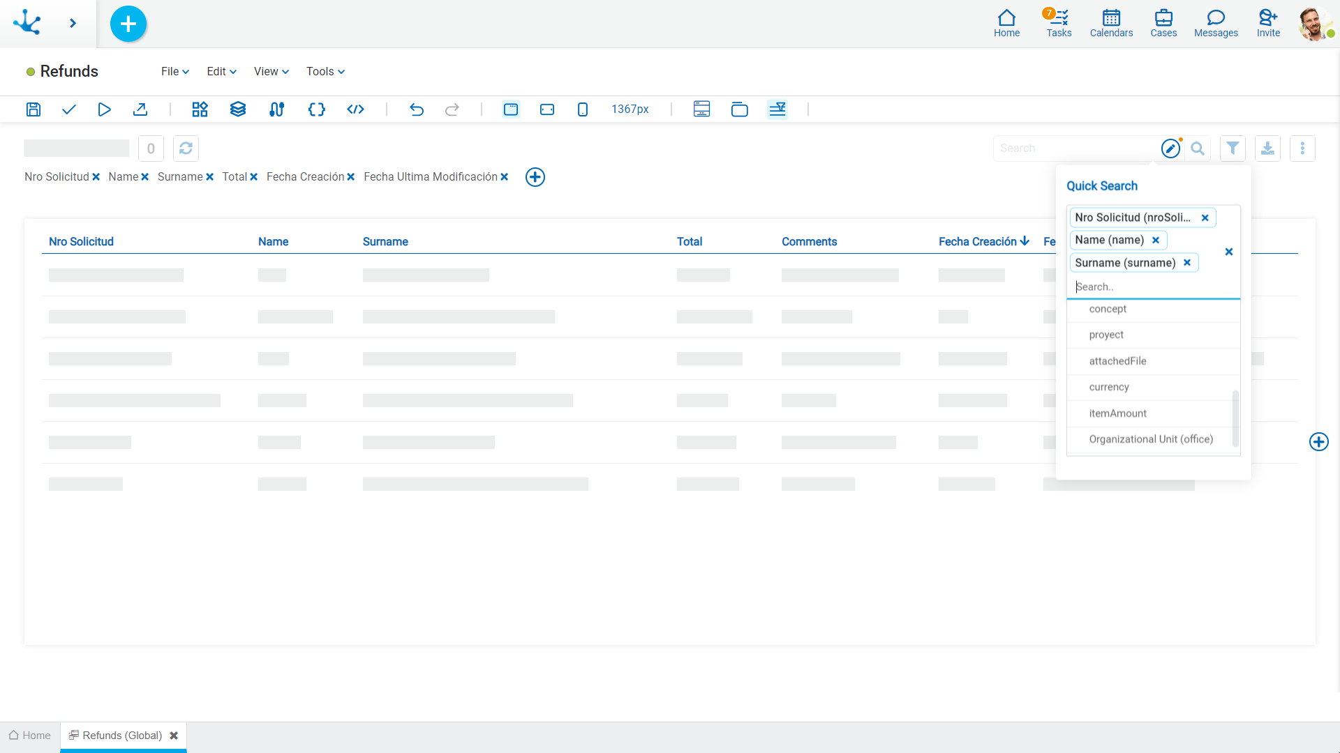
Grid and Filters
Grid
Allows modeling the columns that are displayed in the results and search grids. The default columns of the grid correspond to those fields that have been configured with the Included in Grid property already checked.

New fields can be added by pressing the icon  to the right of the last column of the grid and its order can be modeled by dragging the shaded rectangles of the columns to swap their positions.
When hovering over the title of each column, the following icons are displayed:
 Allows modeling the width of each column by moving the limit bar to the right to enlarge the column, or to the left to shrink it.
 Deletes the column from the grid.
 Establish the column by which the default sorting will be performed, it is ascending or descending depending on the selected icon.
 It is displayed when a field has a relation modeled to a value list. Pressing the icon allows to select the content type to show in the column. The default value is "Text", which can be changed to "Icon" or "Icon and Text".


