Modeling
Below are some good practices that should be considered when modeling pages, aimed at information blocks, margins, breakpoints, images, fonts, buttons, padding spaces and docking, among others.
Information blocks in top elements
•In the user Interface, group and generate blocks of information within sections for greater control of the elements that make up each section and thus facilitate the necessary adjustments for each breakpoint.

•The same applies to blocks of information inside containers.

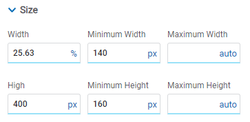
Set width to container
•Set a specific width to a container allows working with more facilities the elements that it contains.
In this example the container has specific width and all the elements it contains have their width at 100%. This makes it easier to adjust the display of elements at the remaining breakpoints.

Consistent margins
•Working with consistent margins between sections or groups of information generates visual order and the necessary separation of content.
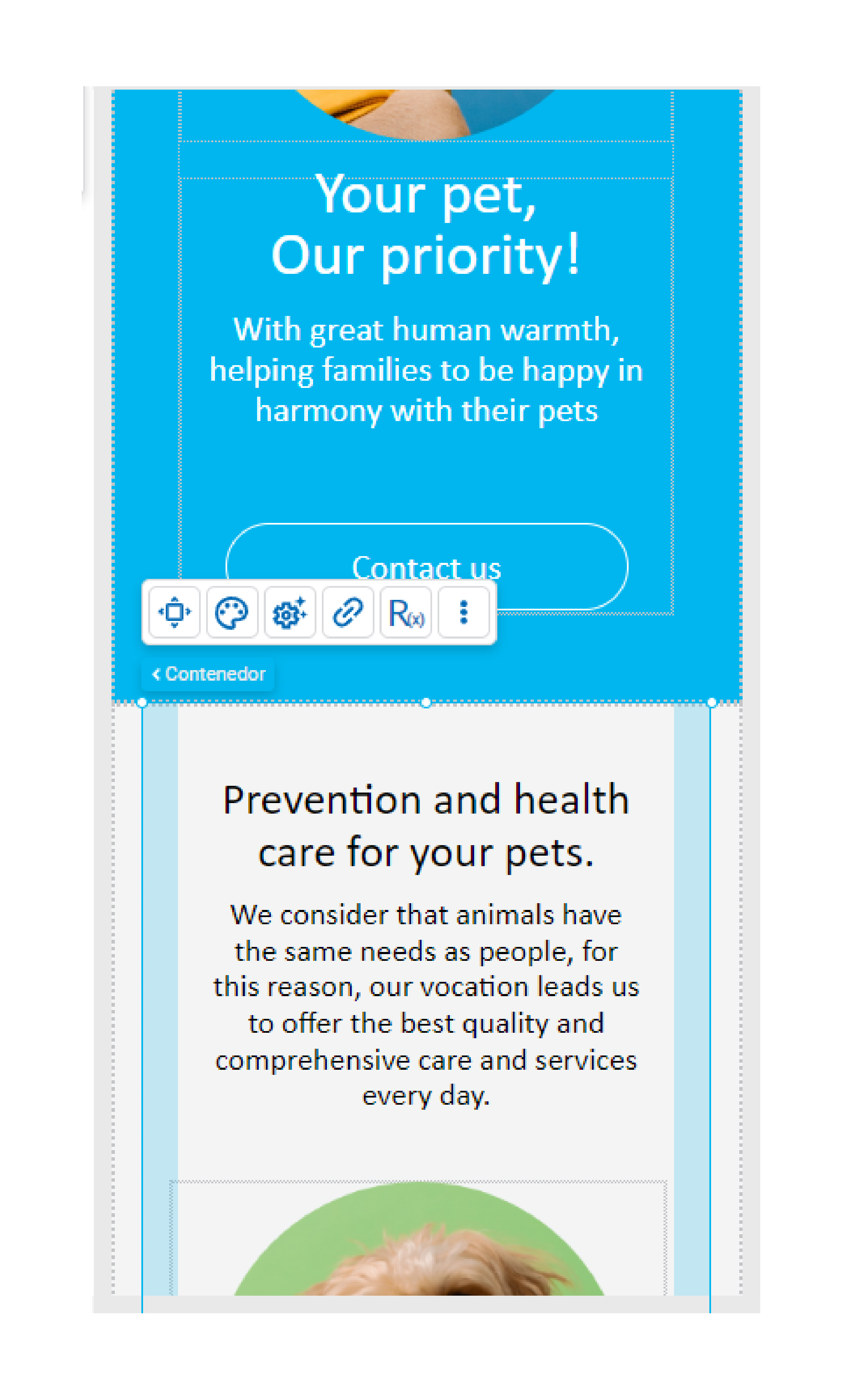
•Likewise, within sections and containers, both margins and padding spaces should be consistent.
•Equality of margins must be maintained on similar elements when they are repeated in the modeling and are not within a repeater.
•For example, to model exactly the same cards, a good tip is to adjust the first card and once you achieve the desired design, copy and paste to finally edit each one in particular.
Control breakpoints gradually by section
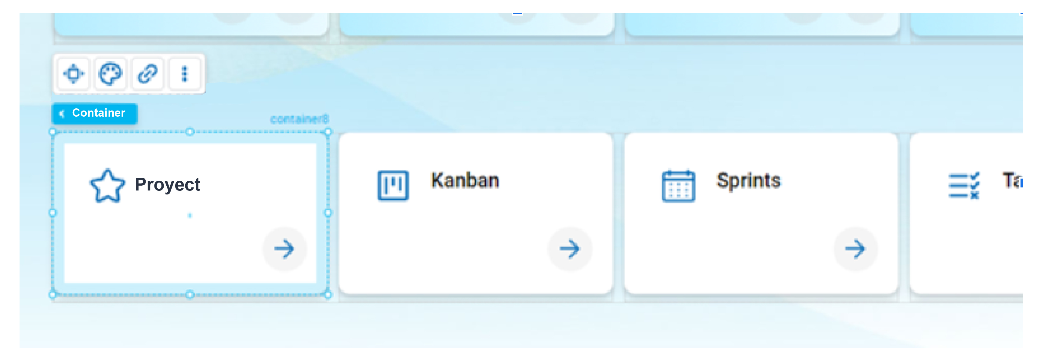
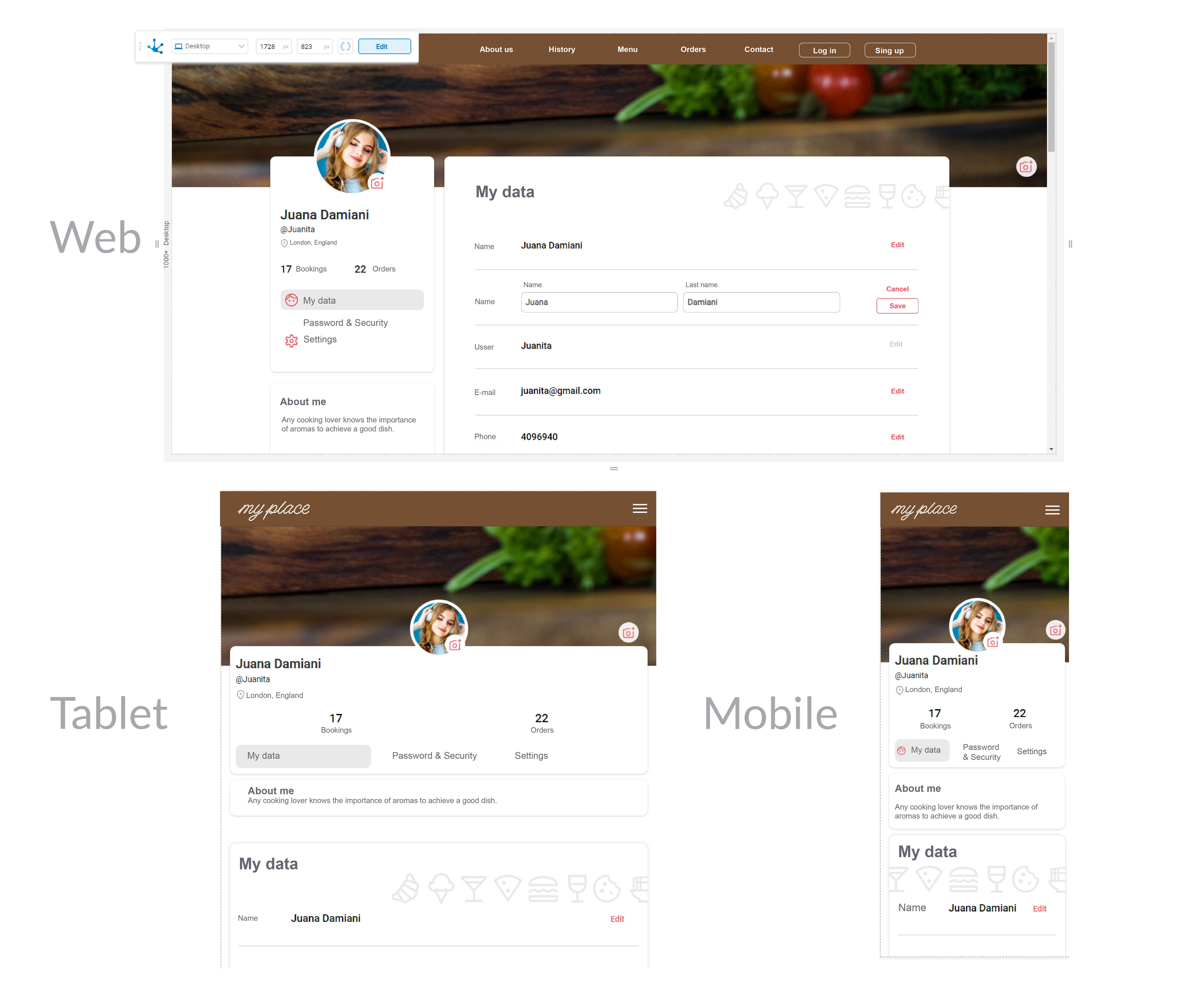
•When modeling, as the content grows, it is advisable to work on the breakpoints gradually. This makes it easier to control the correct position of the elements and adjust the breakpoints as the modeling progresses.
Images: sizes and resolutions
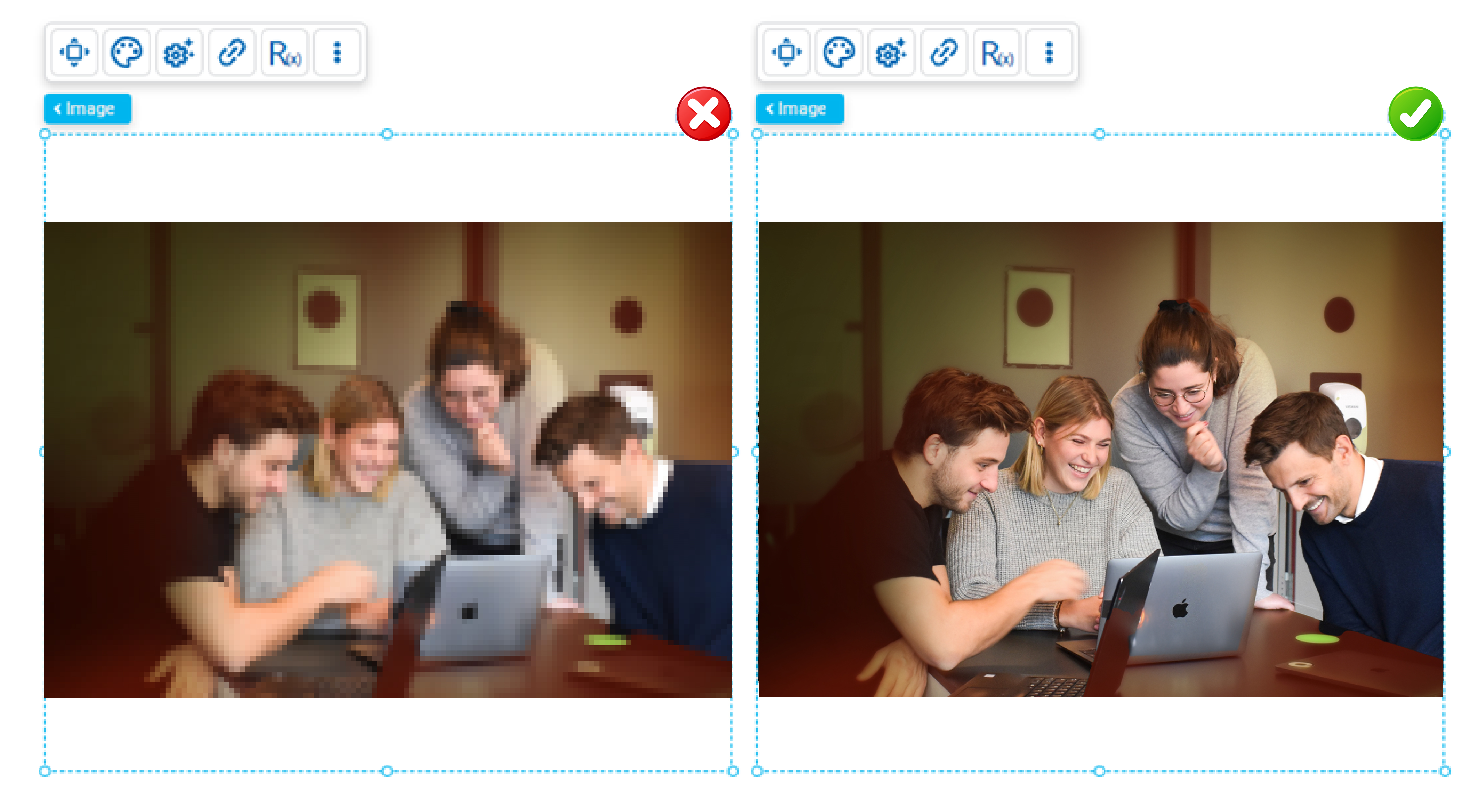
•When modeling an image element, the size at which it will be used on the page must be equal to or smaller than the original.
For example, if the size of a modeled image is small and it is used as the background of a section on a desktop computer, it will not look sharp and the result will not be as expected.
•Ideally, images should be in jpg or png format and use a resolution of 72dpi, to optimize the weight of the page.
•For icons, the best is the svg format because it does not lose definition, for photos the best is jpg because the files are lighter and if the user wants to use transparency, the use of png is recommended.
•Images must be optimized for use on the web, the most common formats are JPG, PNG, GIF and their resolution must be 72 dpi.
•The JPG format is ideal for photographs, PNG for images with transparency, GIF for short animations. On the other hand, for icons or logos, the use of SVG is recommended since they can be scaled without loss of definition.
•There are new image formats such as WebP and AVIF that offer greater compression and quality images with lighter files. While most browsers support them, it is advisable to check compatibility before use.
Source
•When modeling a text element, it must be able to be read clearly. To do this, it is advisable not to use sizes lower than those recommended for both a web interface (for text body 16/18 px) and for a mobile interface (for text body 14/16 px).
•Blocks of text should be short and concise since long paragraphs are difficult to read on the screen. If they are too wide they make reading difficult.
•The line spacing must be adequate, the recommended proportion is 20% larger than the font size.

Contrast
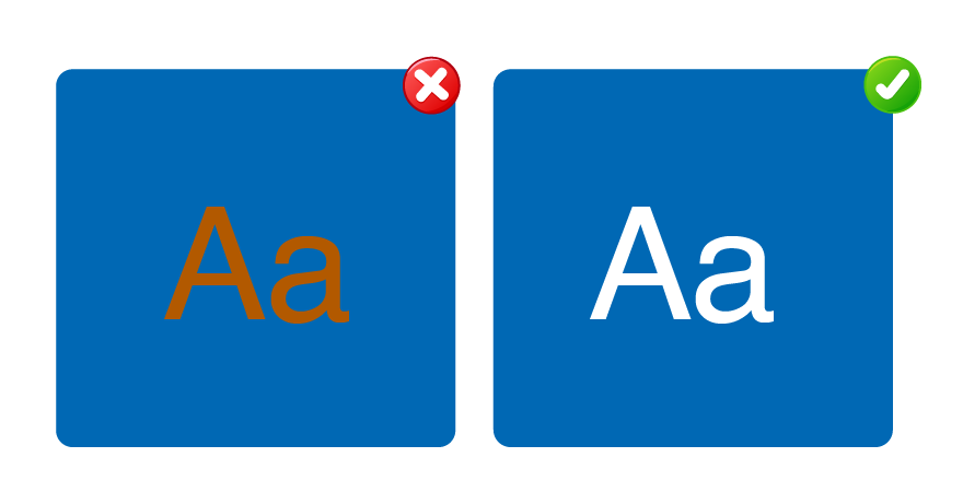
•We must always ensure a good contrast between the text and the background to ensure readability.
Buttons
•The user should not add too many buttons per groups of information and they should differentiate which one corresponds to the main call to action.
•Try to generate the fewest steps and clicks in the interaction with the user.

Element names and identifiers
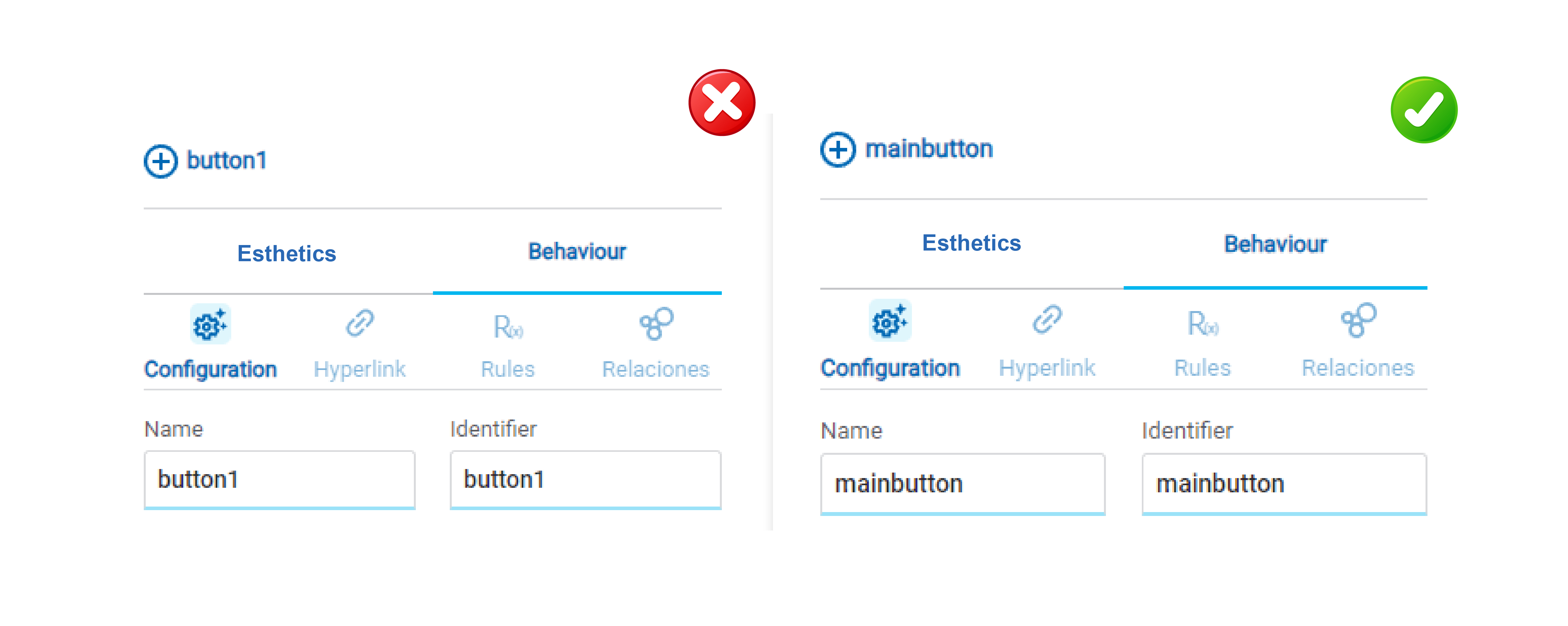
•The identifiers and names of the elements of a page must be descriptive, allowing easy queries when using the layers menu and in embedded rules modeling. It can also be useful when modeling behavior through the use of scripting.
•The names and identifiers of elements on a page must be descriptive. Names are used to reference elements within the modeling while identifiers are used when referencing fields in the Deyel SDK for JavaScript. When using the layers facility, items can be searched by both name and identifier.
Simple structure
•Avoid excessive nesting of elements on a page.
For example, adding unnecessary containers makes modeling difficult. If a container occupies the same size as the section, container or item that contains it, then it can be removed.

Padding
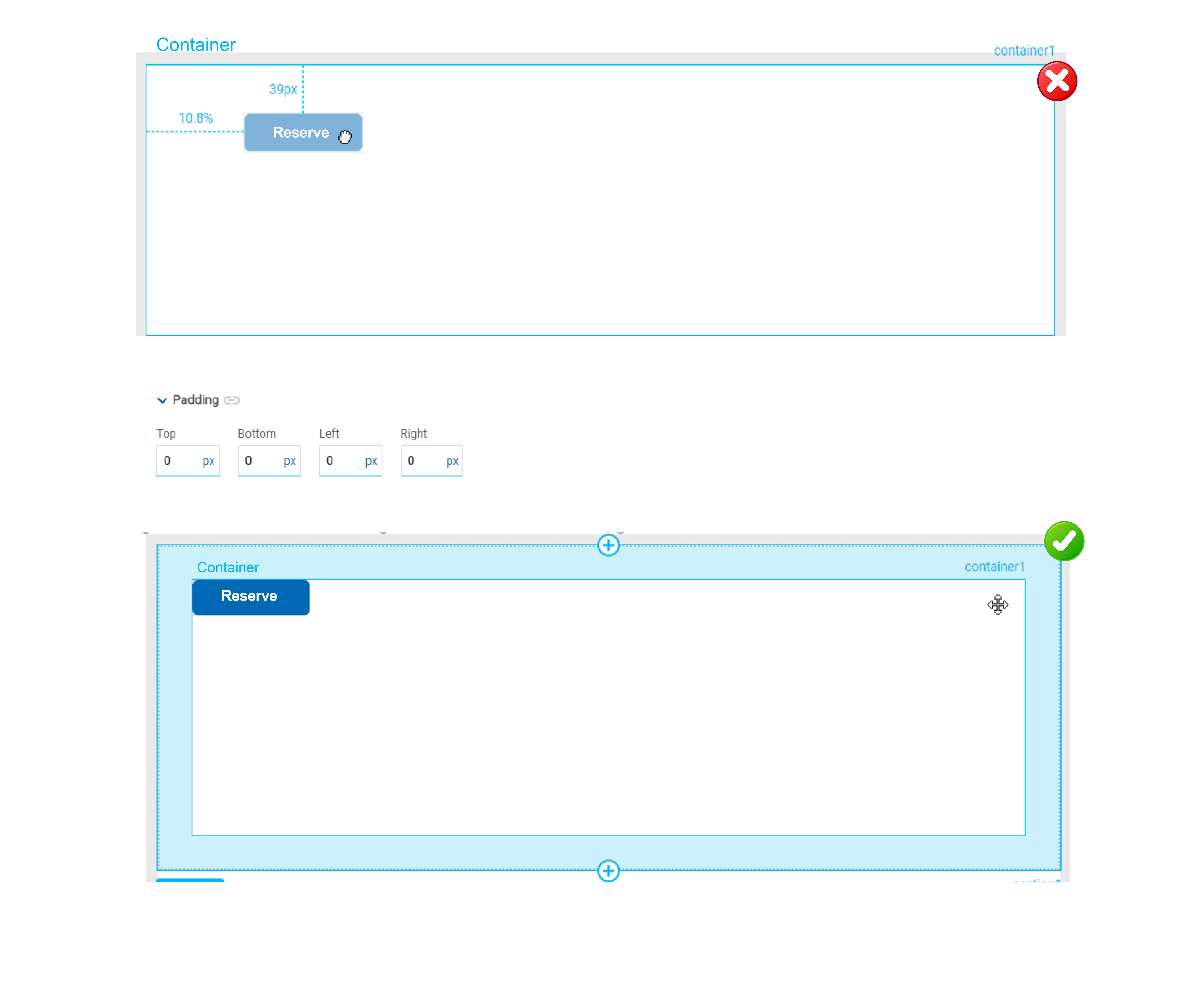
•Align elements within a container using “padding”, rather than manually. Besides it allows to control spaces easily.
For example, use:
Docking
•Dock the elements to the side that must remain fixed when it changes size.
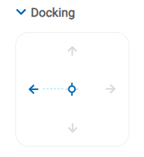
Alignment icons can also be useful, to dock to a specific position and automatically remove the margin if necessary.

Elements in the same row
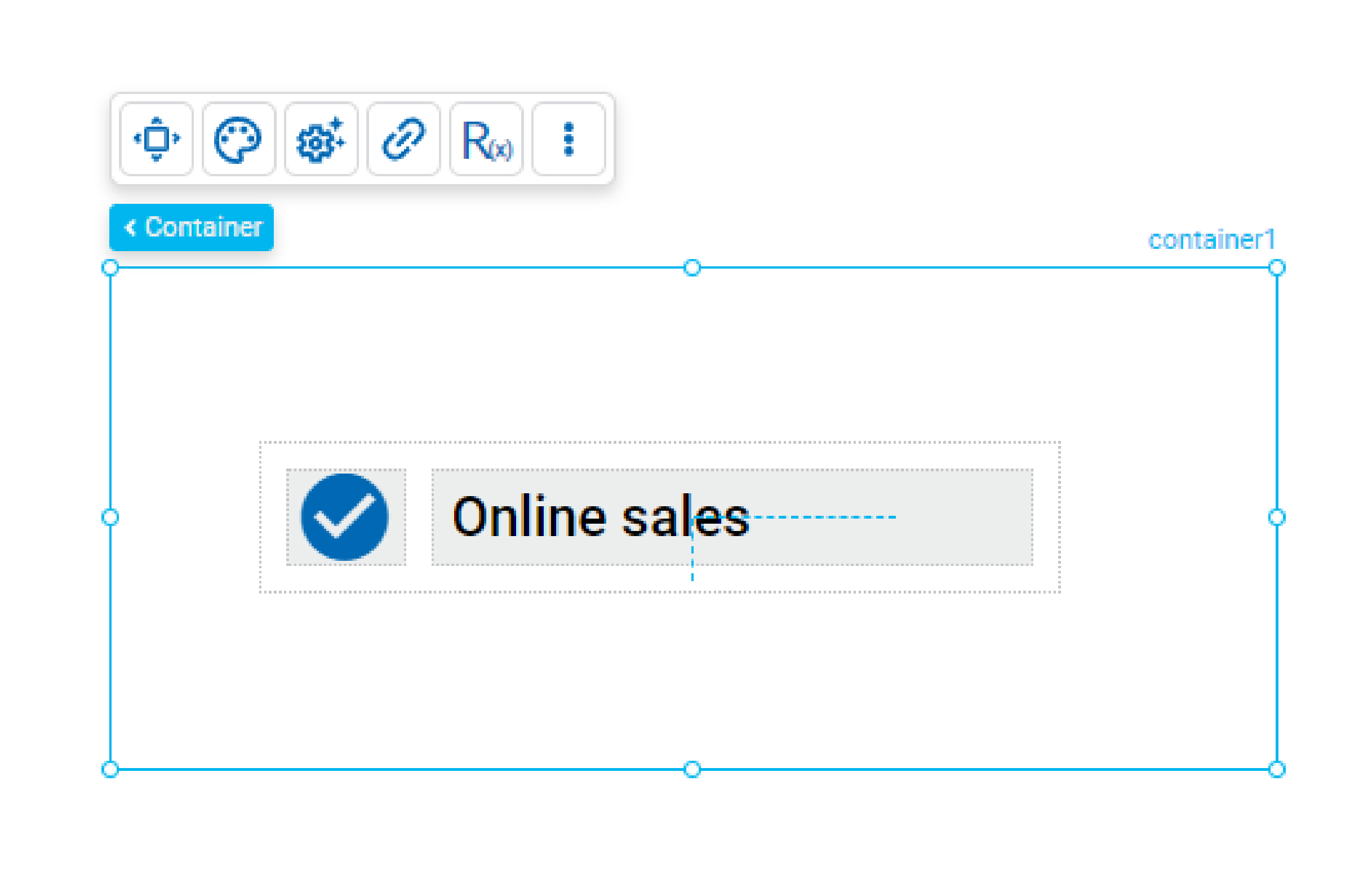
When modeling two or more horizontally oriented elements it is recommended to use a row type “Layout” element to contain them. This allows the page to be responsive and these elements do not overlap.
Elements in a same column
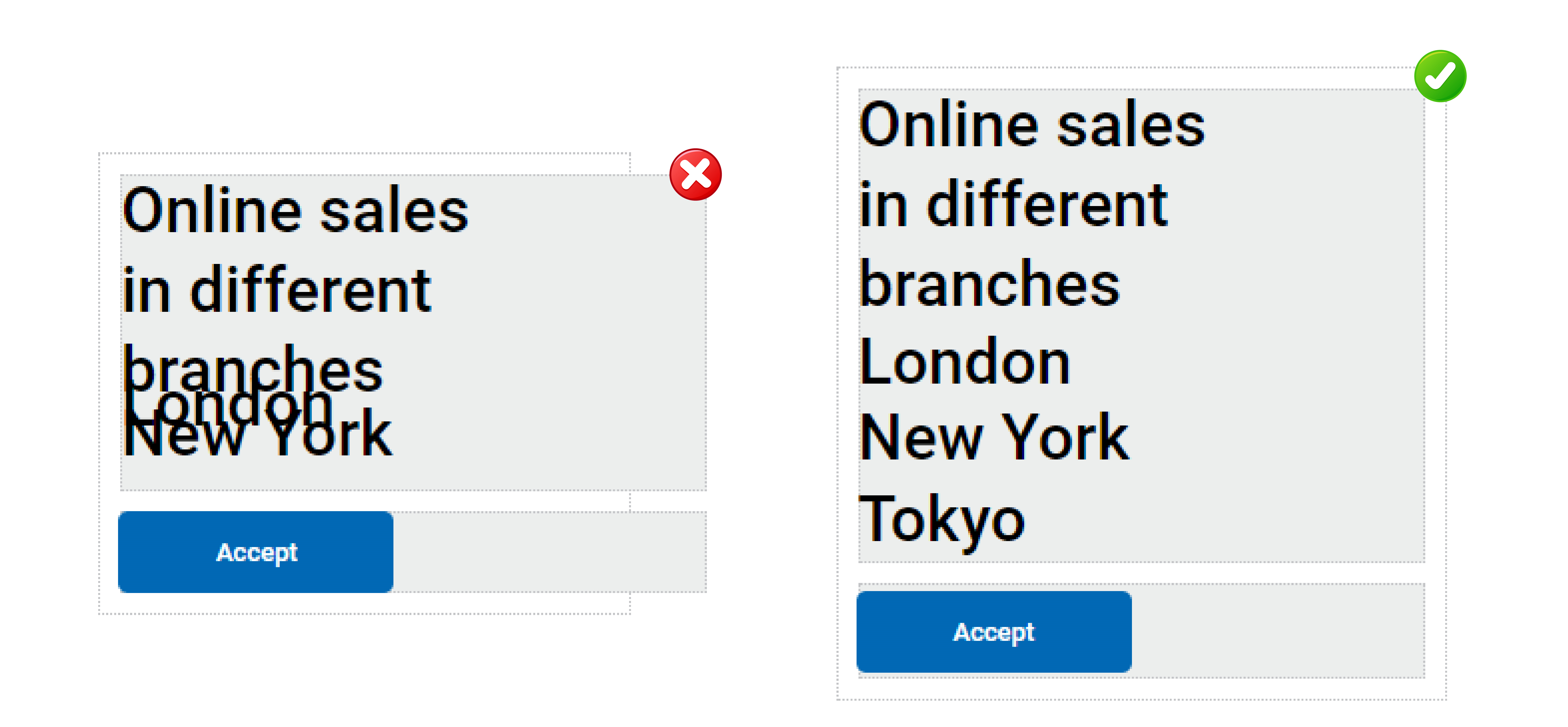
•When modeling two or more vertically oriented elements it is recommended to use a column type “Layout” element to contain them.
If there are items within the design that are of variable size, the height of the item must be indicated as “automatic”. This ensures they do not overlap.
Minimum size
•The “Minimum Height” and “Minimum Width” properties of an element should be modeled to prevent its content from overflowing or displaying undesiredly if the size of the browser window is reduced. This improves the user experience and ensures that the page layout remains readable and functional across different browser window sizes.
