Repeater
The repeater element allows to display a set of retrieved instances by a data source, unlike other elements that only allow a single instance to be displayed.
Visually it is similar to the layout element but only the first item can be modified and a data source must be defined. Such item repeats as many times as instances are obtained from the data source.
If the items included in the repeater show information on the instances of the data source defined in it, such source must be previously configured.
The element properties are represented by icons in its context menu, where its operations are also available.
Subtypes
•Cards
•Tape
Structure Properties
The structure properties panel of an element opens when selecting the icon  of the context menu.
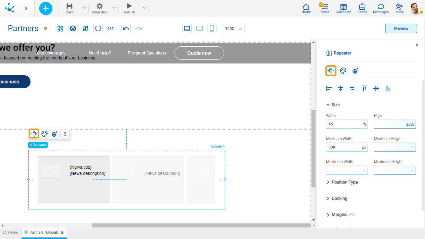
Alignment
Allows to align the element by selecting one of the available icons.
• Align to the left.
• Align to horizontal center.
• Align to the right.
• Align up.
• Align vertical center.
• Align bottom.
Size
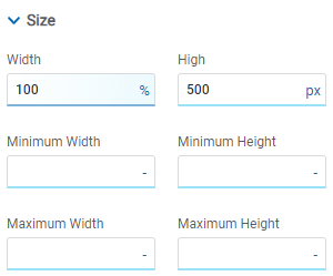
All size properties can be expressed in pixels (px), percentage (%), viewport width (vw), and viewport height (vh). Additionally, for Width and Height properties, the “auto” option is added.
If selecting percentage (%) for the width and height properties, the size is calculated relative to the top element.
Position Type
It determines if at the time of execution the element remains fixed on the page or if it moves as the scroll bar moves forward or backward.
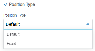
Possible Values
•Default: The element has a relative position with respect to the superior element where it was placed (container or section).
•Fixed: Fixes the element to the page so that it is always visible in the same position. It allows to increase the visibility of important content.
Docking
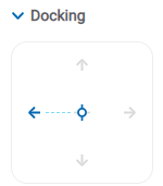
Determines the vertical and horizontal position of elements within the page section or container, when the screen is resized.
When an element is added or moved within the section or container, the modeler automatically docks it to the nearest corners or edges. It can also be configured by clicking on the arrows of the side to be docked to or on the center.
Once the element is docked, its exact position is indicated in the Margins property. The direction of the docking arrows determine the values that are automatically displayed for margins.
The docking position is indicated in the modeling area by dotted lines on the element.
Margins

It allows to define the distance of elements from the borders of their top element. The behavior of margins depends on the docking of the element. It can be expressed in pixels (px), percentage (%), viewport width (vw), and viewport height (vh).
Top
Distance to the top border of the highest ranking element.
Bottom
Distance to the bottom border of the highest ranking element.
Left
Distance to the left border of the highest ranking element.
Right
Distance to the right border of the highest ranking element.
![]() Allows the value entered in one of the margins to be copied to the other ones automatically.
Allows the value entered in one of the margins to be copied to the other ones automatically.
![]() Allows to indicate different values for each margin.
Allows to indicate different values for each margin.
Advanced
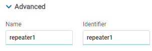
Name
Name used to reference the element during modeling.
Identifier
Uniquely identifies the element. It is used in the Javascript SDK.
Style Properties
The style properties panel of an element opens when selecting the icon  of the context menu.
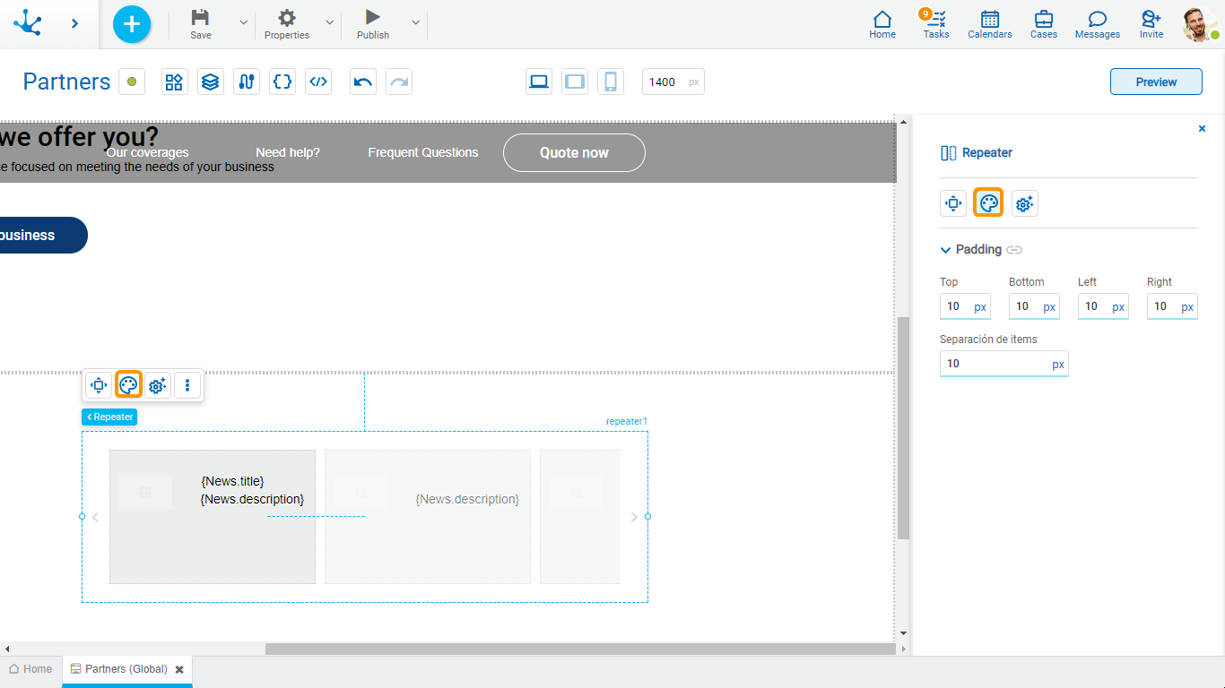
Padding
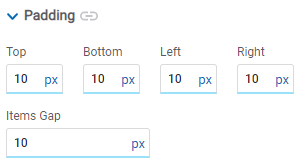
All padding space properties allow you to create a space around the borders (top, bottom, sides) and the bottom elements. It can be expressed in pixels (px), percentage (%), viewport width (vw), and viewport height (vh).
Items Gap
Defines the gap between the repeater items.
![]() Allows values entered in one of the paddings to be copied to the other ones automatically.
Allows values entered in one of the paddings to be copied to the other ones automatically.
![]() Allows to indicate different values for each padding.
Allows to indicate different values for each padding.
Configuration Properties
The configuration properties panel of an element opens when clicking the icon ![]() of the context menu.
of the context menu.
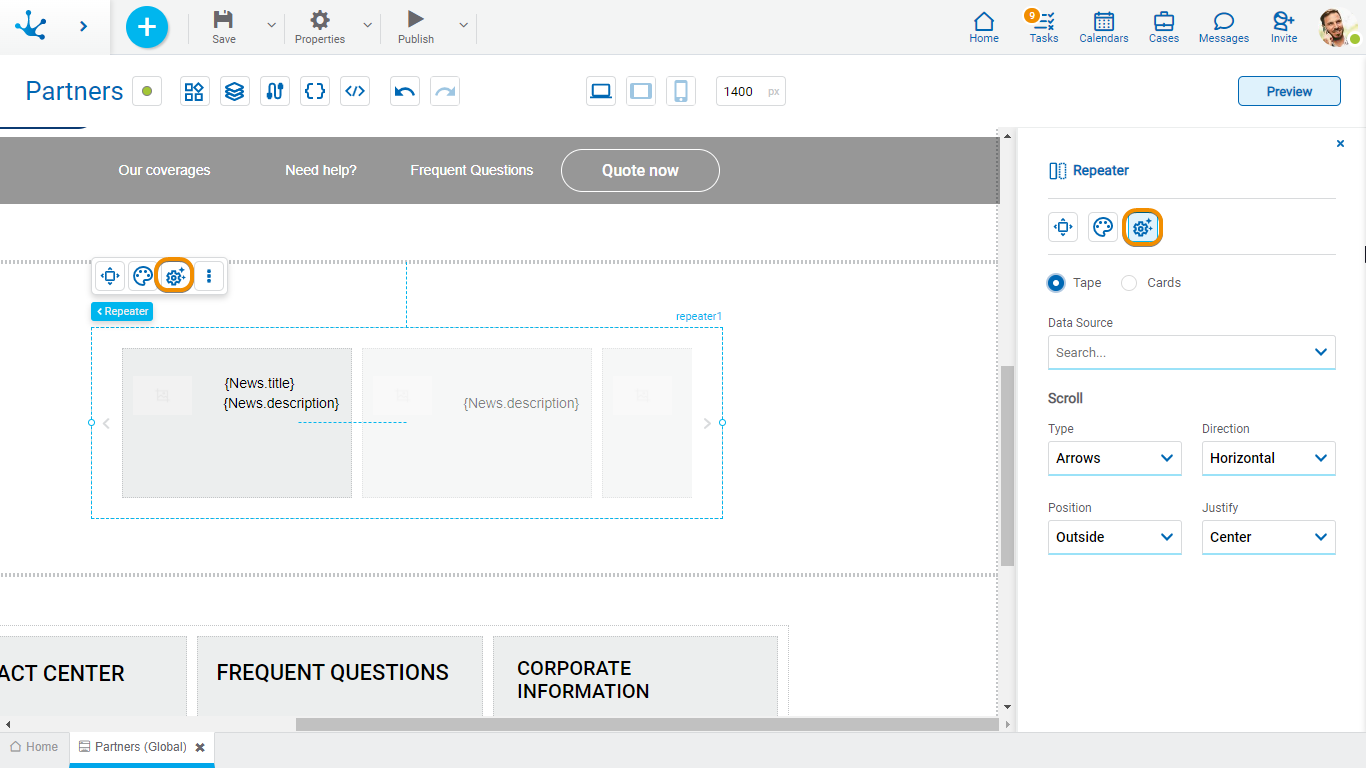
The items can be repeated in tape or card format.
Tape
When executing a page the items scroll within the repeater as the forward and back icons are pressed. The number of items are visualized initially on the tape depending on the repeater size.
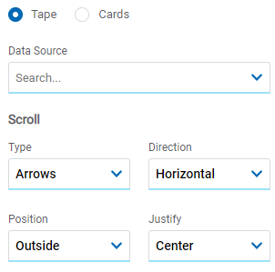
Data Source
Allows to select the form from which the data is retrieved to be displayed in the repeater.
Type
If the page is used from a desk the icons  and
and  that indicate the advance or regression of the items on the tape must be selected. If it is used from a touch breakpoint, the “None” option can be selected to scroll.
If the “Arrows” value is selected the properties enabled are Position and Alignment.
Possible Values
•Arrows
•None
Direction
Allows to select the direction in which the items within the example are displayed.
Possible Values
•Horizontal
•Vertical
Position and Alignment
It selects the position of the scroll icons within the repeater.
Possible Values
•If for the property Position the values “Inset” and “Outset” are selected, the possible values of the property Alignment are: “Top”, “Center”, “Bottom”.
•If for the property Position the values “Top” or “Bottom” are selected, the possible values for the property Alignment are: “Left”, “Center”, “Right”.
Cards
Different from the tape, items page into the repeater as the forward and back icons are pressed. The number of items is displayed initially in the repeater depending on the modeled values in the Columns and Rows properties.
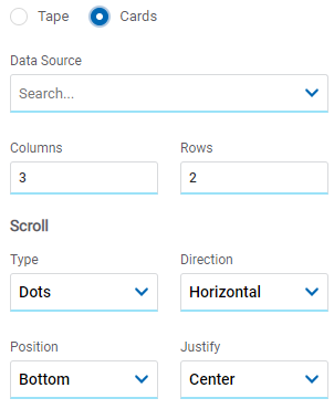
Data Source
Allows to select the form from which the data is retrieved to be displayed in the repeater.
Columns
Allows to define the number of columns in the repeater.
Rows
Allows to define the number of rows in the repeater.
Type
Allows to select if the icons  or
or  that indicate the progress or regression of the items in the repeater are visualized.
Possible Values
•Dots
•Arrows
Direction
Allows to select the direction in which the items within the example are displayed.
Possible Values
•Horizontal
•Vertical
Position and Alignment
It selects the position of the scroll icons within the repeater.
Possible Values for Position
•Top
•Bottom
•Inside Top
•Inside Bottom
Possible Values for Alignment
•Left
•Center
•Right
Embedded Rules
The embedded rules properties panel of an element opens when selecting the icon ![]() of the context menu.
of the context menu.
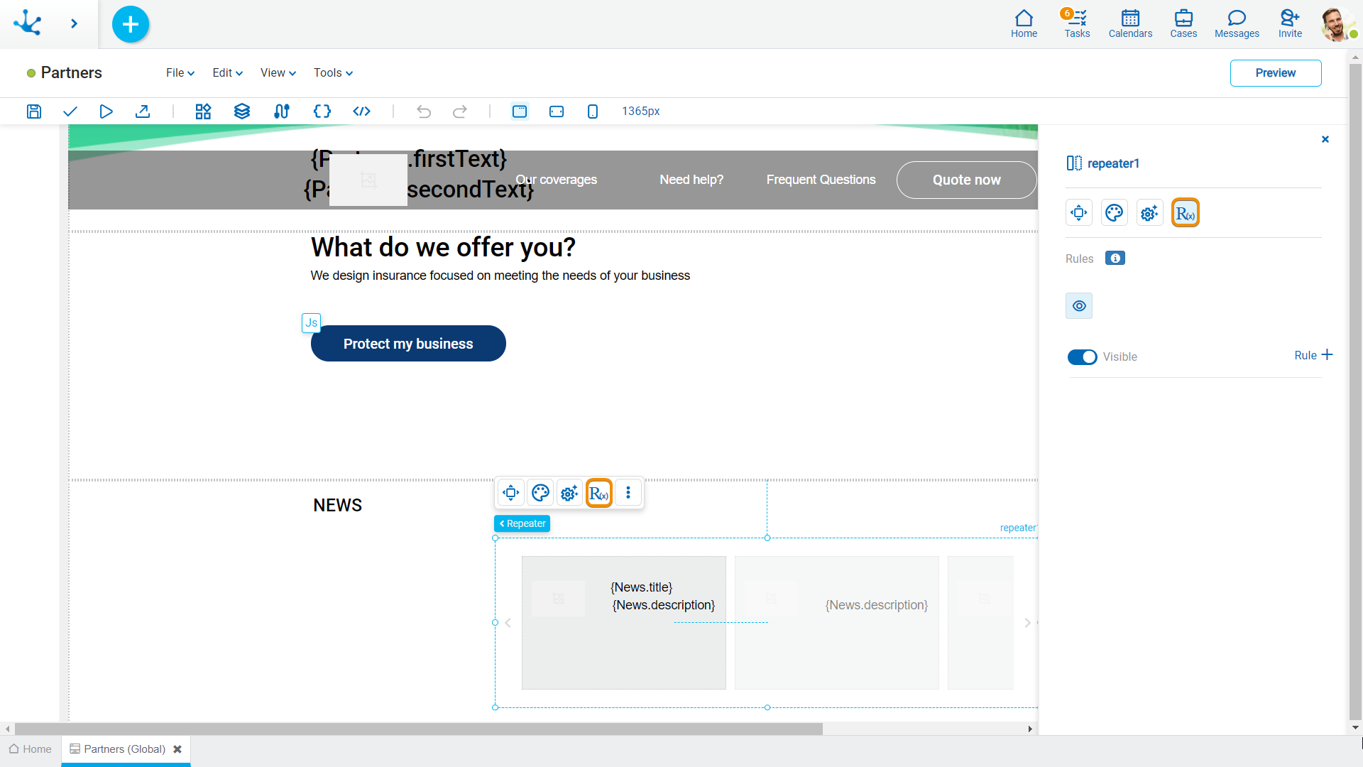
Properties
Rules
Embedded rules on behavior, validation and calculation can be defined, associated with an element, by using the wizard (ctrl + space).
 Shows syntax examples for writing the rules.
|
|
Indicates whether the element is visible. If this property is not checked, the element is not displayed in the page.
|
Operations when defining the rule:
|
Saves the new or modified rule |
|
Cancels the operation |
Operations once the rule is defined:
|
Edits the existing rule |
|
Deletes the rule |


 Visible (default)
