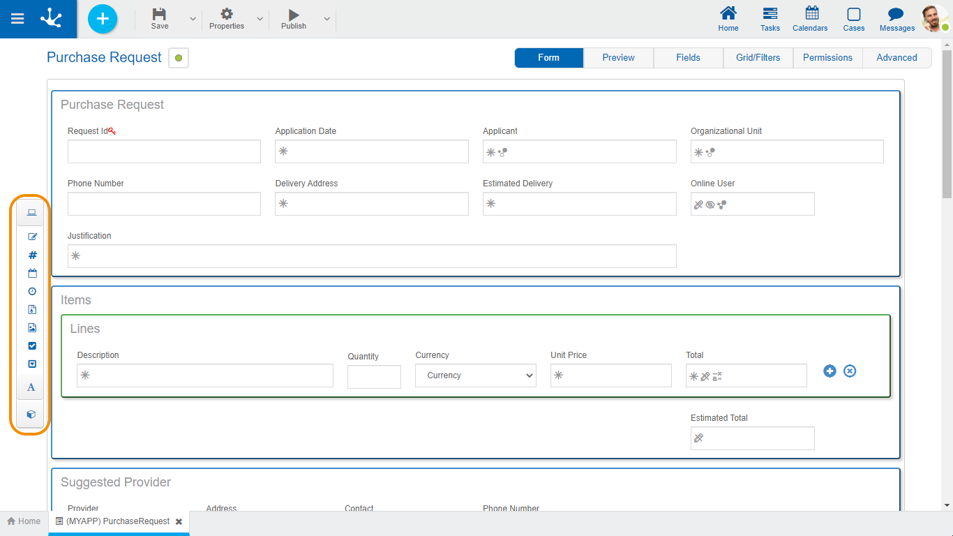
Left Side Toolbar
It is the toolbar that contains the icons corresponding to the different types of elements that can be defined in a form.
To use it, it is necessary to click on the corresponding section of the bar and select the type of element to add, dragging it to the desired place on the form.
Separators
They are light blue rectangular boxes that are displayed to the right and left, or above and below the elements defined in the modeling area, when dragging a field, graphic element or container with the mouse from the bar on the left. Indicate the positions within the modeling area where a field, graphic element or container chosen to be included in the form can be dropped.

|
Pressing this icon displays a subset of elements that allow modeling fields represented by controls within the form. Each field can have a data type associated with it, depending on the control that represents it.
|
|
•Alphanumeric (Default Type) The values are saved keeping the entered uppercase and lowercase letters. •Uppercase Alphanumeric Values are saved in uppercase. •Long alphanumeric It works as a default alphanumeric, with the exception that it allows storing long texts (usually up to 4GB). •Rich Text It has the characteristics of the alphanumeric type. It presents an extended editor that allows you to format the text by applying different styles, colors, sizes, etc. See detail of use of control.
|
|
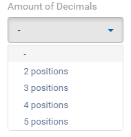
Integer •Number It can contain integer values between -2147483648 and 2147483647 (they are stored in 32 bits). •Large Integer It can contain integer values between -9223372036854775808 and 9223372036854775807 (they are stored in 64 bits). •Decimal If the data type is decimal, the selection of the number of decimal places (2 to 5) is enabled.
|
|
•Date Allows you to view a date or enter it from a selector. See detail of use of control. •Date and Time Allows you to view a date and time or enter them from selectors. See detail of use of control. •Local Date Allows you to view a date or enter it from a selector, according to the time zone corresponding to the calendar of the user who uses it. •Date and Local Time Allows you to view a date and time or enter them from selectors, according to the time zone corresponding to the calendar of the user who uses them.
|
|
•Time Allows you to view a time or enter it from a selector. See detail of use of control. •Local time Allows you to view a time or enter it from a selector, according to the time zone corresponding to the calendar of the user who uses it.
|
|
•File in Database •File in Folder
|
|
•Image in Database Allows using image type user files as an attachment to the form. Allowed extensions are jpg, png, tif, bmp, and gif. See detail of control use. •Image in Folder Images are stored in the file structure of Deyel. This option is available only in the On-Premise version.
|
|
Allows to model fields represented by a check control. The values are of the logical type "YES/NO". It can be displayed in toggle format if the field Display property was modeled. See detail of use of control.
|
|
Value List
It allows modeling fields represented by a value list type control, whose possible values are predetermined based on a pre-existing list or are defined at the time the field is modeled, in the "Relation" tab of its properties. See detail of control use.
|
|
Pressing this icon displays a subset of graphic elements.
|
|
Title It is used to include a text with a highlighted format.
|
|
Label Used to include a free text and to be able to locate it in any section.
|
|
Separator Allows to divide sections of the form.
|
|
Space Used to include blank lines.
|
|
Allows you to add and remove iterative. It can be used within iterative containers.
|
|
Containers are graphic elements that allow grouping other elements under certain criteria.
For more details on its configuration and attributes, see Container Properties. Clicking on this icon displays a subset of container elements.
|
|
Row It is the grouping used in the graphic modeling area. An unlimited amount of elements can be put within a row, although the window width is recommended not to be exceeded since the row expands by increasing the width with respect to the others.
Rows can be scrolled up or down by moving all their content. To move a row, you must hold down the left mouse button with the cursor, focusing on the row you want to move and dragging it up or down another one. Rows can only be ordered within the container they are in, either the general area or a created container.
To delete a row you must position the mouse over it, where the delete option is displayed on the right
As an error prevention mechanism, a confirmation notice is displayed and if it is accepted, the row and all its content, including fields, are deleted.
If the form already contains data, deleting rows that contain fields is not allowed.
|
|
A rectangle containing any element of the form (fields, graphic elements and even other containers) is displayed. It can be used to group sections of the form, to which operations are added (hide, relate rules, etc.). The outline is not visible at the time of execution.
To differentiate it from other containers, its outline is orange.
|
|
The difference with a simple container is that everything inside the graphic container is displayed in run mode as inside an accordion. It can be used to group sections of the form, to which operations are added (hide, relate rules, etc.). This container transformed into an accordion can be seen in the preview.
To differentiate it from other containers, its outline is blue.
|
|
It can contain any element of the form (fields, graphic elements and even other containers).
Its main functionality is that all content is defined as multiple, that is, when executing the form, copies can be generated and deleted from the icons to the right of the element. This container is created by holding down a couple of buttons, but they can be deleted if not required.
Unlike the other containers, all the fields contained within are defined as a set of multi-occurrence fields. It cannot include other iterative containers either, nor simple containers if the Field Group property is checked.
It can be used to group sections of the form, to which operations are added (hide, relate rules, etc.). The outline is not visible at the time of execution.
To differentiate it from other containers, its outline is green.
|


