Container
To create an adaptive and structured design for the page, container boxes are used. Drag the elements inside the container and its style is then arranged for different displays. Elements are automatically attached to the container so they change size in direct relation to the container.
The element properties are represented by icons in its context menu, where its operations are also available.
Subtypes
•Simple
•Background Color
•Border
•Shadow
Structure Properties
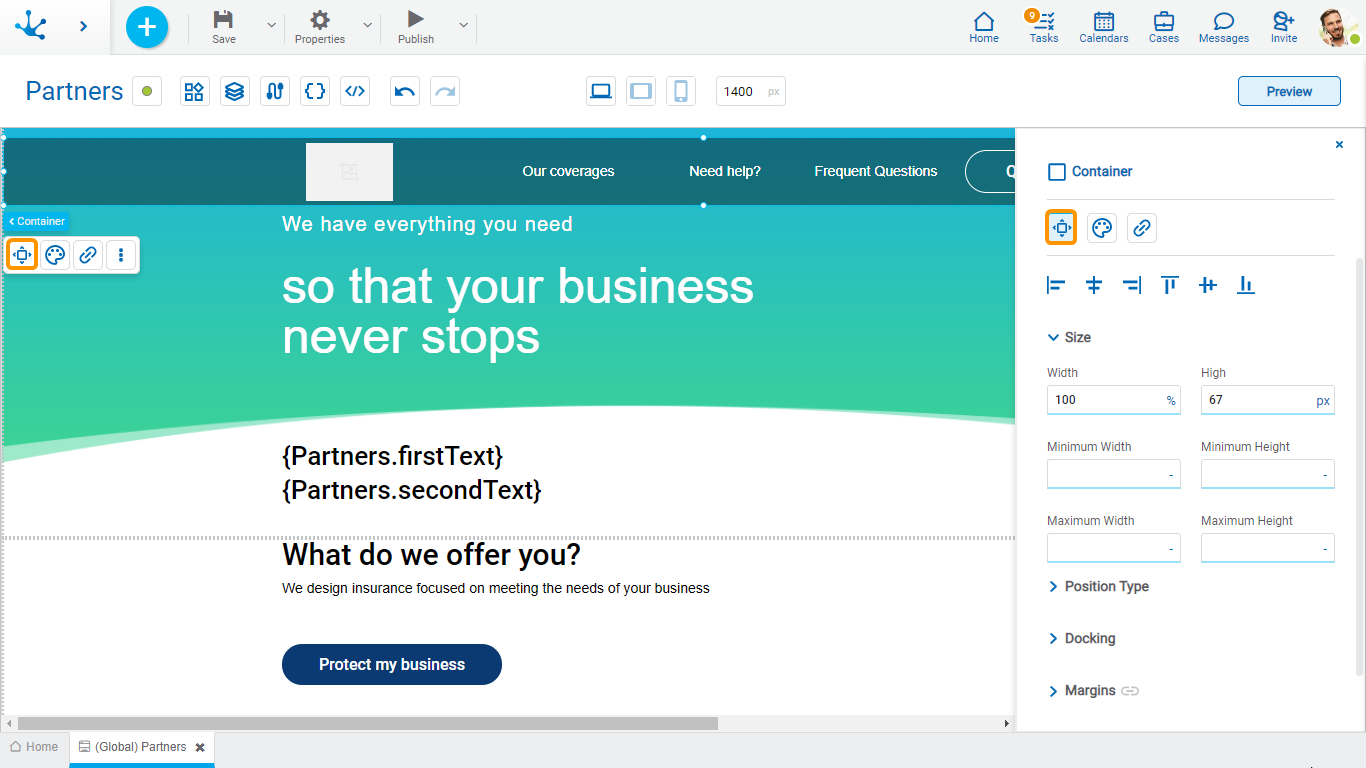
The structure properties panel of an element opens when selecting the icon  of the context menu.
Alignment
Allows to align the element by selecting one of the available icons.
• Align to the left.
• Align to horizontal center.
• Align to the right.
• Align up.
• Align vertical center.
• Align bottom.
Size
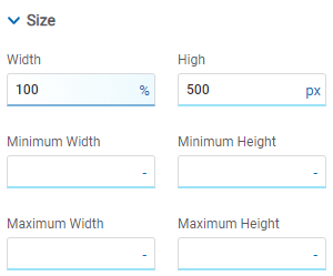
All size properties can be expressed in pixels (px), percentage (%), viewport width (vw), and viewport height (vh). Additionally, for Width and Height properties, the “auto” option is added.
If selecting percentage (%) for the width and height properties, the size is calculated relative to the top element.
Position Type
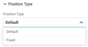
It determines if at the time of execution the element remains fixed on the page or if it moves as the scroll bar moves forward or backward.
Possible Values
•Default: The element has a relative position with respect to the superior element where it was placed (container or section).
•Fixed: Fixes the element to the page so that it is always visible in the same position. It allows to increase the visibility of important content.
Docking
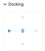
Determines the vertical and horizontal position of elements within the page section or container, when the screen is resized.
When an element is added or moved within the section or container, the modeler automatically docks it to the nearest corners or edges. It can also be configured by clicking on the arrows of the side to be docked to or on the center.
Once the element is docked, its exact position is indicated in the Margins property. The direction of the docking arrows determine the values that are automatically displayed for margins.
The docking position is indicated in the modeling area by dotted lines on the element.
Margins

It allows to define the distance of elements from the borders of their top element. The behavior of margins depends on the docking of the element. It can be expressed in pixels (px), percentage (%), viewport width (vw), and viewport height (vh).
Top
Distance to the top border of the highest ranking element.
Bottom
Distance to the bottom border of the highest ranking element.
Left
Distance to the left border of the highest ranking element.
Right
Distance to the right border of the highest ranking element.
![]() Allows the value entered in one of the margins to be copied to the other ones automatically.
Allows the value entered in one of the margins to be copied to the other ones automatically.
![]() Allows to indicate different values for each margin.
Allows to indicate different values for each margin.
Advanced
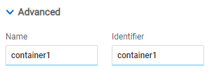
Name
Name used to reference the element during modeling.
Identifier
Uniquely identifies the element. It is used in the Javascript SDK.
Style Properties
The style properties panel of an element opens when selecting the icon  of the context menu.
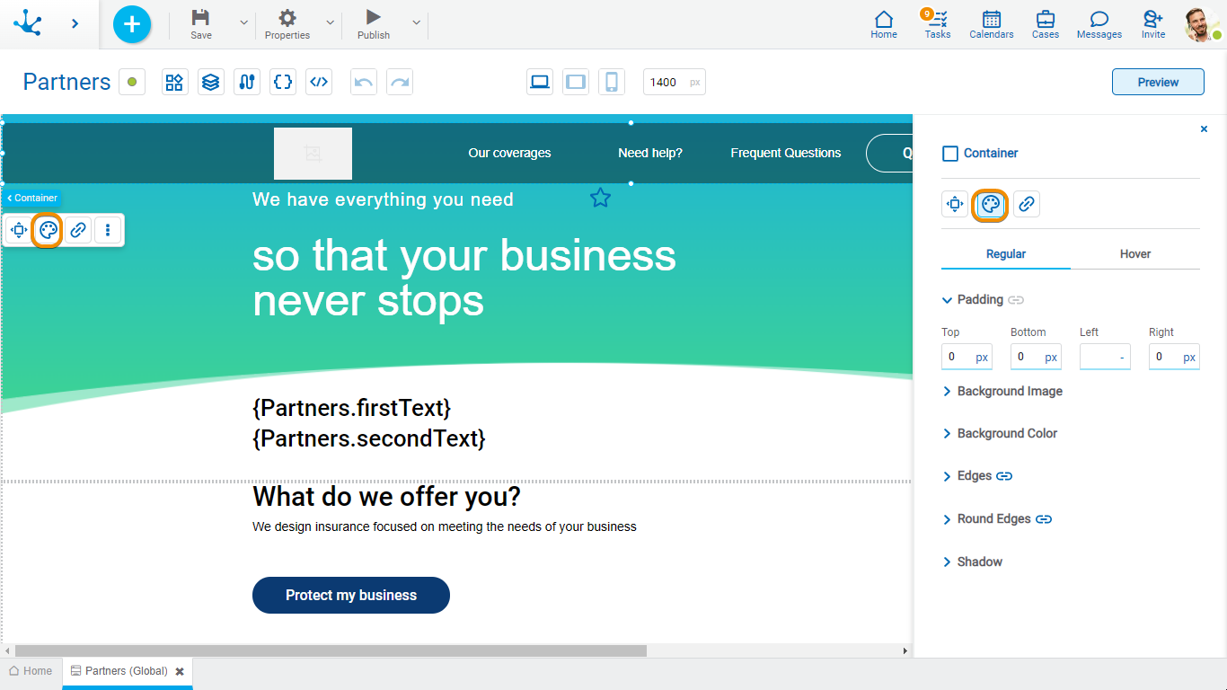
This type of element may take different states and for each of them different values for its properties may be modeled.

•Regular: The mouse pointer is not over the element.
•Over: The mouse pointer is over the element.
Padding

All padding space properties allow to create a space around the element borders (top, bottom, sides) and its content. The padding space configured is inward, while the margin is configured relative to a top element. It can be expressed in pixels (px), percentage (%), viewport width (vw), and viewport height (vh).
![]() Allows values entered in one of the paddings to be copied to the other ones automatically.
Allows values entered in one of the paddings to be copied to the other ones automatically.
![]() Allows to indicate different values for each padding.
Allows to indicate different values for each padding.
Background Image
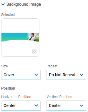
Allows to add a background image to the element.
Selected
An image can be uploaded from the computer where it is being modeled.
Size
Possible Values
•Cover
•Content
•Auto
Repeat
Possible Values
•Repeat
•Repeat Hor.
•Repeat Vert.
•Spacing
•Rounded
•Do Not Repeat
Horizontal and Vertical Position
Possible Values
•Center
•Left
•Right
Background Color
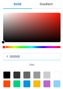
It allows to model a background color for the element, it can be solid or gradient and different properties are defined for each one.
Solid

This option enables not only to select the color from a palette but also to define the degree of transparency.
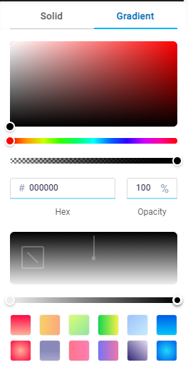
Gradient

This option enables to select not only the color from a palette but also to define its opacity and intensity according to the selected angle.
Edges
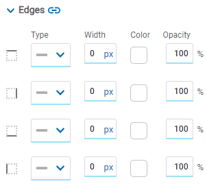
It allows to define the style of borders. Each one has its type, width, color and opacity defined, the latter as a percentage.
![]() Allows the value entered in one of the borders to be copied to the other ones automatically.
Allows the value entered in one of the borders to be copied to the other ones automatically.
![]() Allows to indicate different values for each border.
Allows to indicate different values for each border.
Round Edges
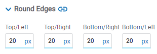
It allows to define the round edges at the corners of elements.
It can be expressed in pixels (px), percentage (%), viewport width (vw), and viewport height (vh).
![]() Allows the value entered in one of the borders to be copied to the other ones automatically.
Allows the value entered in one of the borders to be copied to the other ones automatically.
![]() Allows to indicate different values for each border.
Allows to indicate different values for each border.
Shadow
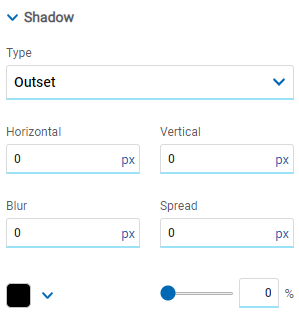
Allows to define a shadow effect around the element.
Horizontal
Horizontal size of the shadow to the right of the element. It can be expressed in pixels (px), percentage (%), viewport width (vw), and viewport height (vh).
Vertical
Vertical size of the shadow below the element. It can be expressed in pixels (px), percentage (%), viewport width (vw), and viewport height (vh).
Blur
The greater this value is, the greater and lighter the shadow becomes. If not specified, its value is 0 and the shadow border is darker. It can be expressed in pixels (px), percentage (%), viewport width (vw), and viewport height (vh).
Spread
Positive values will cause the shadow to expand and grow bigger, while negative values will cause the shadow to shrink. If not specified, its value is 0 and the shadow will have the same size as the element.
Color
Defines the color of the shadow.
Transparency
Defines the transparency of the shadow.
Hyperlink Properties
The hyperlink properties panel of an element opens by pressing the icon ![]() of the context menu.
of the context menu.

Define the behavior of the element when selecting it. Different properties are enabled depending on the type of object selected.
Page
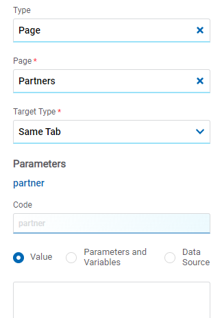
Page
The pages modeled in the environment are displayed.
Target Type
The available options for opening the object are displayed.
Possible Values
•Same Tab
•New Window
•Modal: if this option is selected the additional properties are enabled.
Modal Horizontal Size
Define its width.
Modal Vertical Size
Define its height.
•Iframe: this option is selected and an additional property is enabled.
Target Iframe
Displays the iframes previously defines in the page.
Parameters
If there are parameters, their value can be specified with text, parameters and variables or data source.
Deyel Page
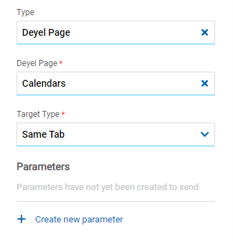
Deyel Page
The pages belonging to Deyel are displayed.
Target Type
The available options for opening the object are displayed.
Possible Values
•Same Tab
•New Window
•Modal: if this option is selected the additional properties are enabled.
Modal Horizontal Size
Define its width.
Modal Vertical Size
Define its height.
•Iframe: this option is selected and an additional property is enabled.
Target Iframe
Displays the iframes previously defines in the page.
Parameters
Allows sending parameters to the selected object type.
Form
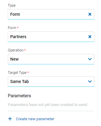
Form
The forms modeled in the environment are displayed.
Operation
Defines the operation made when selecting the object.
Target Type
The available options for opening the object are displayed.
Possible Values
•Same Tab
•New Window
•Modal: if this option is selected the additional properties are enabled.
Modal Horizontal Size
Define its width.
Modal Vertical Size
Define its height.
•Iframe: this option is selected and an additional property is enabled.
Target Iframe
Displays the iframes previously defines in the page.
Parameters
Allows sending parameters to the selected object type.
Process
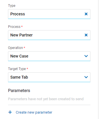
Process
The processes modeled in the environment are displayed.
Operation
Defines the operation made when selecting the object.
Target Type
The available options for opening the object are displayed.
Possible Values
•Same Tab
•New Window
•Modal: if this option is selected the additional properties are enabled.
Modal Horizontal Size
Define its width.
Modal Vertical Size
Define its height.
•Iframe: this option is selected and an additional property is enabled.
Target Iframe
Displays the iframes previously defines in the page.
Parameters
Allows sending parameters to the selected object type.
Link
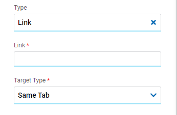
Link
Allows to enter any link.
Target Type
The available options for opening the object are displayed.
Possible Values
•Same Tab
•New Window
•Modal: if this option is selected the additional properties are enabled.
Modal Horizontal Size
Define its width.
Modal Vertical Size
Define its height.
•Iframe: this option is selected and an additional property is enabled.
Target Iframe
Displays the iframes previously defines in the page.
Element
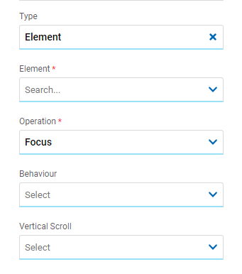
Element
The modeled elements in the page are displayed.
Behaviour
Establishes the transition of the animation.
Possible Values
•Auto
•Smooth
Vertical Scroll
Possible Values
•Start: Moves to the start of the selected element.
•Closest: Moves to the closest position to the selected element from the element the event fires.
•Center: Moves to the center of the selected element.
•End: Moves to the end of the selected element.
Back

It allows associating the event to go back in the browser to the element.
Events
The containers allow to use different events.
Event |
Description |
|---|---|
onMouseIn() |
It is executed when the cursor is positioned on the element. |
onMouseOut() |
It is executed when the cursor moves out of the element. |
onClick() |
It is executed when clicking on the element. |
onDoubleClick() |
It is executed when clicking twice on the element. |
onInit() |
It is executed before the element is loaded. |
afterViewInit() |
It is executed after viewing the element. |
onViewportEnter() |
It is executed when the element is visible. |
onViewportLeave() |
It is executed when the element is no longer visible. |
