Item
Items can be included to the layout and their characteristics can be defined by modeling its properties.
Operations
Add
Allows to add an item to the design clicking on the icon ![]() from the element´s context menu.
from the element´s context menu.

Move
The change of position for an item is made in the configuration properties panel of the layout.
Change Size
The size of an item can be changed both from its context menu using the icons  to increase its size and
  to reduce it, as well as from its structure properties panel.

Context Menu
Clicking the right button of the mouse on an item expands a second context menu whose options correspond to operations that can be performed on the selected item. The same menu is displayed by pressing the icon  on the palette.
•Cut (Ctrl+X)
•Copy (Ctrl+C)
•Paste (Ctrl+V)
•Duplicate (Ctrl+D)
•Lock/Unlock When an item is locked, it cannot be moved until it is unlocked.
•Hide: Hides the item in the breakpoint that is being used and in minor breakpoints. Once hidden it can be displayed again from Layers.
•Delete (Supr)
Structure Properties
The structure properties panel of an item opens when selecting the icon  of the context menu.
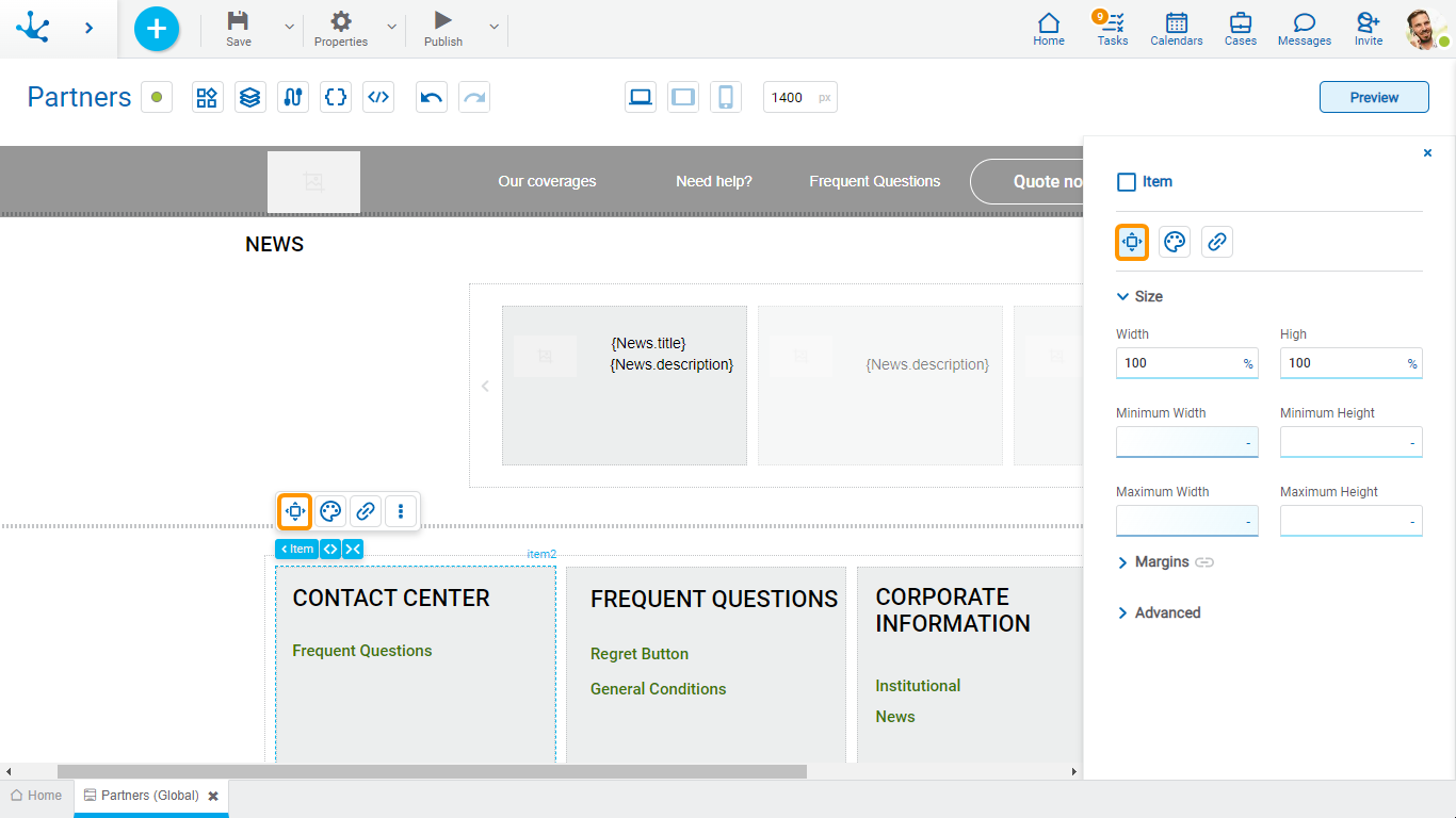
Size
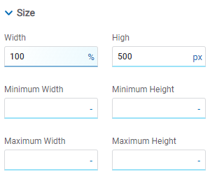
All size properties can be expressed in pixels (px), percentage (%), viewport width (vw), and viewport height (vh). Additionally, for Width and Height properties, the “auto” option is added.
Margins

It allows to define the distance of elements from the borders of their top element. The behavior of margins depends on the docking of the element. It can be expressed in pixels (px), percentage (%), viewport width (vw), and viewport height (vh).
Top
Distance to the top border of the highest ranking element.
Bottom
Distance to the bottom border of the highest ranking element.
Left
Distance to the left border of the highest ranking element.
Right
Distance to the right border of the highest ranking element.
![]() Allows the value entered in one of the margins to be copied to the other ones automatically.
Allows the value entered in one of the margins to be copied to the other ones automatically.
![]() Allows to indicate different values for each margin.
Allows to indicate different values for each margin.
Advanced
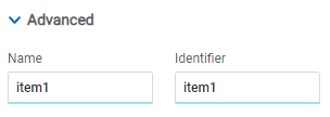
Name
Name used to reference the item during modeling.
Identifier
Uniquely identifies the item. It is used in the Javascript SDK.
Style Properties
The style properties panel of an item opens when selecting the icon  of the context menu.
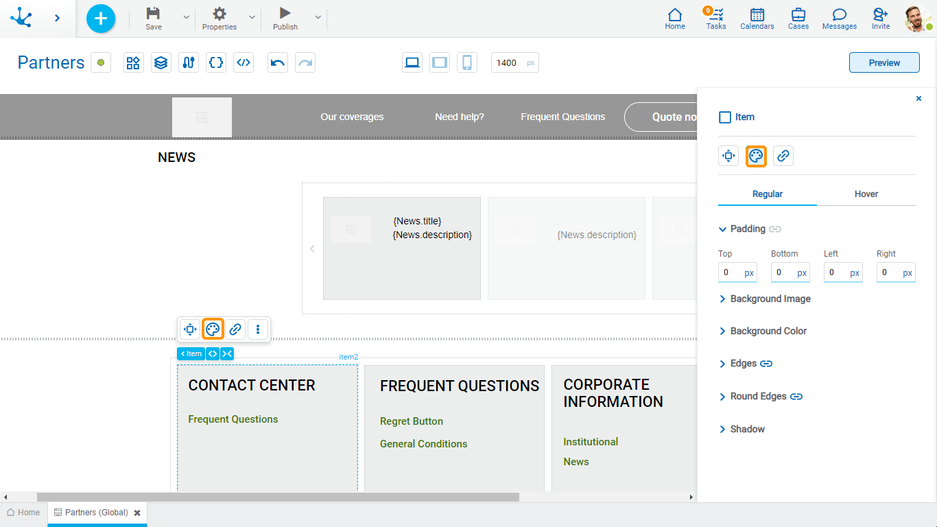
Padding

All padding space properties allow you to create a space around the borders (top, bottom, sides) and the bottom elements. It can be expressed in pixels (px), percentage (%), viewport width (vw), and viewport height (vh).
![]() Allows values entered in one of the paddings to be copied to the other ones automatically.
Allows values entered in one of the paddings to be copied to the other ones automatically.
![]() Allows to indicate different values for each padding.
Allows to indicate different values for each padding.
Background Image
Allows to add a background image to the item.
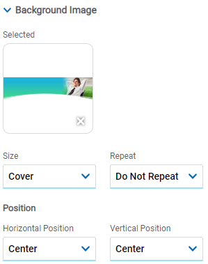
Selected
An image can be uploaded from the computer where it is being modeled.
Background Color

It allows to add a background color to the item.
•Color
•Transparency
Edges
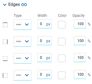
It allows to define the style of borders. Each one has its type, width, color and opacity defined, the latter as a percentage.
![]() Allows the value entered in one of the borders to be copied to the other ones automatically.
Allows the value entered in one of the borders to be copied to the other ones automatically.
![]() Allows to indicate different values for each border.
Allows to indicate different values for each border.
Round Edges
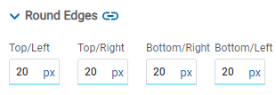
It allows to define the round edges at the corners of items.
It can be expressed in pixels (px), percentage (%), viewport width (vw), and viewport height (vh).
![]() Allows the value entered in one of the borders to be copied to the other ones automatically.
Allows the value entered in one of the borders to be copied to the other ones automatically.
![]() Allows to indicate different values for each border.
Allows to indicate different values for each border.
Shadow
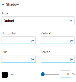
Allows to define a shadow effect around the item.
Type
Possible Values
•Outset
•Inset
Horizontal
Horizontal size of the shadow to the right of the item. It can be expressed in pixels (px), percentage (%), viewport width (vw), and viewport height (vh).
Vertical
Vertical size of the shadow below the item. It can be expressed in pixels (px), percentage (%), viewport width (vw), and viewport height (vh).
Blur
The greater this value is, the greater and lighter the shadow becomes. If not specified, its value is 0 and the shadow border is darker. It can be expressed in pixels (px), percentage (%), viewport width (vw), and viewport height (vh).
Spread
Positive values will cause the shadow to expand and grow bigger, while negative values will cause the shadow to shrink. If not specified, its value is 0 and the shadow will have the same size as the item.
Color
Defines the color of the shadow.
Transparency
Defines the transparency of the shadow.
Hyperlink Properties
The hyperlink properties panel of an item opens by pressing the icon ![]() of the context menu.
of the context menu.
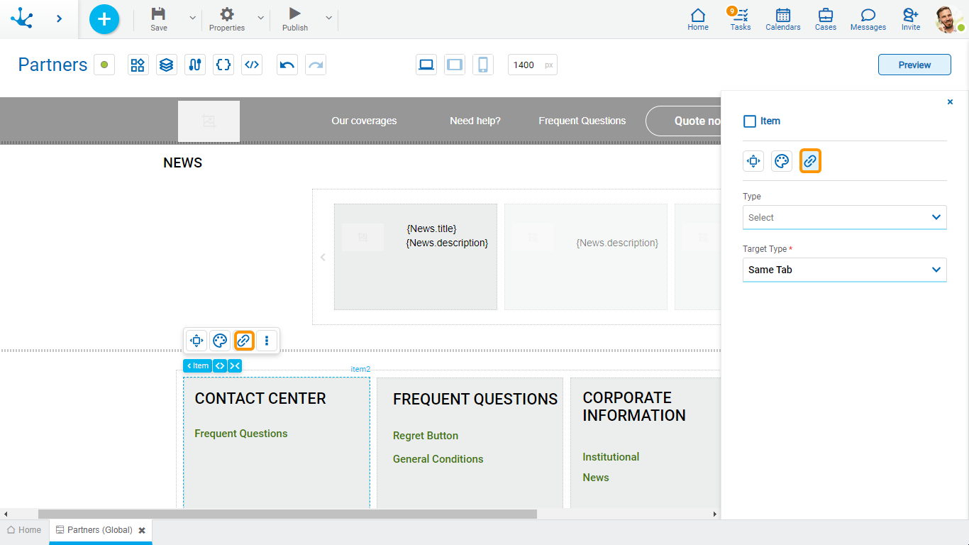
Define the behavior of the item when selecting it. Different properties are enabled depending on the type of object selected.
Page
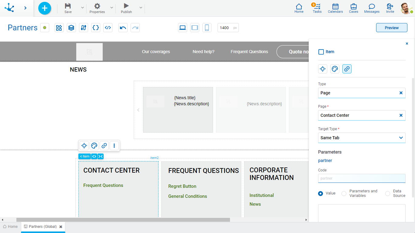
Page
The pages modeled in the environment are displayed.
Target Type
The available options for opening the object are displayed.
Possible Values
•Same Tab
•New Window
•Modal: if this option is selected the additional properties are enabled.
Modal Horizontal Size
Define its width.
Modal Vertical Size
Define its height.
•Iframe: this option is selected and an additional property is enabled.
Target Iframe
Displays the iframes previously defines in the page.
Parámetros
En el caso de poseer parámetros se puede especificar su valor con texto, parámetros y variables o fuente de datos.
Deyel Page
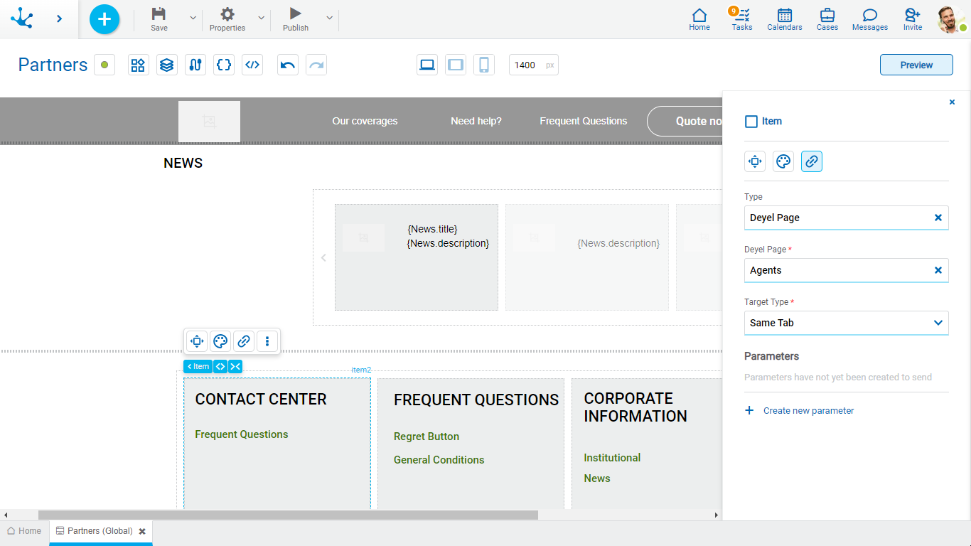
Deyel Page
The pages belonging to Deyel are displayed.
Target Type
The available options for opening the object are displayed.
Possible Values
•Same Tab
•New Window
•Modal: if this option is selected the additional properties are enabled.
Modal Horizontal Size
Define its width.
Modal Vertical Size
Define its height.
•Iframe: this option is selected and an additional property is enabled.
Target Iframe
Displays the iframes previously defines in the page.
Parámetros
Permite enviar parámetros al tipo de objeto seleccionado.
Form
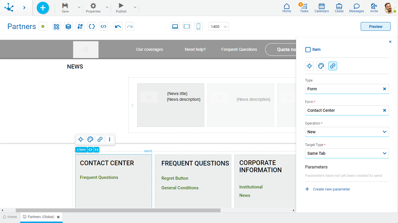
Form
The forms modeled in the environment are displayed.
Operation
Defines the operation made when selecting the object.
Possible Values
•New: Indicates that the panel of the form selected in the previous property is opened for the creation of an instance.
•Grid: Indicates that the grid of the form selected in the previous property is opened.
Target Type
The available options for opening the object are displayed.
Possible Values
•Same Tab
•New Window
•Modal: if this option is selected the additional properties are enabled.
Modal Horizontal Size
Define its width.
Modal Vertical Size
Define its height.
•Iframe: this option is selected and an additional property is enabled.
Target Iframe
Displays the iframes previously defines in the page.
Parámetros
Permite enviar parámetros al tipo de objeto seleccionado.
Process
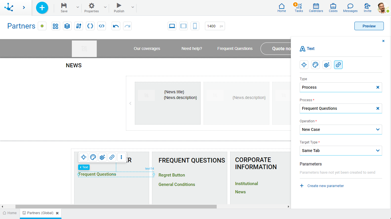
Process
The processes modeled in the environment are displayed.
Operation
Defines the operation made when selecting the object.
Target Type
The available options for opening the object are displayed.
Possible Values
•Same Tab
•New Window
•Modal: if this option is selected the additional properties are enabled.
Modal Horizontal Size
Define its width.
Modal Vertical Size
Define its height.
•Iframe: this option is selected and an additional property is enabled.
Target Iframe
Displays the iframes previously defines in the page.
Parámetros
Permite enviar parámetros al tipo de objeto seleccionado.
Link
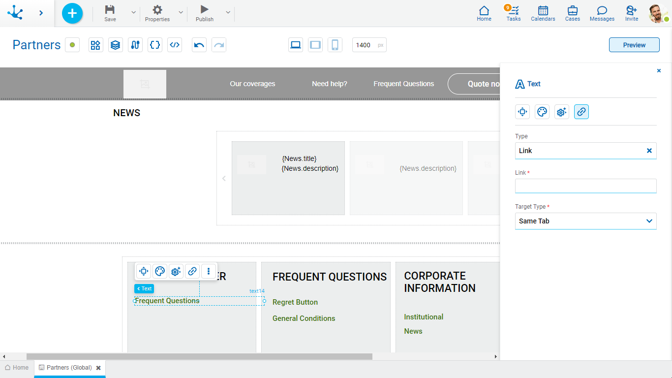
Link
Allows to enter any link.
Target Type
The available options for opening the object are displayed.
Possible Values
•Same Tab
•New Window
•Modal: if this option is selected the additional properties are enabled.
Modal Horizontal Size
Define its width.
Modal Vertical Size
Define its height.
•Iframe: this option is selected and an additional property is enabled.
Target Iframe
Displays the iframes previously defines in the page.
Element
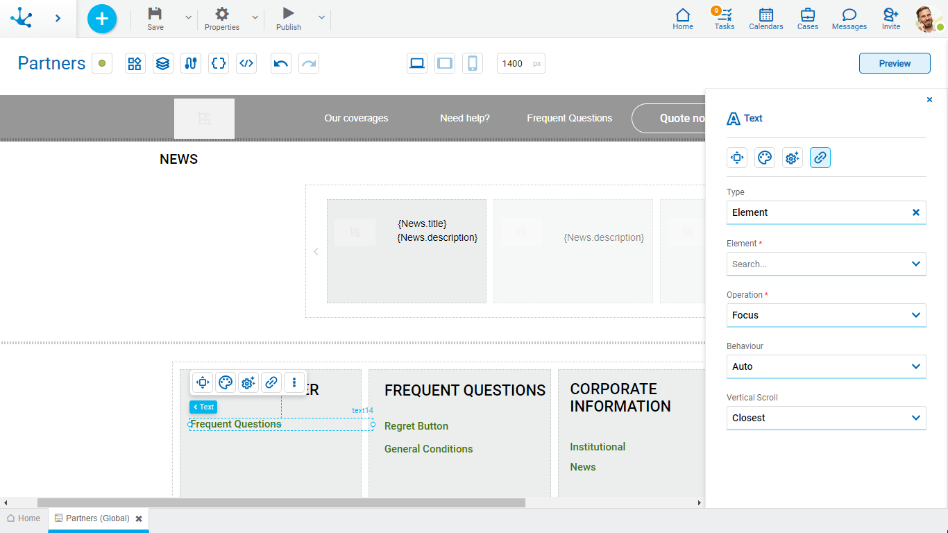
Element
The modeled elements in the page are displayed.
Operation
Defines the operation made when selecting the element.
Possible Values
•Focus
•Show
•Hide
•Show/Hide
Behaviour
Establishes the transition of the animation.
Possible Values
•Auto
•Smooth
Vertical Scroll
Possible Values
•Start: Moves to the start of the selected element.
•Closest: Moves to the closest position to the selected element from the element the event fires.
•Center: Moves to the center of the selected element.
•End: Moves to the end of the selected element.
Back

It allows associating the event to go back in the browser to the element.
Events
The items allow to use different events.
Event |
Description |
|---|---|
onMouseIn() |
It is executed when the cursor is positioned on the element. |
onMouseOut() |
It is executed when the cursor moves out of the element. |
onClick() |
It is executed when clicking on the element. |
onDoubleClick() |
It is executed when clicking twice on the element. |
onInit() |
It is executed before the element is loaded. |
afterViewInit() |
It is executed after viewing the element. |
onViewportEnter() |
It is executed when the element is visible. |
onViewportLeave() |
It is executed when the element is no longer visible. |
